|
|
|
|
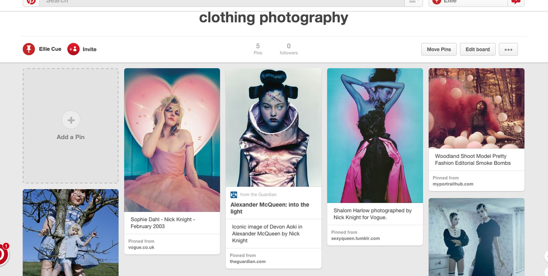
I have started my project with 'clothing'. This is very interesting. I have chosen this as its hard and something to think about and work hard for. I like to experiment and experiment the different ways clothing could be model for. Like the different themes and the different clothes and how you can do fairy tale and do real life clothing and themes.
clothing

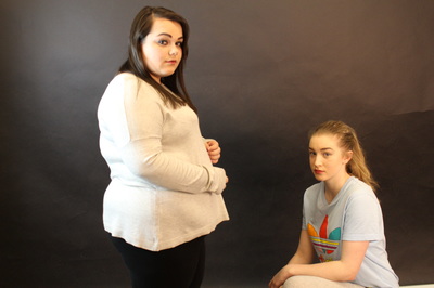
Photoshoot (1)
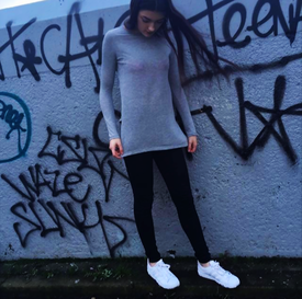
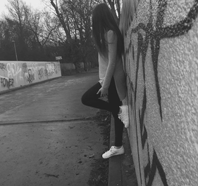
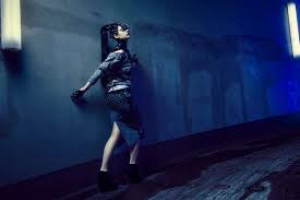
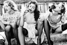
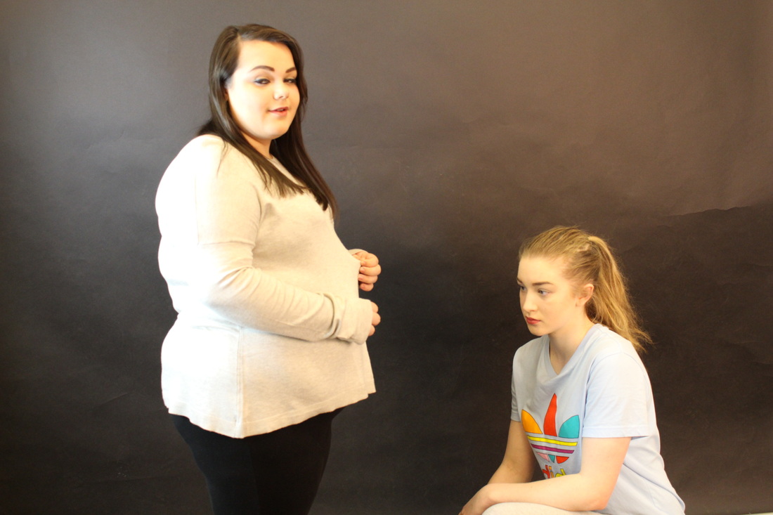
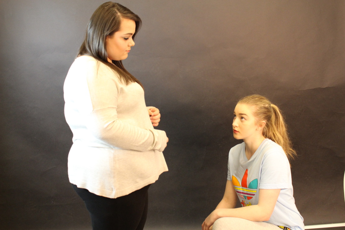
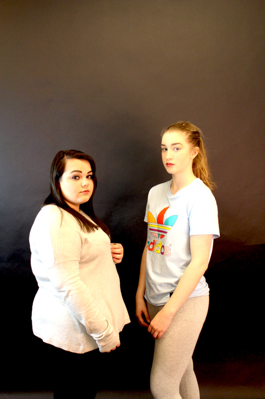
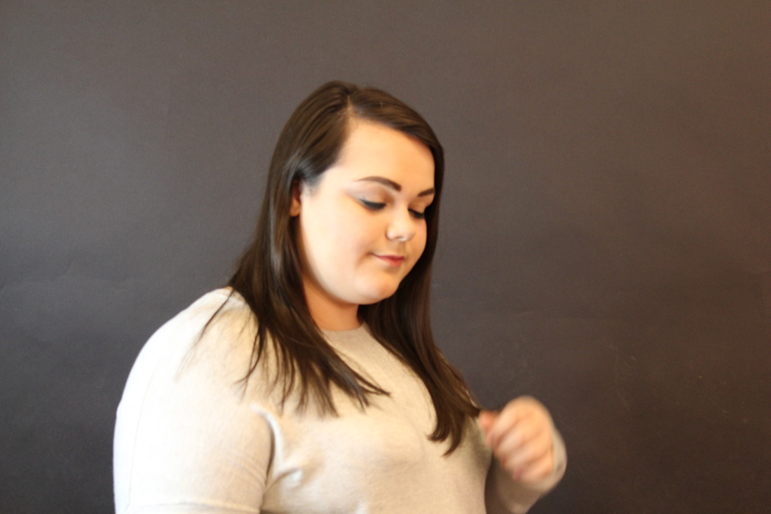
These are my first set of images to take with the theme 'clothing'. This was really hard to figure and plan out. I was inspired to take these images on pinterest. I saw a lot of ideas but I decided to go with this one as i thought it would be more of a challenge and a way to use my imagination . I like these images due to the background. The background made the picture better as its showing what the image is about. so If I was to take an image being at home its clothes maybe you would wear at home. If I was the change these images and improve I would do more different styles of clothes. So instead of having only 2 outfits maybe have a range of different outfits, mix and match. And maybe next time I could have more people model for these images, maybe a boy aswell. In these images they all have a background of graffiti this is to show the theme "street'. I would describe these images as interesting and urban due to the graffiti. The colours in these images are very blue they all have a blue tone to it. This makes the images look slightly alike. These images as a group look naturalistic as they don't look abstract. The equipment i used to take these images was a mobile phone (iphone 6) this had better quality thats why i chose to use i also used a torch light on the phone and the flash to make the image more brighter and more better. I took these images at a straight front angle but i then decided to mix it up and used different angles to make it more interesting. So i looked on pinterest and saw some angles other photographers/people tok it at they took most images more at a side angle and a low angle to get certain things in the image. For example, if i only wanted half of her jacket, and wanted to logo side i would then take it at a side angle. There are a lot of lines in these images due to the wall and the model her self. These images as a group remind me of films, and rough streets that have a lot of graffiti. There is a lot of space in this image however it is positive space as it is needed for the photograph, this is what makes the photograph street.
|
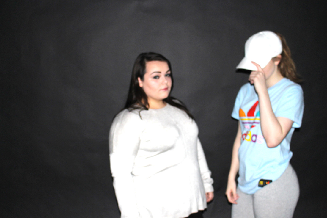
Image that is least successful
This image was the least successful due to the way the image is set out. In this image the person is standing doing a silly pose in front of a wall with writing on. I used an iphone to take this image thats why the quality was not that good. This is least successful as it looked like it was a rushed image as i just captured it at the moment in time. It does not look like a still image as in the image the top is blowing up and the hair so you can tell there is wind. There is also a lot of negative space within this photo , i could of cropped it so it just had the person with a but of writing, i could of also cropped out the sky so then it looks like the image is straight and taken at a good angle. There is not much lighting in this photo, it looks really dark and it shows that the weather was not good. if there was lighting in this image the image would of turned out better and you would be able to see the person a lot more. |
|
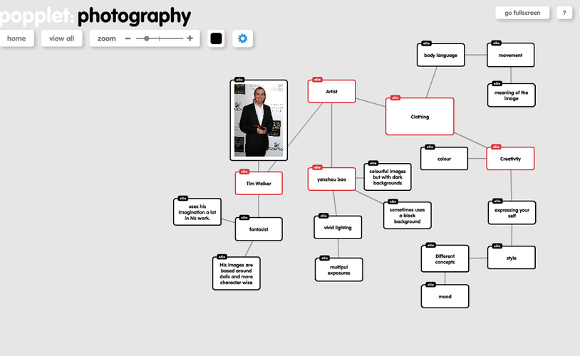
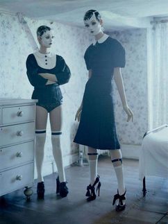
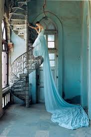
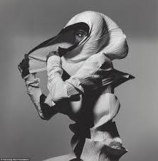
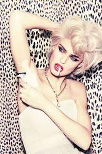
Tim Walker
Tim Walker does very interesting photographs. I like this image as its interesting and unusual. He does more doll , fairy-tale images. This image he took is something that I would want to-do, as you wouldn't see a doll posing for an image . I like the way the image is set out. The background fits into the theme that Tim has chosen, as the wallpaper is something a doll house or a very girly , old room would have. And to see that one of the models is nearly touching the ceiling maybe symbolise the fact that they are in doll play house. The image looks so real and it has been thought out really well. I like that the lighting that is coming through the window gives it more of an effect and as if it is lighting up to whole room. I would describe these images as abstract. It does not look like something you would see on a daily basis its clear that it has been planned, thought out , took time to take an image like this due to the way everything is set out and how the image looks. This image reminds me of a doll house. There are many lines in this image, the draw lines, the wallpaper lines and the out line of the room and the dolls its self. The thing that interests me the most in this image is the dolls and the makeup, because of the way they look and how they fit in with the theme and the image. |
|
|
Yanzhou bao
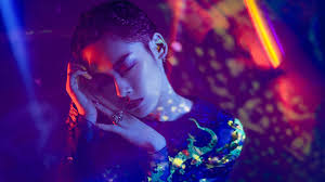
yanzhou bao images are very bright with mostly a dark background to make the bright colours stand out more. In this image i see a person that has moved and yanzhou bao has captured the movement so it looks as if more than one person is there. The image also is interesting because of the bright colours, the fact that the image goes form dull colours to bright colours shows and suggests what yanzhou bao does with the photos. I would describe this image as colourful and bright. There is a lot of negative space in this photo but yanzhou bao has used majority of the space that is provided.The first person closest to the camera draws my attention due to the colour and due to the fact it is the clearest object in the image. Some questions i would ask yanzhou bao is , what inspired you to take these images? is there a story behind the image? what equipment did you use to take this? what techniques did you use to get the image like this? This photography reminds me of a uv party because of the colours being so bright and which kind of looks like luminous clothing. |

|
|
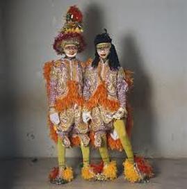
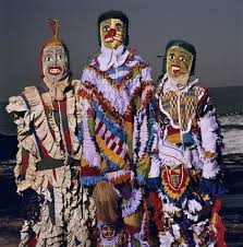
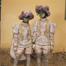
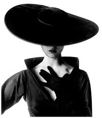
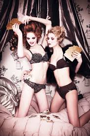
Phyllis Galembo
In this image it had 2 people standing in costumes, with a shadow being reflected behind them. It looks like a plain room and background to make the two people stand out and to draw attention to them. I would describe this image as interesting and looks a bit freaky, due to the faces and the costume. I would describe this image to someone who could not see it as , colourful and two people wearing the same outfits and the same theme. There is a lot of negative space in this image due to the space around the people, however the space could represent the whole image. The thing that makes the image more interesting is the way they are both staring at the camera with no facial expressions. This image looks different to real life as its not something you would see normally maybe for events such as festivals etc but other wise its just costumes. I like this image as there is a colour theme that goes on, orange , yellow, green , and red. This all works well as an image. What makes the image better is that the two people are wearing the same outfit this makes the image more interesting as it has not got much going on. I think that the lighting could have been better as it has gave of a shadow which does not really work well with the image as it would look better without the shadow. |
|
|
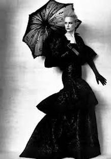
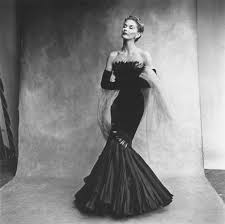
Irving Penn
This image is of a lady standing in a long black dress and a black umbrella. Her facial expressions are striking as her face looks very sharp and concentrated. I would describe this photo as a bit eerie as due to the black and white concept and the dark makeup. I would describe this image to someone who cant see it as, a lady standing with a striking pose looking mysterious and innocent in a black long dress. The things that seem new to me in this image is the background. As in the background the image has faded black and white patches. This goes with the whole theme and concept of the image. It seems new to me as i have never came across an image with an distorted background. This photographer would have used a digital camera to take this due to the quality of the image and due to the history of the photographer. The photographer has taken this image as central because of the composition of the image. This photograph reminds me of an fashion magazine and reminds me of olden days and how they would of dressed. It also reminds me of higher classes going for meals and going out to a fancy restaurants. What interest me the most about penns work is the colour black and white as it brings out the image better and gives it more of an interesting effect. |
|
|
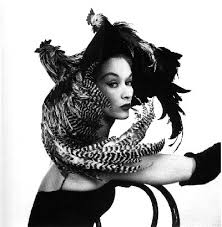
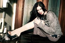
ellen von unwerth
I like this image that ellen has created due to the colours and the way the model is posing. In this photography there is a lady standing shaving her arms and looks as if she is getting ready to go out on a night out. I would describe this image as creative. I would describe it as creative as its like the olden day as people wouldn't dress that way now. I like the way the photographer has used the background, as it plays a good part in the image as it could relate to the model. It makes the model look like its her characteristic. It makes the model stand out a lot more with her hair and makeup. The photographer looks as if she has used an digital camera due to the quality and how the image has turned out. The space in this image is used well as there is not a lot of negative space as the background is needed for the image. What strikes me the most in this image is the fact the photographer has added the shaving part in. What was the concept of adding that part in? Was it going to make the image better or more interesting? Was it part of the theme? its interesting to have that part in due to not knowing the concept of it. The colours used in this images stand out, gives the image a better tone. |
|
What i want to do next.
Photoshoot (2)
Props Used
- Washing Basket
- Empty wooden frame
- newspaper
- Tree basket (leaves)
- Clothes
- Empty glass bottle
- Equipment
- Iphone
Evaluation
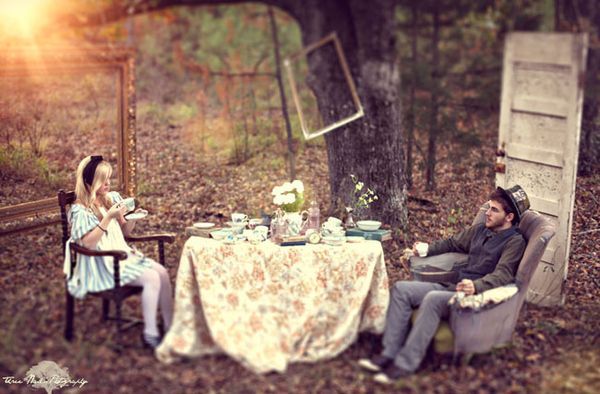
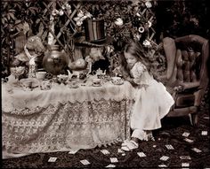
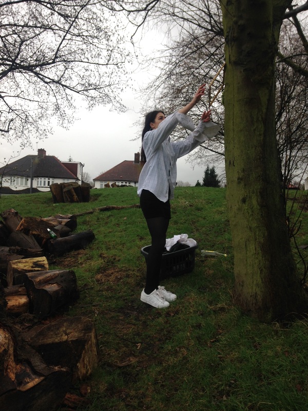
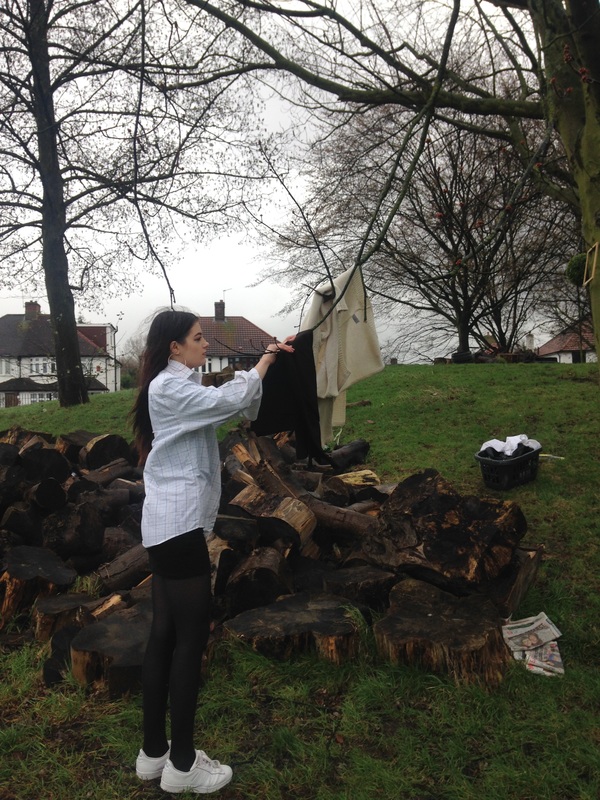
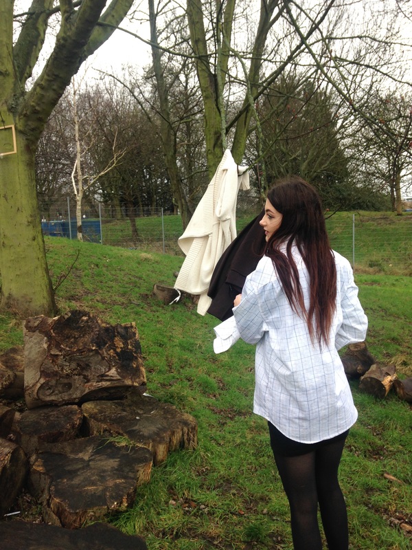
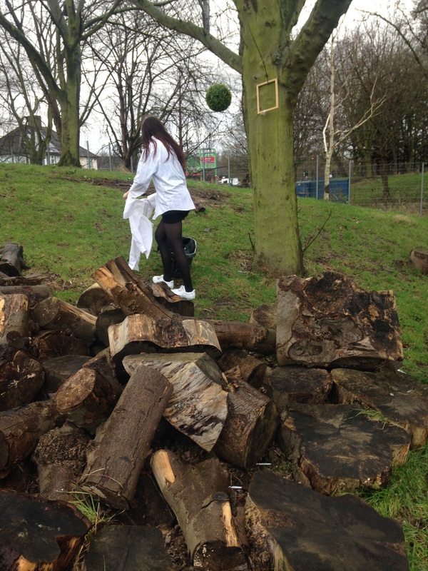
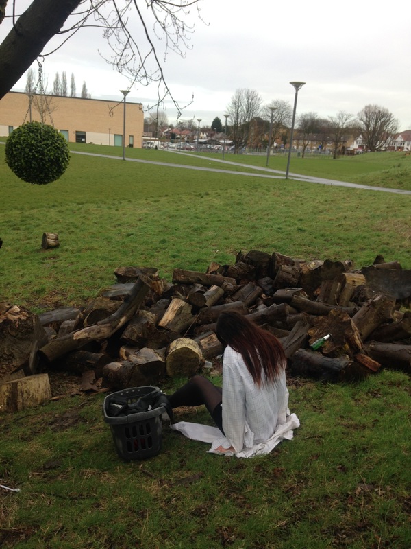
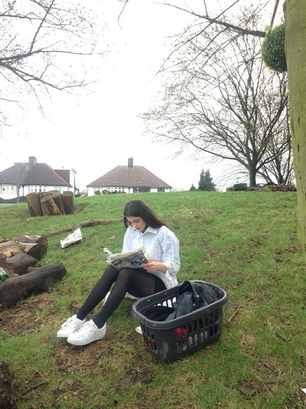
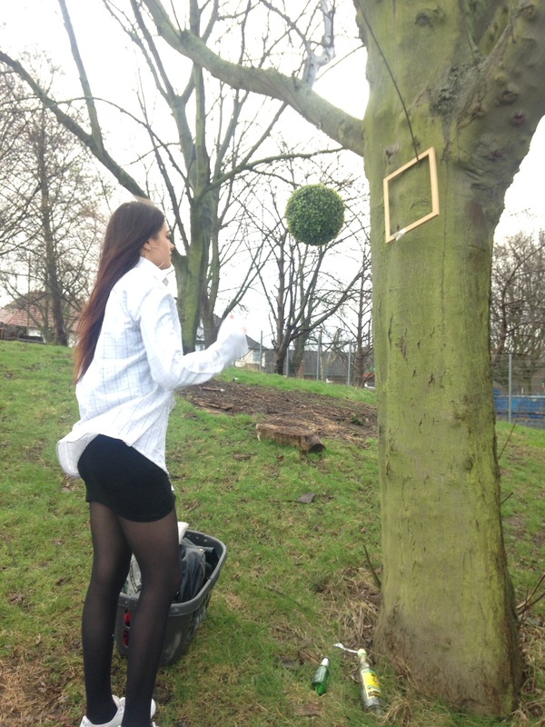
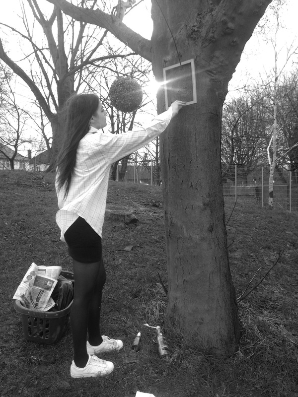
These images that i have captured i got inspiration to take these images from Pinterest. I tried to develop images relating to what inspired me on pinterest. I wanted to develop a set of images that represented a more of a home in the woods which is unusual. In these photos they have objects that relate to home , for example a washing basket, clothes on the washing line. I would describe these set of images as a group if someone was not able to se them as, these images are based in the woods and has a setting of a home with trees, washing line, and with a lot of greenery. For these images i took them on my Iphone. I wanted to takes these images with just basic equipment to see how it would turn out. I took these photos at different angles to see what the effect could make, it also helped me to capture certain objects that i needed in my pictures. these photographs remind me of a fairytale effect in the woods. There is not much light in these images due to the sun as it did start to rain, the light could have gave it more of an effect to look at as it might not look so dull and a sad day. this picture is different to real life as its something you would not normally see in the woods and hardly likely for someone to set up an house in the woods when it is a public area. There is a lot of negative space in these images, space that is not needed and a space which could be cropped out. for example the buildings are not needed in the photo as its suppose to represent the wood effect. And if i was to just capture the objects with the person would give it more of an effect as you can then see the main focus however sometimes the background is needed to you can see what the setting is. Overall i could improve on these images by arranging my objects properly so it does not have things that i don't need in the image. I could also improve this image by having the person in more suitable clothing to represent the theme more. Maybe they could be dressed up in fancy clothes if i wanted to make it more interesting or they could be dressed up in dull clothes to represent there life in the woods.

|
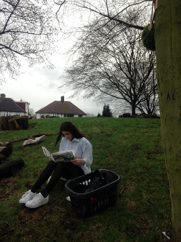
Image that is least successful.
This image is least successful due to the lighting and there is a lot of negative space. This is an image of a girl sitting on the grass reading a newspaper. This is suppose to represent someone who lives in the woods or in a place with a lot of trees and not many houses. This image is not that good as it captured things , objects that was not needed for the photo. The houses was captured in the background, this is not good for the photo and the houses are not needed as its suppose to focus on the girl and the trees. The image looks really dark due to the weather looking really bad. I could of improved this photo by maybe editing it on photoshop to make the image look brighter and next time i should crop the houses out and make it more clear on what the image is suppose to be focused on. |
What i am going todo next.
My next set of images i want to make it look more professional and make them look as if they
was fully planned out. I have not done a photoshoot that it based on just the clothing
and the person. This time i am going to choose a really basic setting so that it does
not take the focus away from the model. I am going to base the clothing around the different
types of coats that someone can wear.
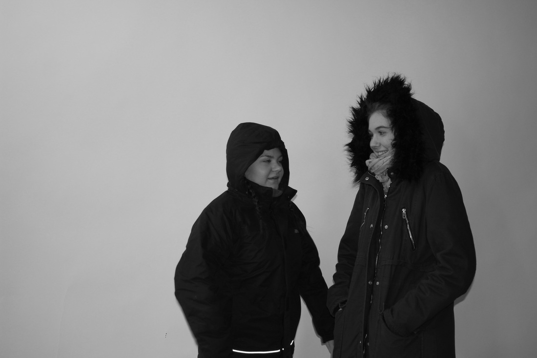
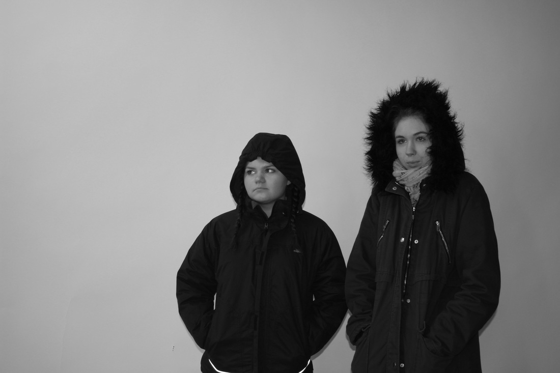
Photoshoot (3)
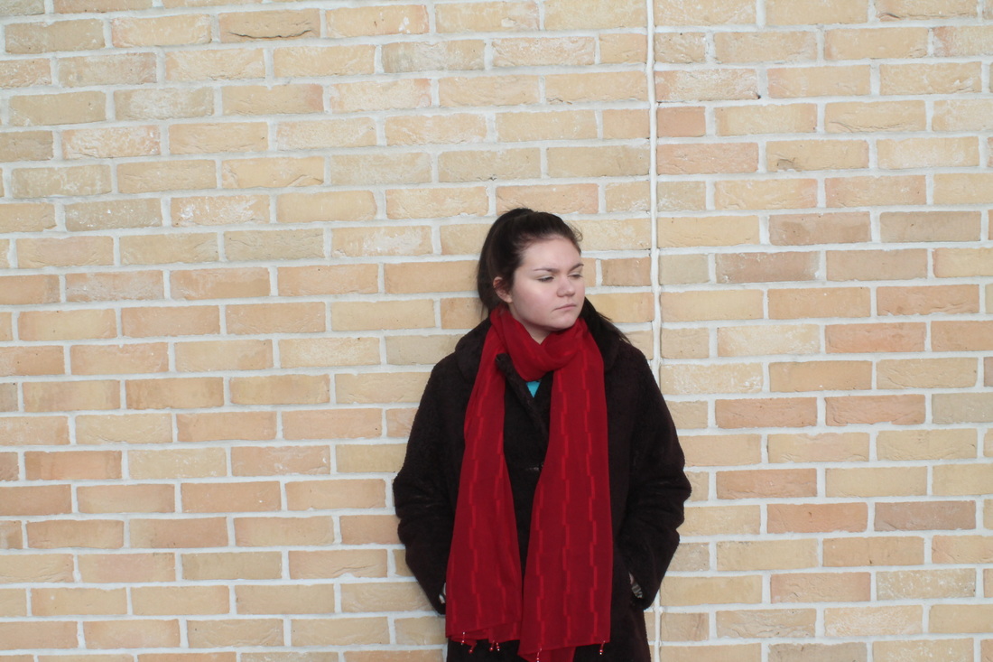
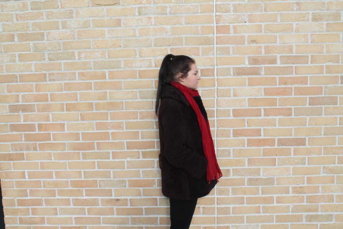
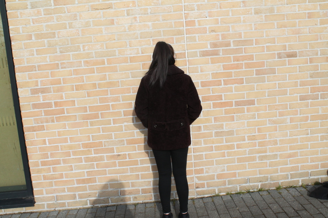
Props used
- Coats
- Scarf
- Equipment
- Digital Camera
- Camera Stand
Evaluation
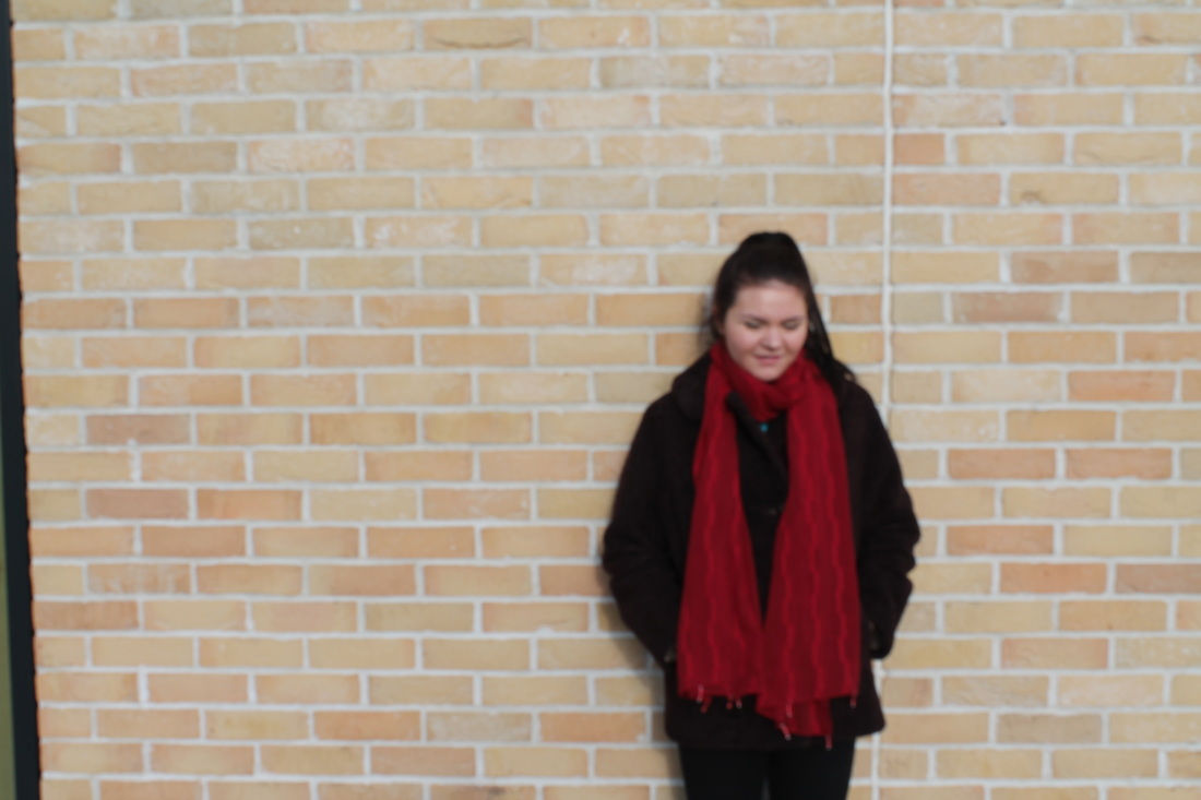
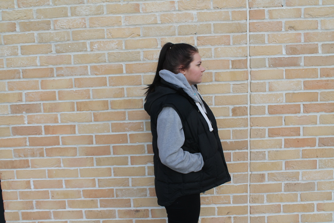
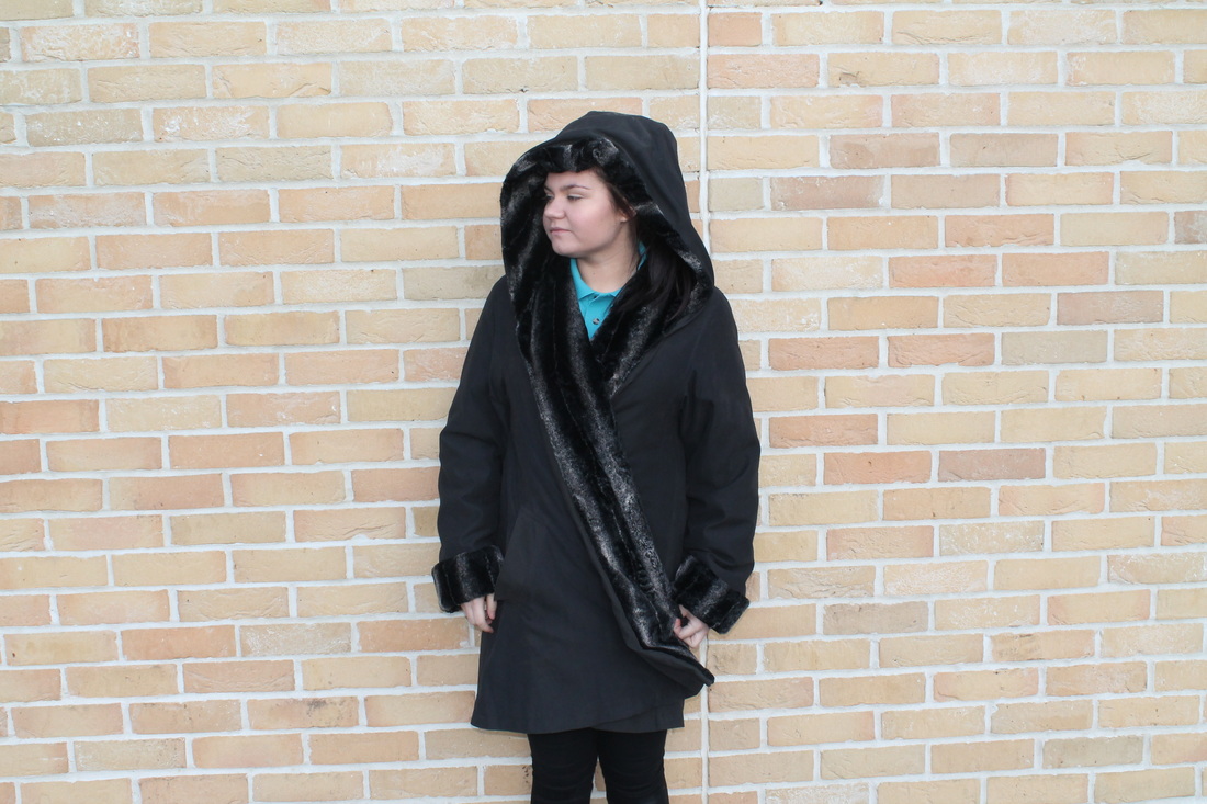
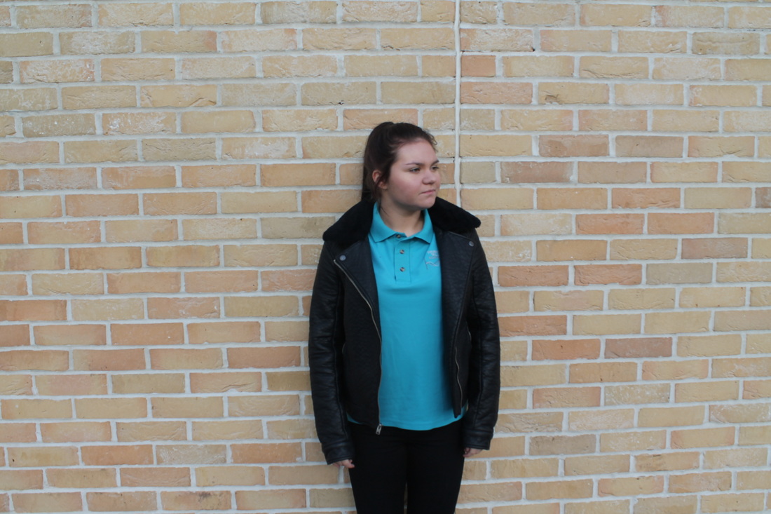
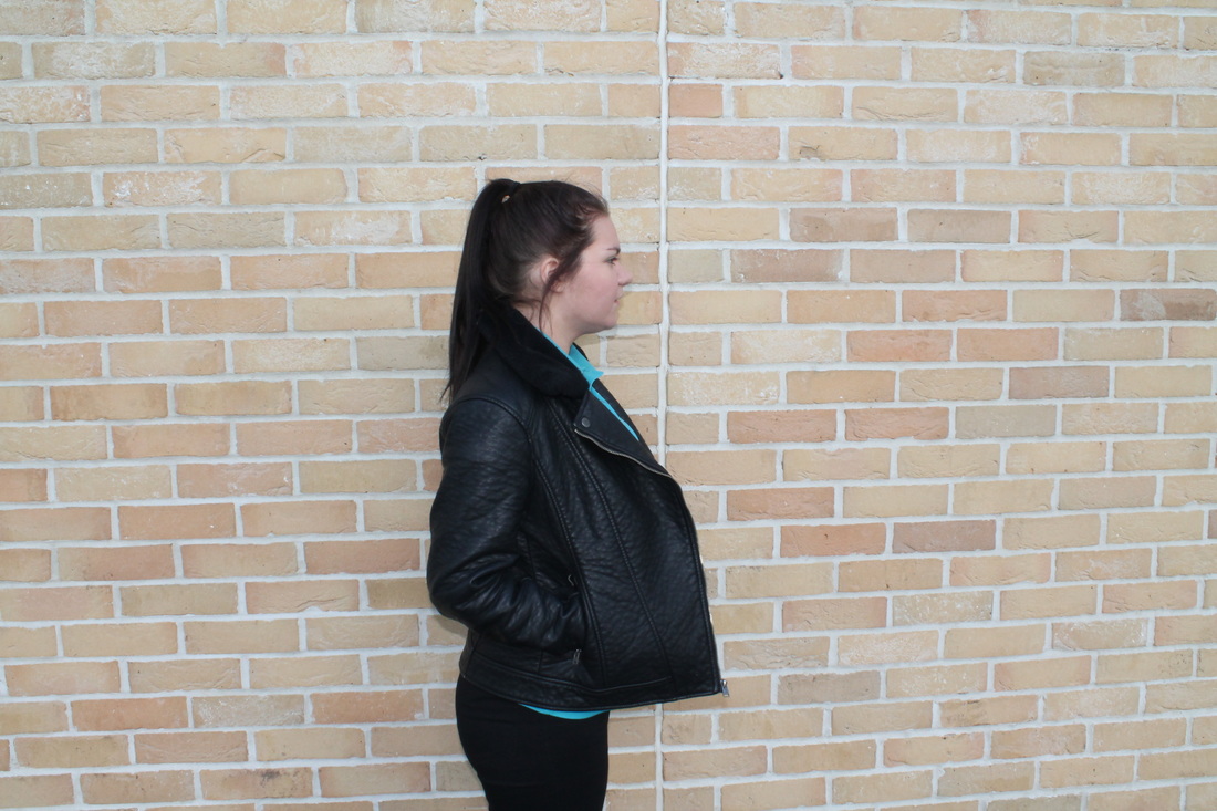
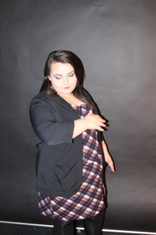
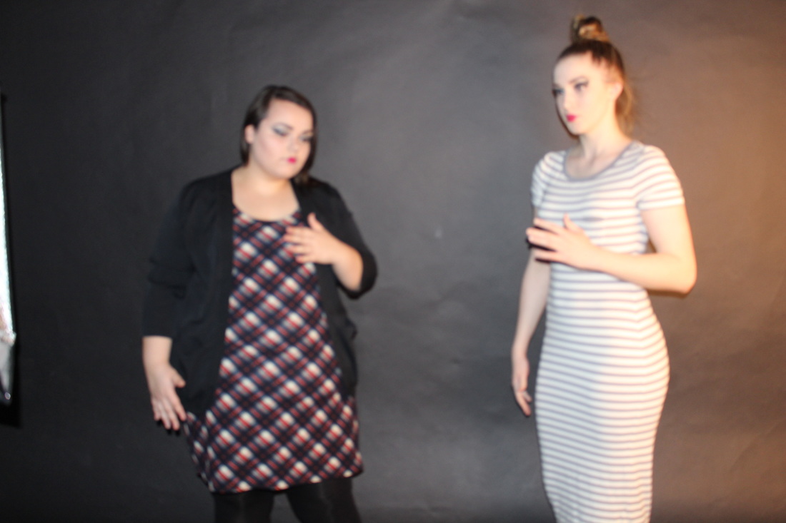
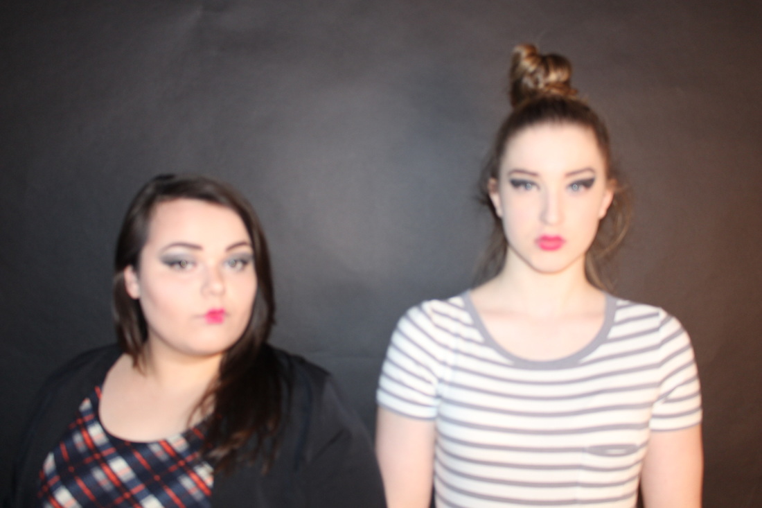
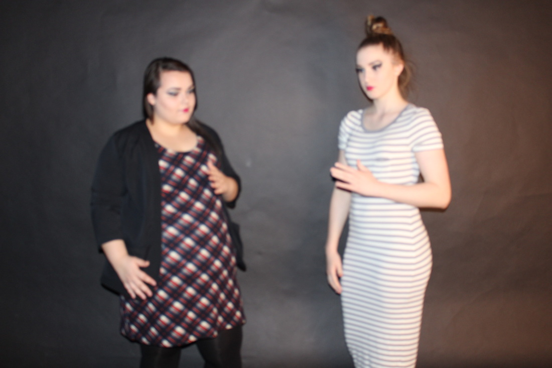
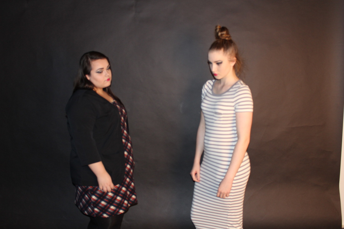
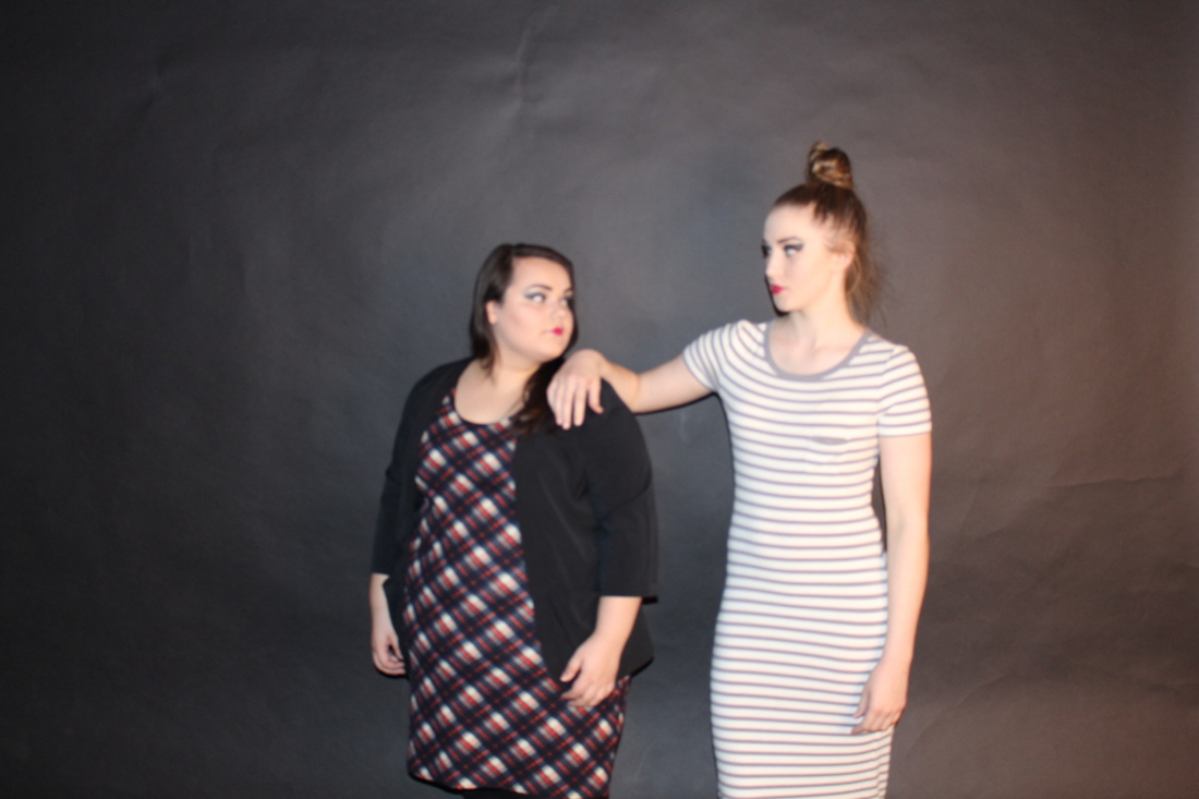
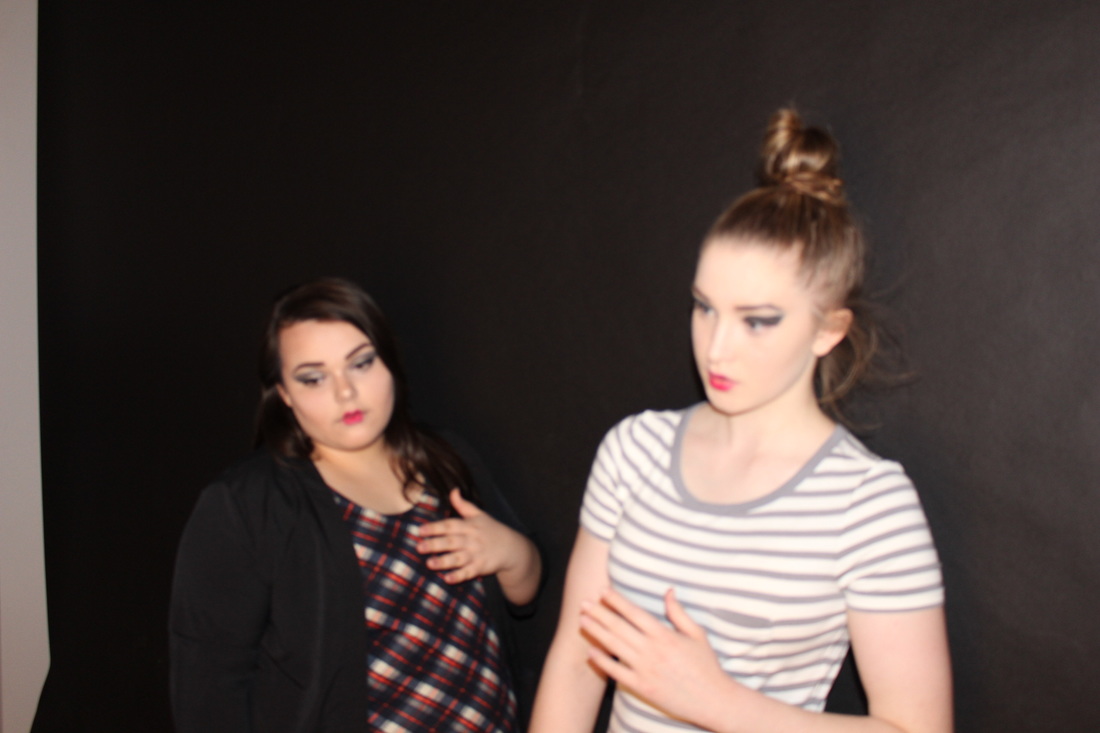
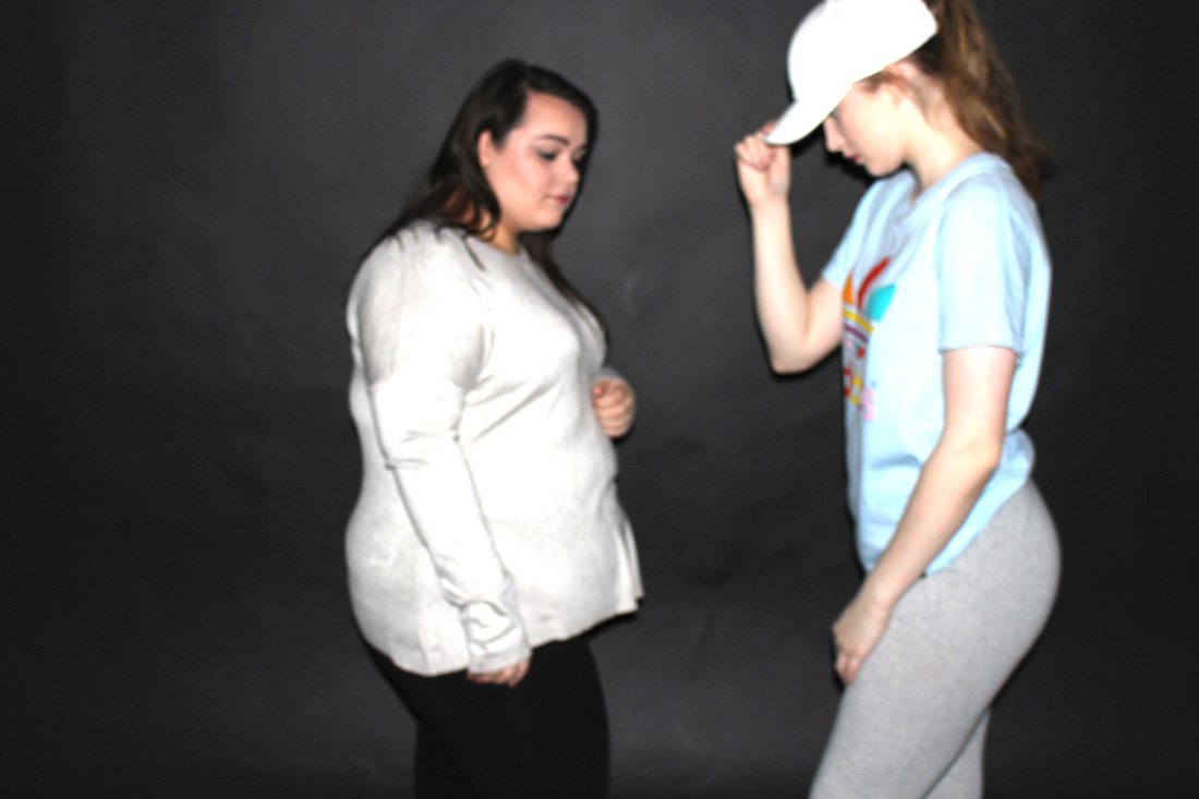
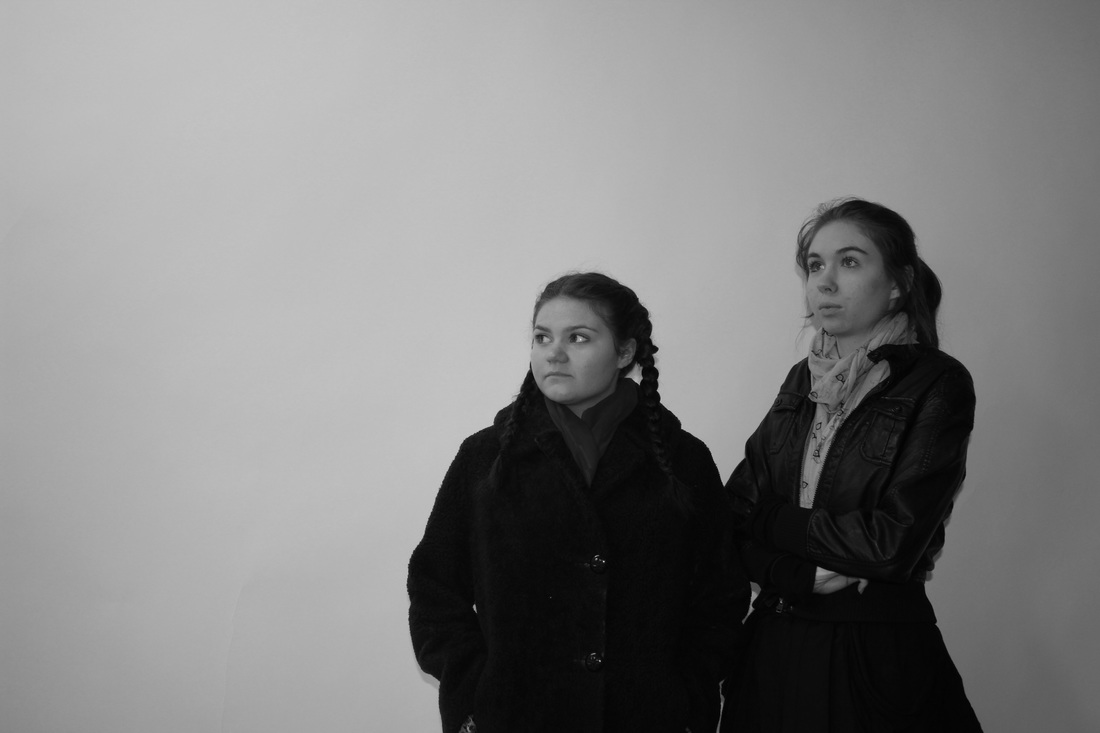
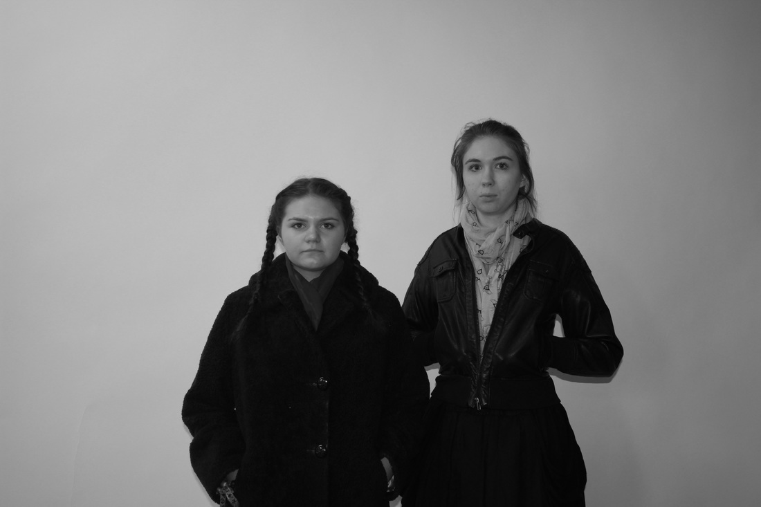
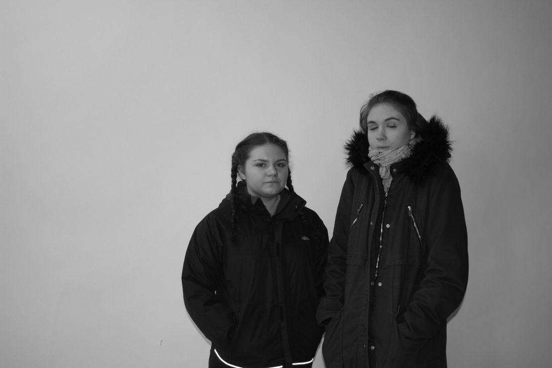
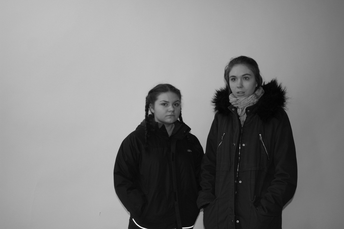
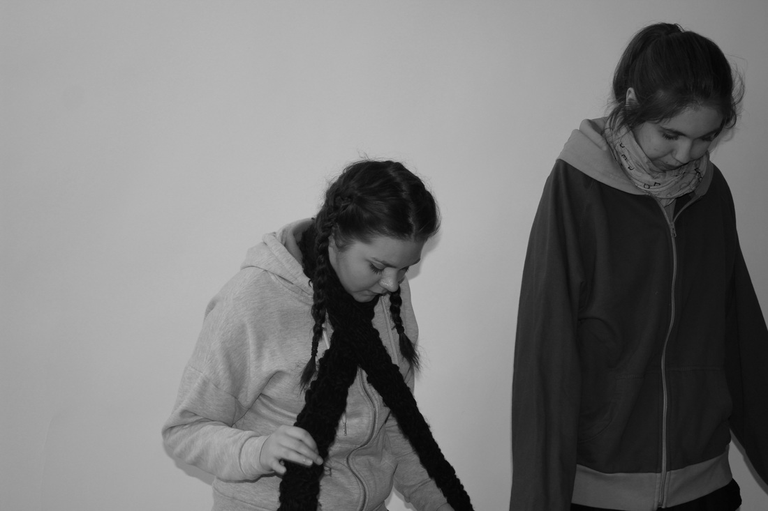
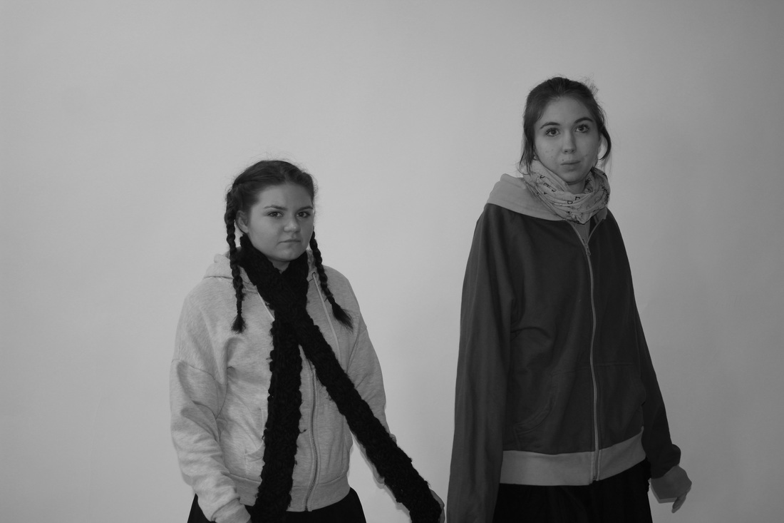
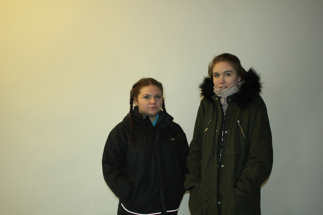
These images were taken in school. I got inspired by normal clothing websites to do something like this. with all my other images its more clothing with a theme behind it however this one is just based on the clothes itself and how the model wears them. In these images i see a model representing all different types of clothing, I would describe these images as dull however its a good thing as i wanted it to not have a theme i would also describe these images as also simple as there is not too much going on in the image. If i was going to describe these images to someone who cant see them i would say that , there is a model standing in front a basic brick wall modelling different types of coats. This picture is not really different to real life as it looks natural and its something people do wear ordinary clothes and take photos. The space represented in these images is a bit of negative space however the space is needed for this images due to what the background is and what it represents. I used a digital camera to take these images. I did have trouble with the lighting with the camera and the flash but i ended up doing it without flash as it looked better and it was not that dark anymore. i decided to just take these images at one angle and having the model turn as other wise the background wouldn't be in the image and i found just doing it at one angle worked better. These images remind me of catalogue books as its natural and just based on the clothing. In these images it has the same lines due to background it has straight lines. I could improve these images by not having the school uniform apart of it so then it looks more professional so it makes the image better. I would also change the models hair to make it more interesting so it shows different looks.
|
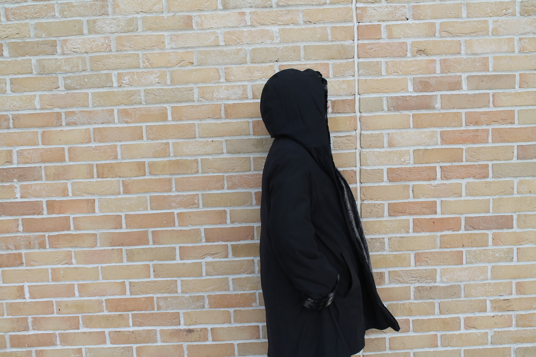
Image that is least successful
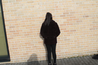
This image is representing the clothing(coat). This is showing you a different angle of the clothing. i chose to do this angle so you could see the different views. I used a digital camera to take these photos so i could get more of an effect. It was really sunny on the day and the exposure on the camera was really high so the image turned out bright, so i edited it on photoshop to get the brightness down. I then noticed that it was the least successful image for many reasons. A reason was that the image had a shadow that was being reflected from me as i was taking the picture. Another reason is that there is a lot of negative space, i should of cropped the image so you could not see the negative space as it is not needed. i also took this photo with out a stand , so it was not taken straight the camera was taken at an awkward angle so the camera captured the window and the floor. |
What i am going todo next.
For my next photoshoot i want to make it as interesting and creative as i can. for example i
want to change the setting,the theme , the way i take the images, and the different angles
that i can take the images at. I was looking on pinterest when i came across a set of images
these set of images were costumed based tea party but i looked so realistic and interesting.
So what i decided to do is to plan my next photoshoot with a fairy tale tea party.
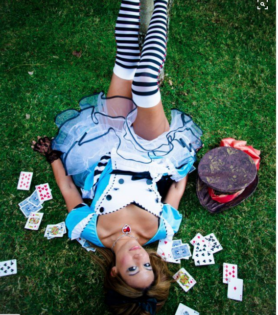
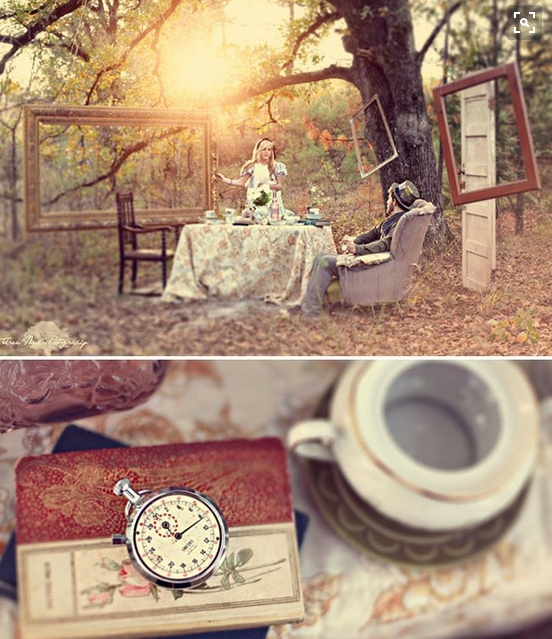
Photoshoot (4)
Inspired by Pinterest


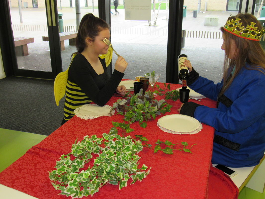


Props used
- Costume
- Fake leaves stem
- table cloth
- plastic cups
- empty wine bottles
- fancy dress costumes ( bee , king)
- knifes and forks
- Place mats
- Equipment
- Digital camera
Evaluation
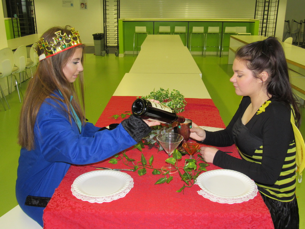
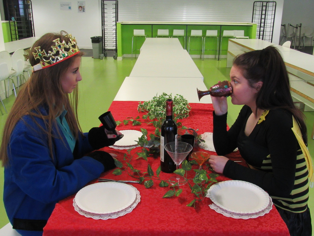
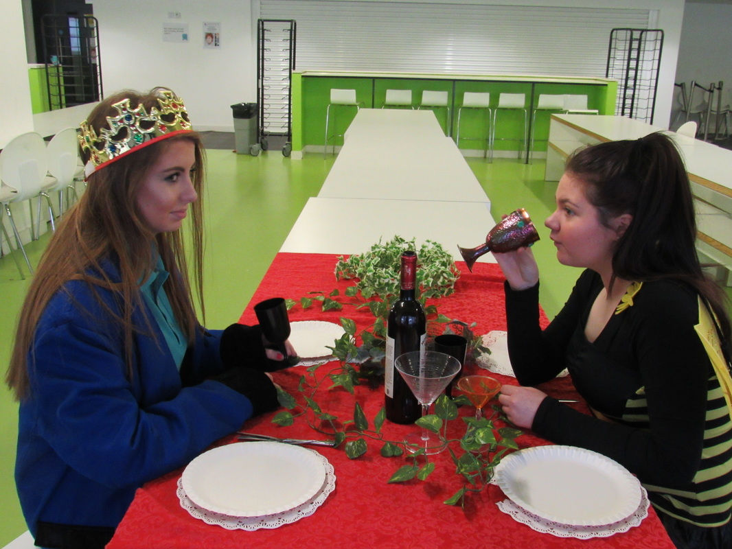
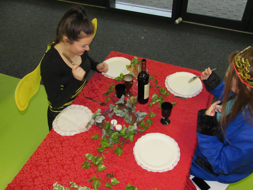
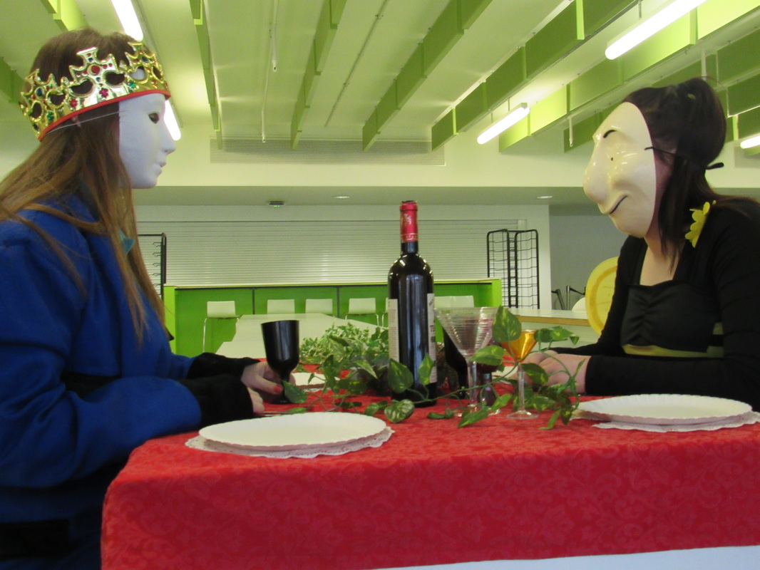
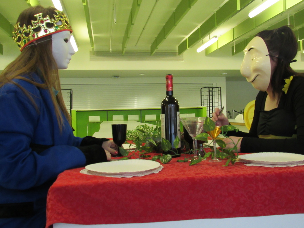
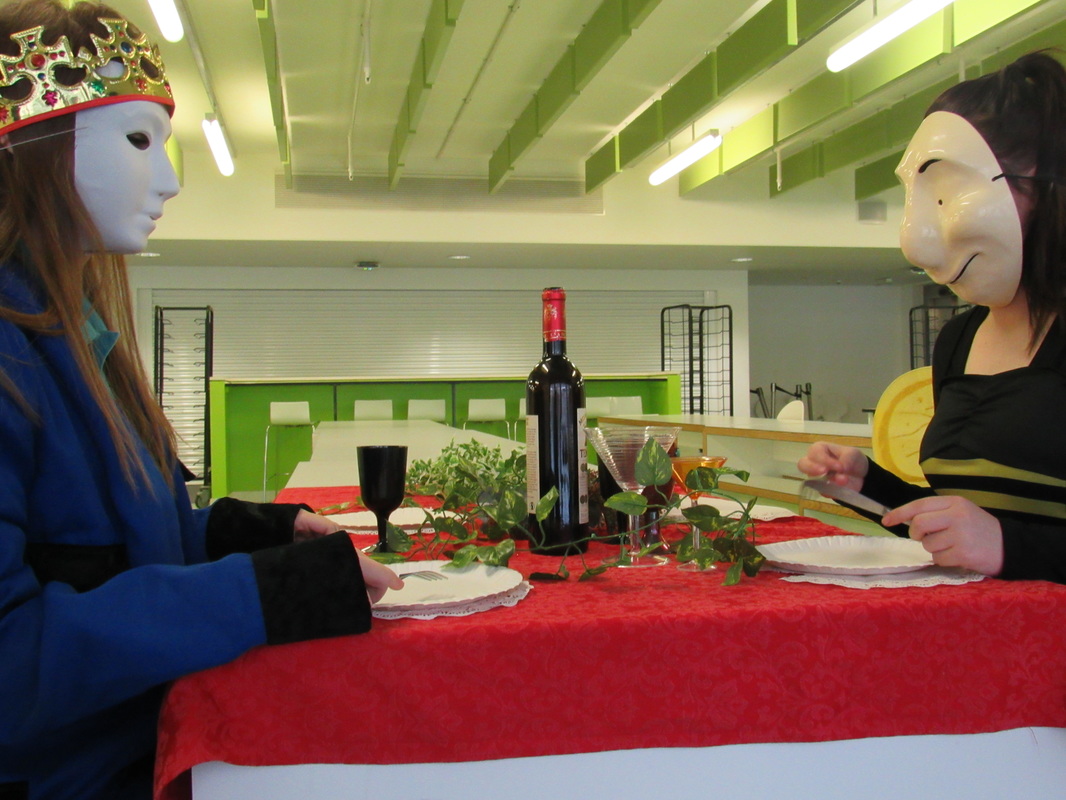
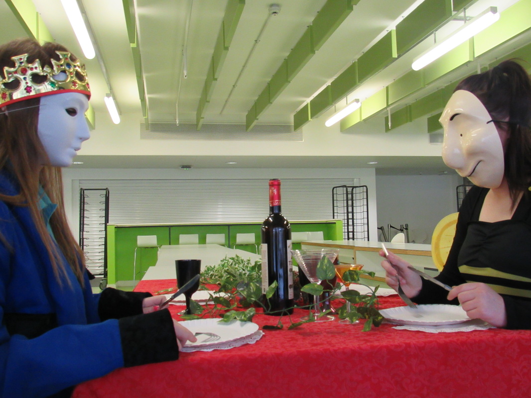
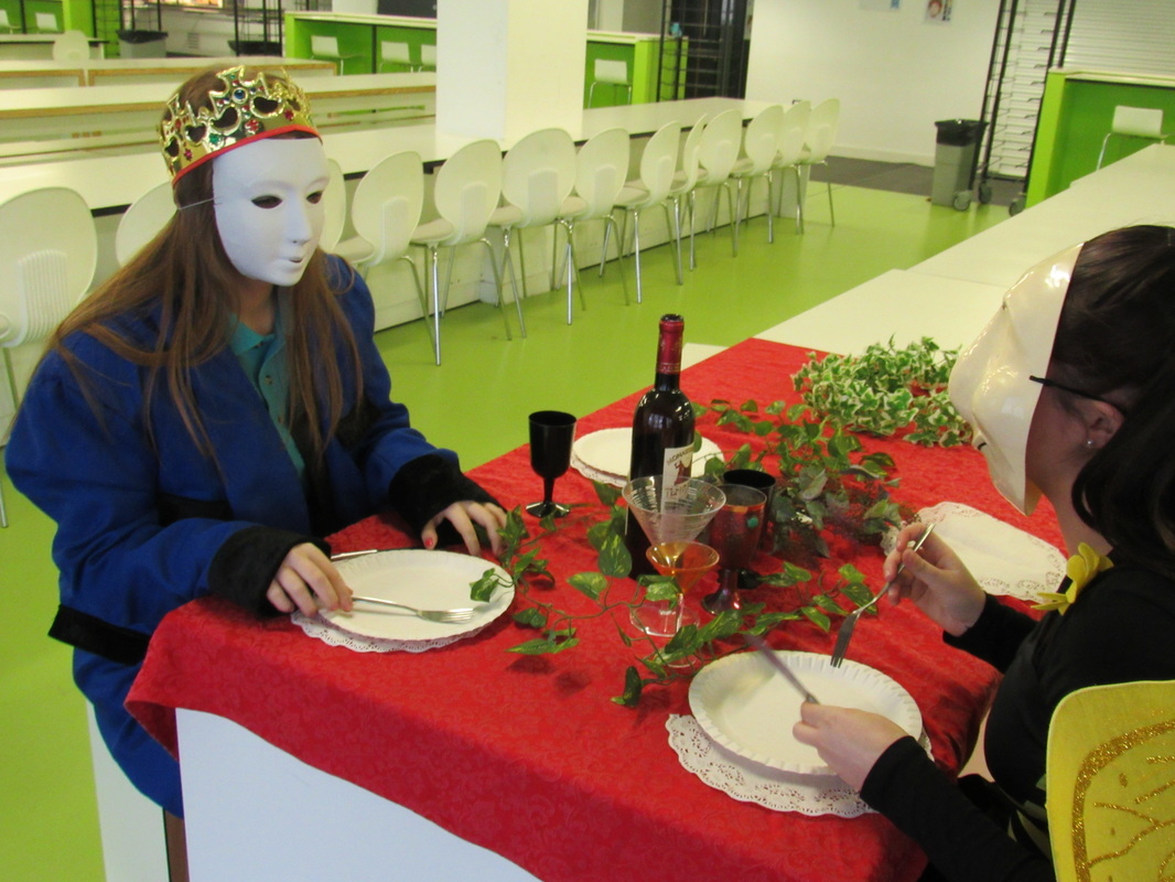
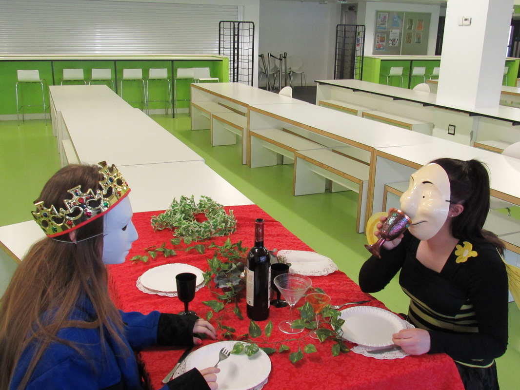
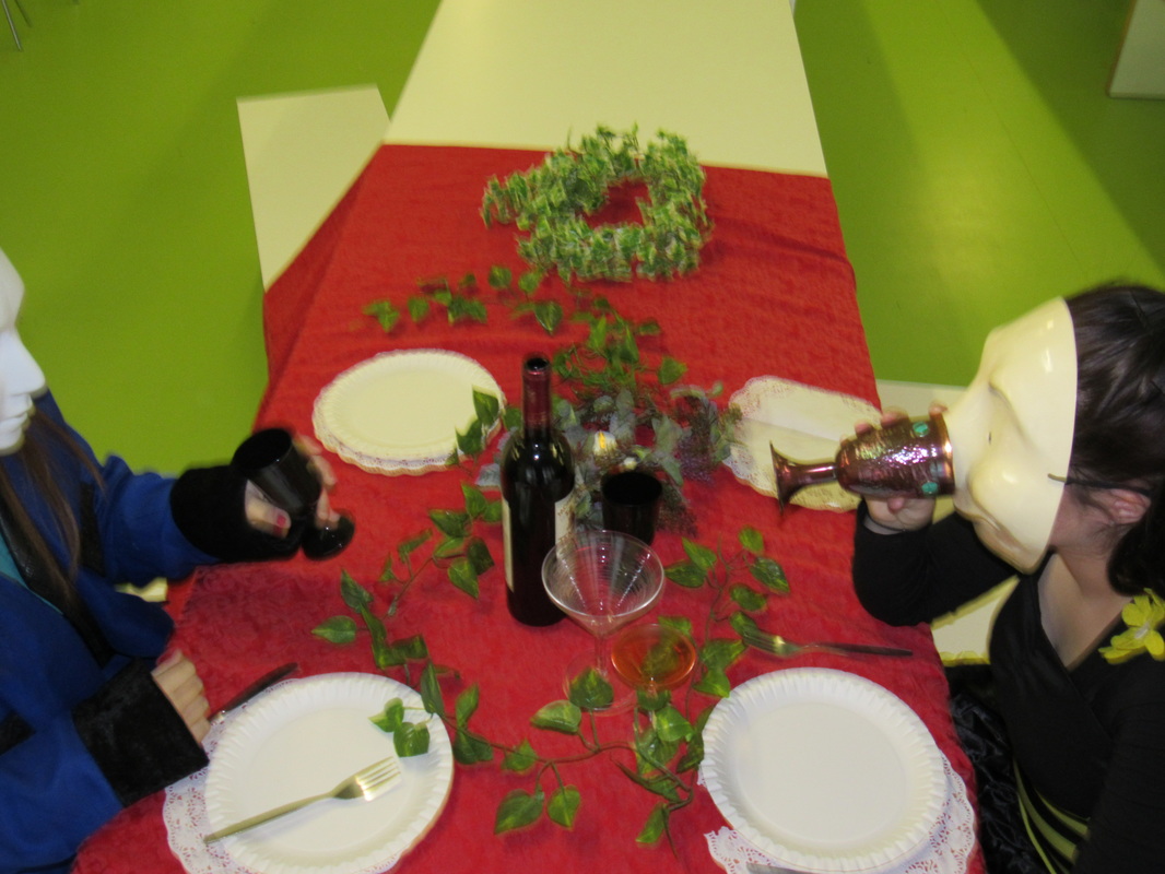
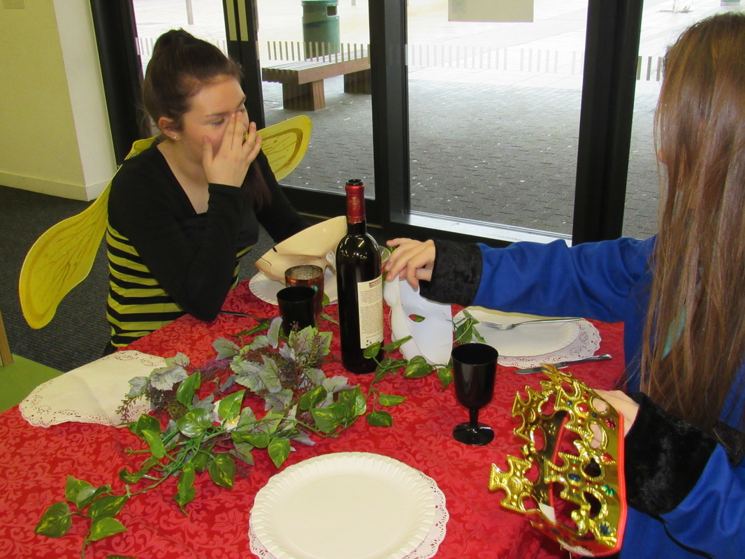
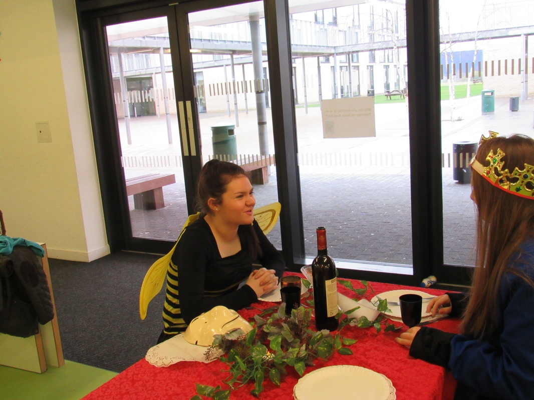
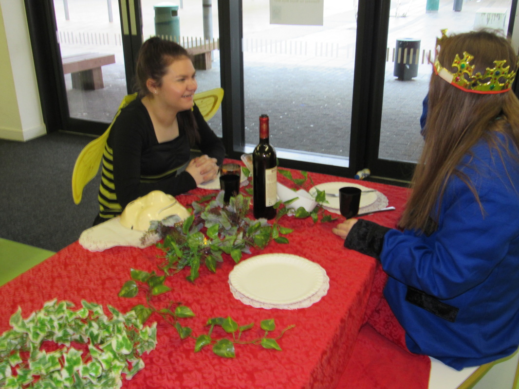
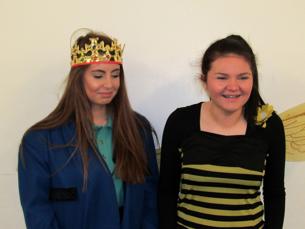
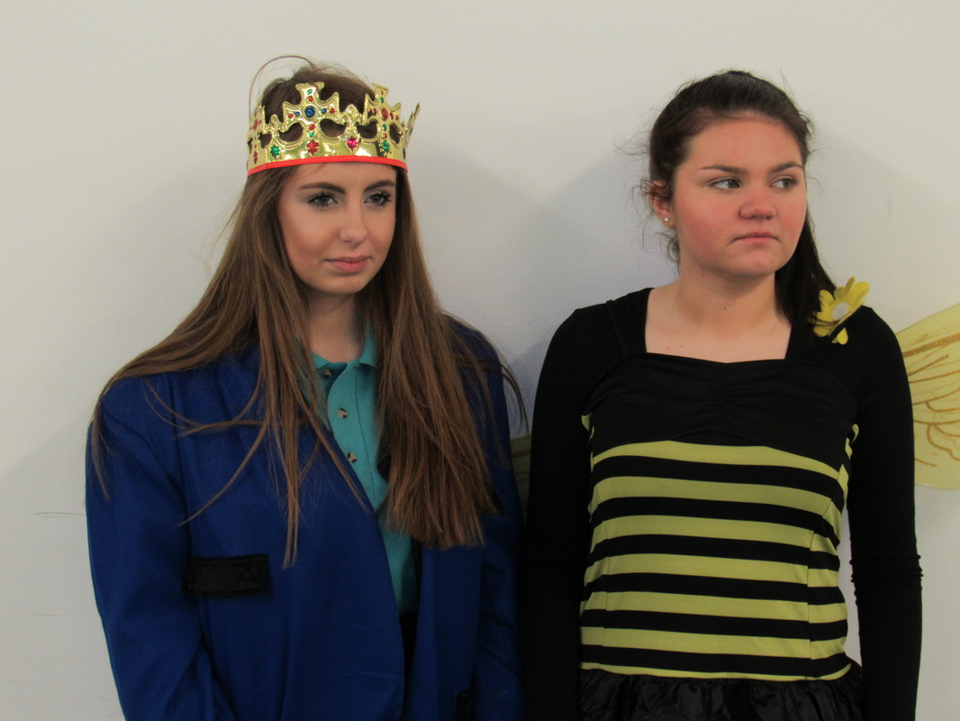
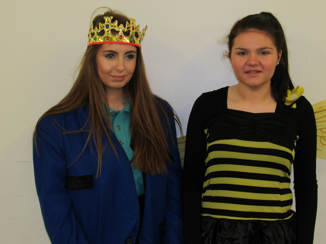
These images were taken in school, I got inspired to take these from Pinterest. On Pinterest i started to look at fairy tale then kept coming across tea party. My original idea was to do the tea party outside on a bench so it looked like a proper tea party however it started to rain so i had todo it inside. I decided to make it more interesting by dressing the models up to fit the theme more. In these photographs i see people dressed up in costumes sitting at a table with props having a tea party. i also added some masks in just to change the image up a bit. I would describe these images as interesting and unusual. I would describe this image to someone who cant see it as a fancy tea party in side with an bee costume and a king so represents a king and queen bee. They are sitting opposite each other at the table having a laugh and with wine etc. This picture is different from real like as normally you have a tea party in normal clothes if it is a casual tea party however some people like to dress up in costumes for tea parties to make it more interesting but mostly younger children would do that. To take these photos i used a digital camera to take these images to make the quality better and i wanted to blur out the background i didn't need and to focus it on the table and the people. I also took these photos at different angles to see the views of the tea party and to see what it looks like. There is a lot of bright colours in these images which makes it more interesting. Overall i like how these images turned out however i could improve next time by taking the images out side and arranging my props properly so that there is no negative space.

|
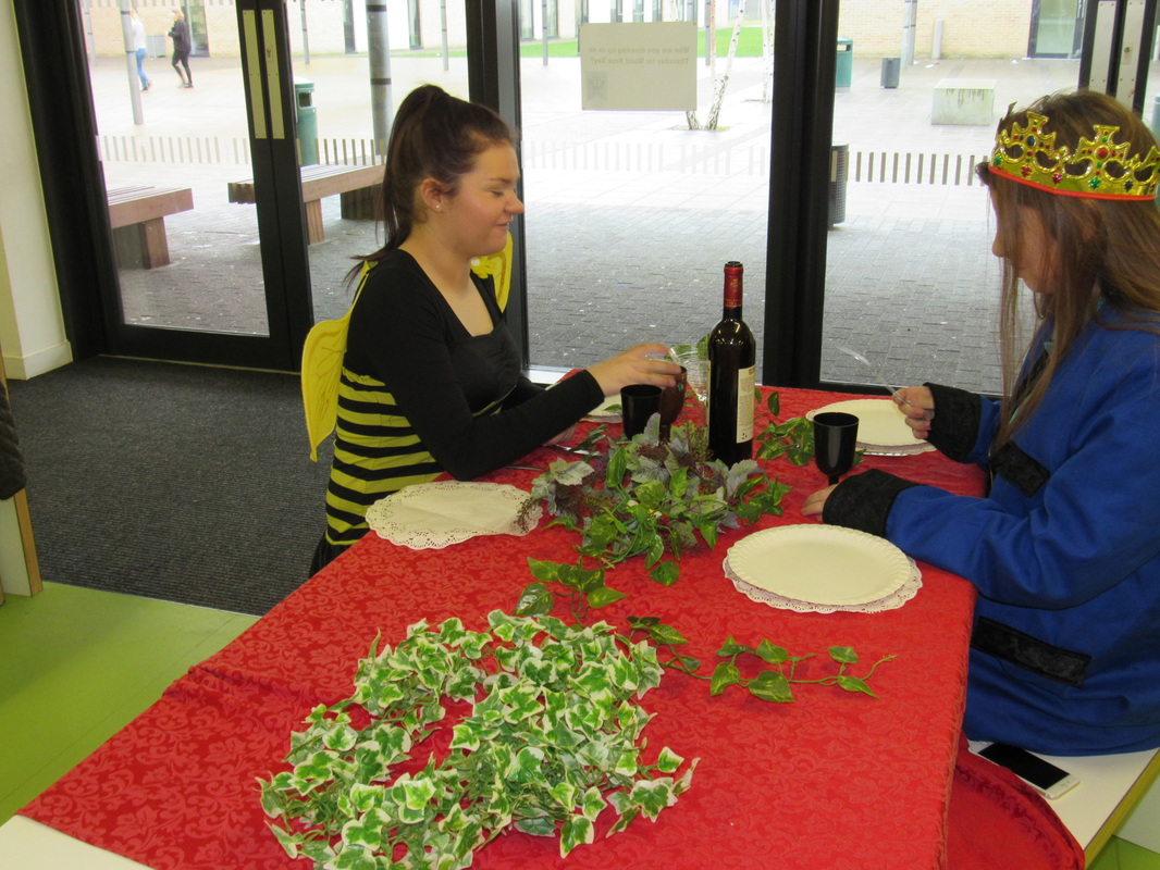
Image that is least successful
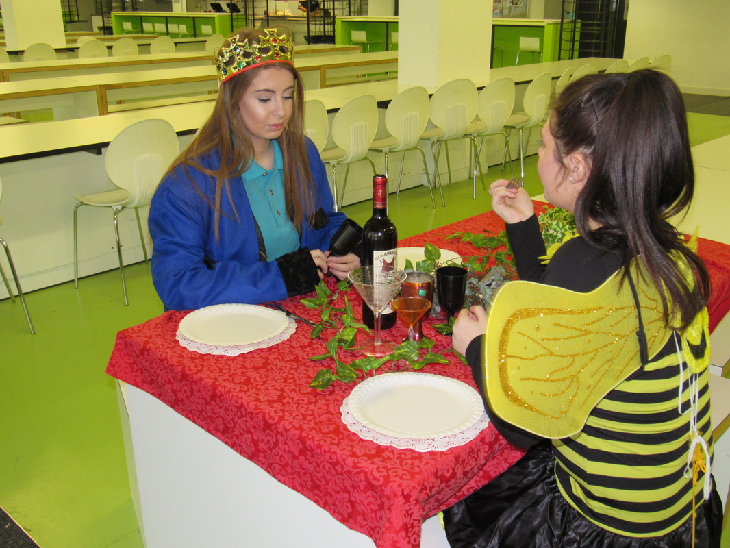
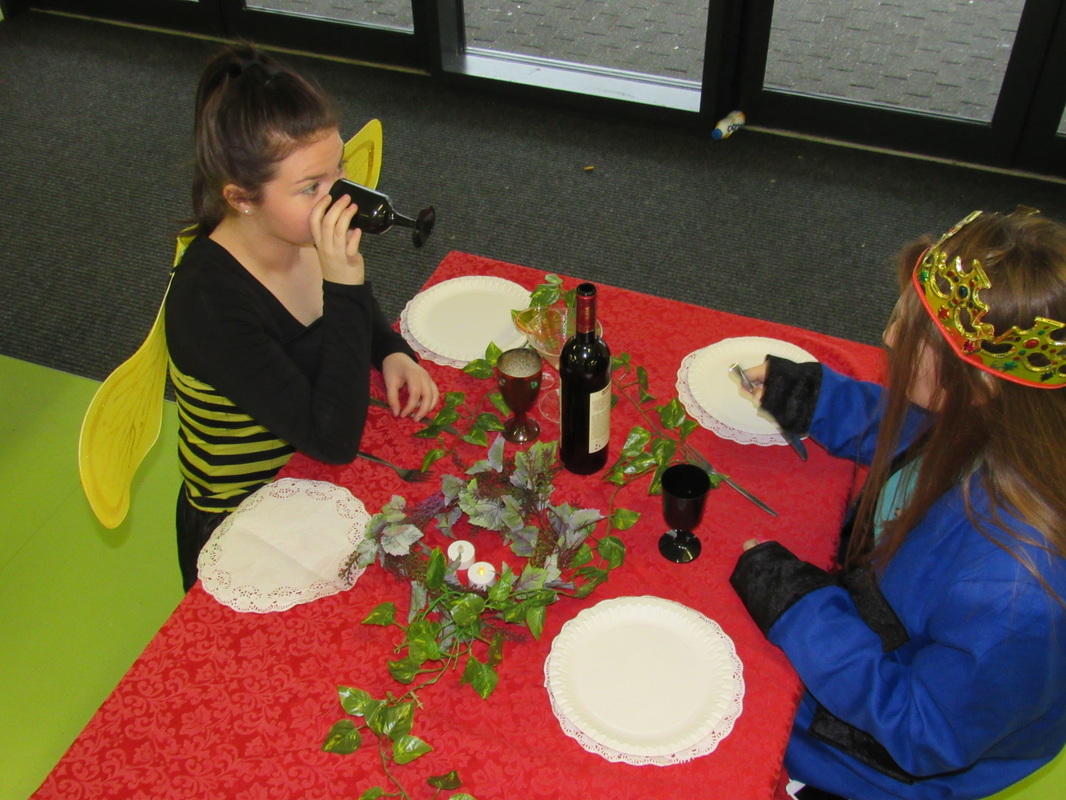
This image is off two girls dressed up , having a tea party. This image was just taken at the moment. I was just experimenting when trying to take the set of images. With this image what went wrong is i didn't access the image in general. I did not look when capturing the image. The image is good as the lighting and the colours are good and bright. The props are in place and in the right position. However when taking the photo after seeing it i saw things that i should of touched up on and made better. for example the phone on the bench, and being able to see the bench. I should of covered this up to make it more realistic. In general i like the image and the setting but i could of edited the background out due to the actual setting and having to much going on in the image already. |
What i am going to do next.
My next photoshoot i want to do i want to be inspired by Irving Penn. Not how her images turn
out like a theme or a setting i want to change the effect on the images to black&white.
After looking at Irving Penn work i decided that i wanted to change the way my images look
with a different effect as i would be able to see how the quality of the images turned out.
I want my next photoshoot to be set in school as i got inspired by pinterest.
Photoshoot (5)
Black&white Photoshoot inspired by Irving Penn

Evaluation
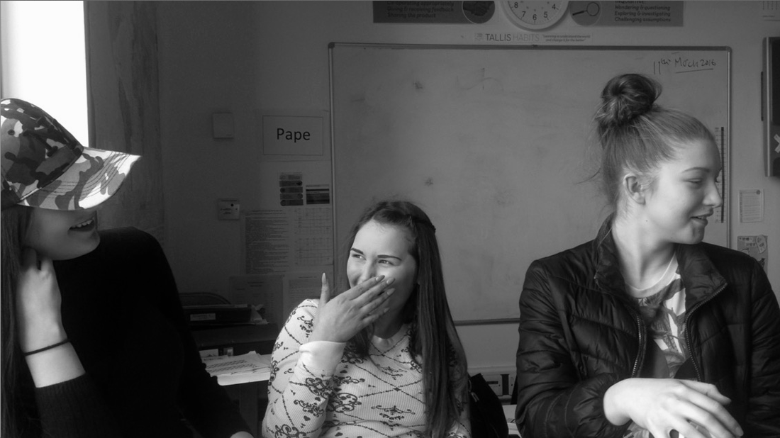
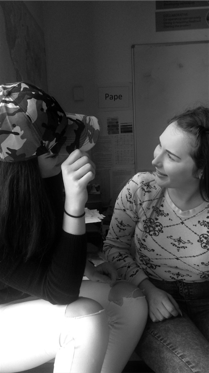
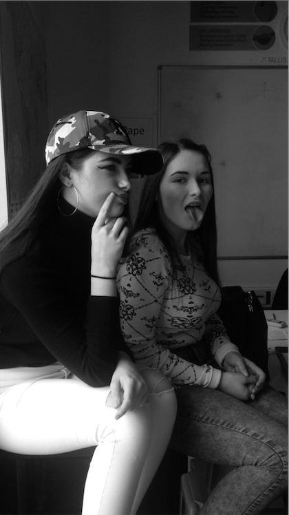
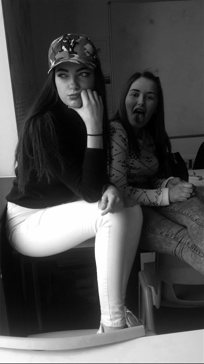
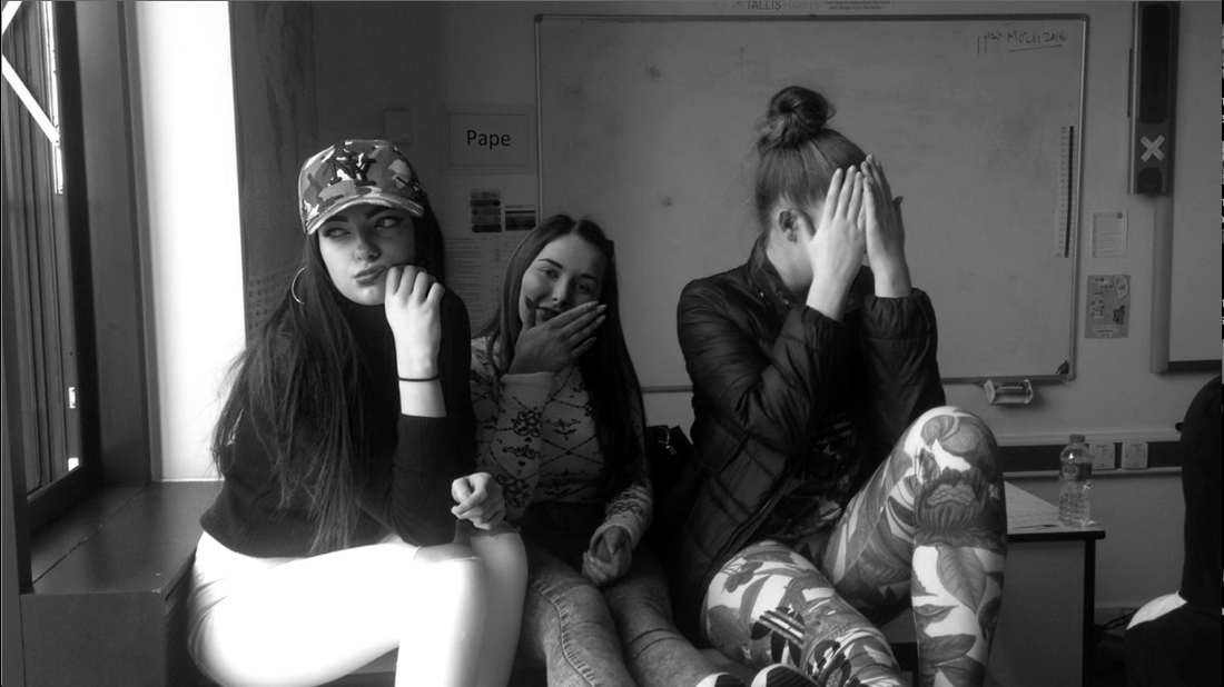
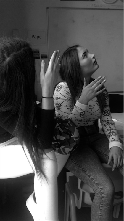
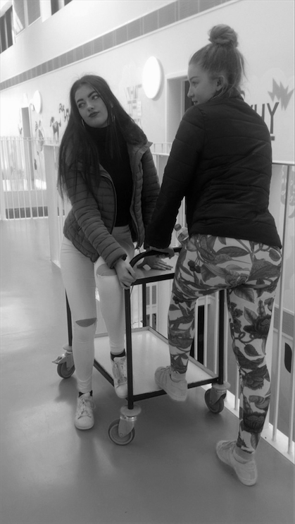
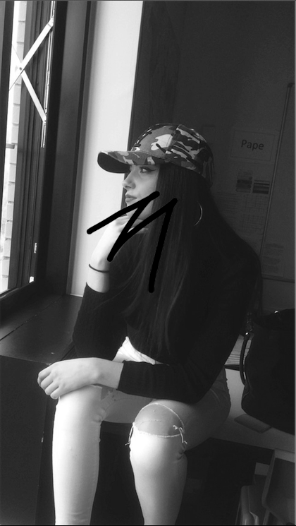
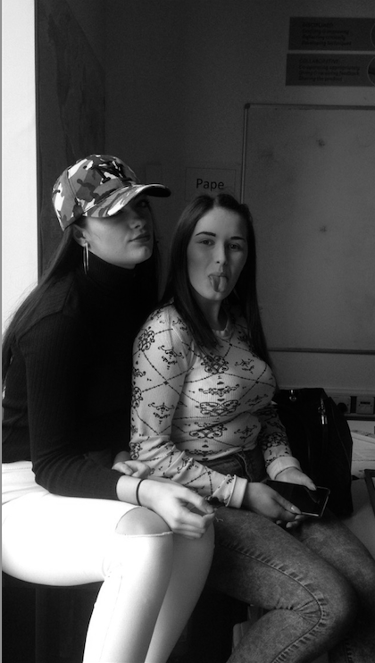
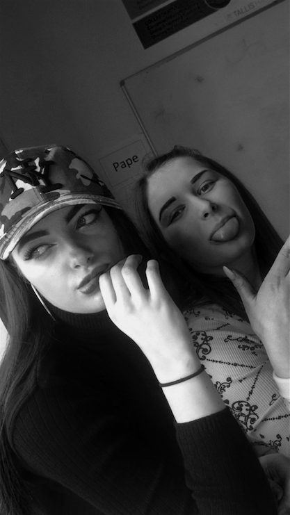
ThThese images were taken in school. I decided to do another clothing on with a normal background with no arranged theme. This was an experiment to see what the images turned out like with no theme. I changed these images to black and white as they looked better in black and white and to change the theme a bit. I would describe these images as interesting and interesting different clothing. In these images there are a repeating of the same girls used, for example they all consist of the same person each time. These images are based in a class room , this is a setting i have not done before so i wanted to use this setting to see how it could change how the image looks. I would describe these photo's to someone who cant see them as a non school uniform day, girls having fun in the classroom taking photos, using different poses and always some sort of light being shown in the image for example , the window letting off light in the image. For these images i used an iphone 5c to capture the images. I used an iphone to see the difference between the quality. Even though the quality might not be as good as a digital camera the images turned out good. There are not a lot of lines being given off in these images except for one which is the girls on the trolly, because there is a lot of lines being given of by the railings. These images are the same as real life situations as its in a setting in a school and with non school uniform and people take images maybe when they are in school. With these images there is not a lot of negative space due to the models taking up most of it. However i could of improved these images by putting objects in the background to make it look more of a setting in school. This would make it easier for people to know what the setting is. These images were edited with photoshop.
|
Image that is least successful
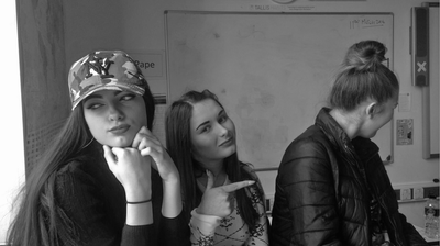
This image is least successful due to the last girl not looking. This image is good but out of the group it is the least successful. in this image there are three girls sitting on a table, they are all doing a pose however to make the image better they all could of been looking at the camera. The lighting is good in this image but the lighting is only hitting the first person on her left side of the face so it looks sharp compared to the rest of the image. I took this image with an iphone camera and edited them with photoshop. Over all the image and the composition is good its just the model that was not looking that made the image look unorganised however by the girl in the middle pointing to the girl on the end made it a part of the image and so it looks like it was suppose to happen. |
What im going todo next.
With my next photoshoot i want it to be inspired with Tim Walker. With one of Tim walker photo's
he done he done a photoshoot of dolls. The dolls looked really good so i wanted to have a try in
the photos that Tim took, the makeup was really good, the setting matched the theme. It was as
if it was real life, he made it look so realistic. I want to develop images like Tim walker as it is
something i have not done yet. I am going to get models to dress up like dolls and do poses that
dolls might do. I am not going to have the right setting as i want it to have a black background to make
the models stand out a lot more.
Photoshoot (6)
Photoshoot inspired by Tim Walker


Props Used
- Chair
- clothes
- Hat
- Equipment
- Digital Camera
- Studio Lighting
- Camera stand
Evaluation
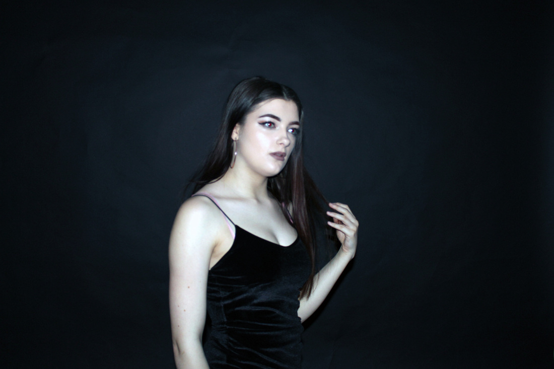
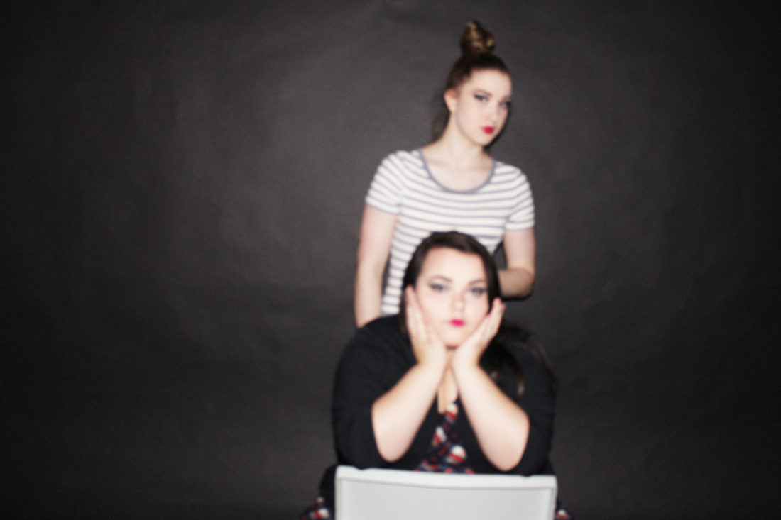
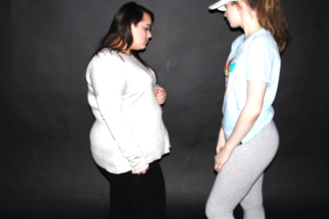
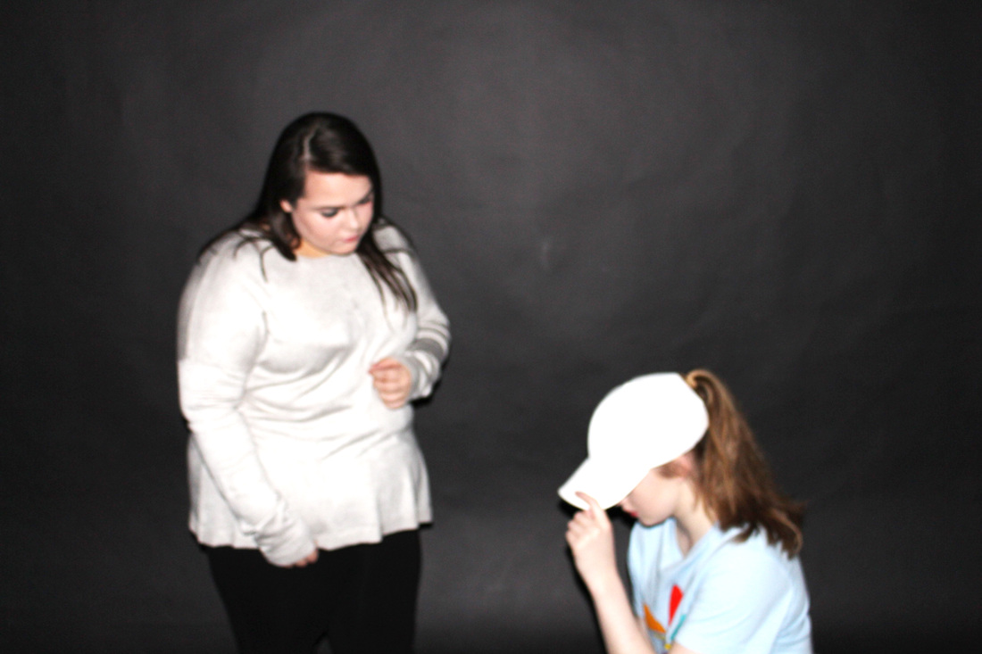
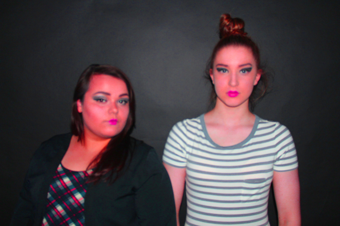
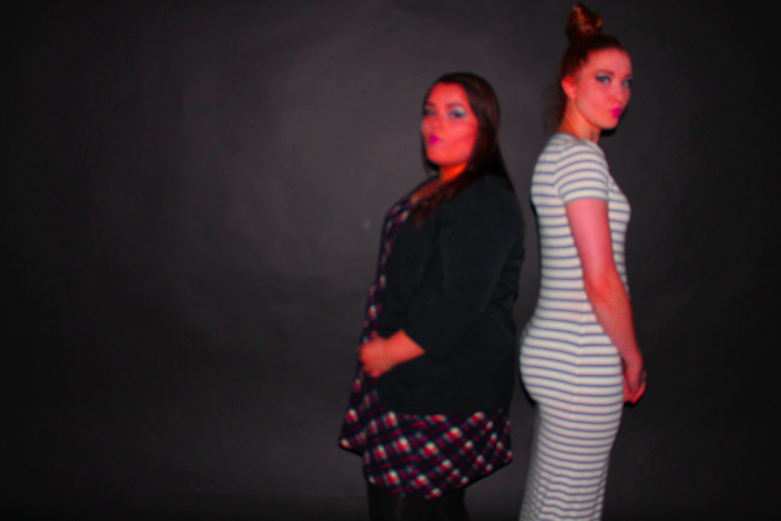
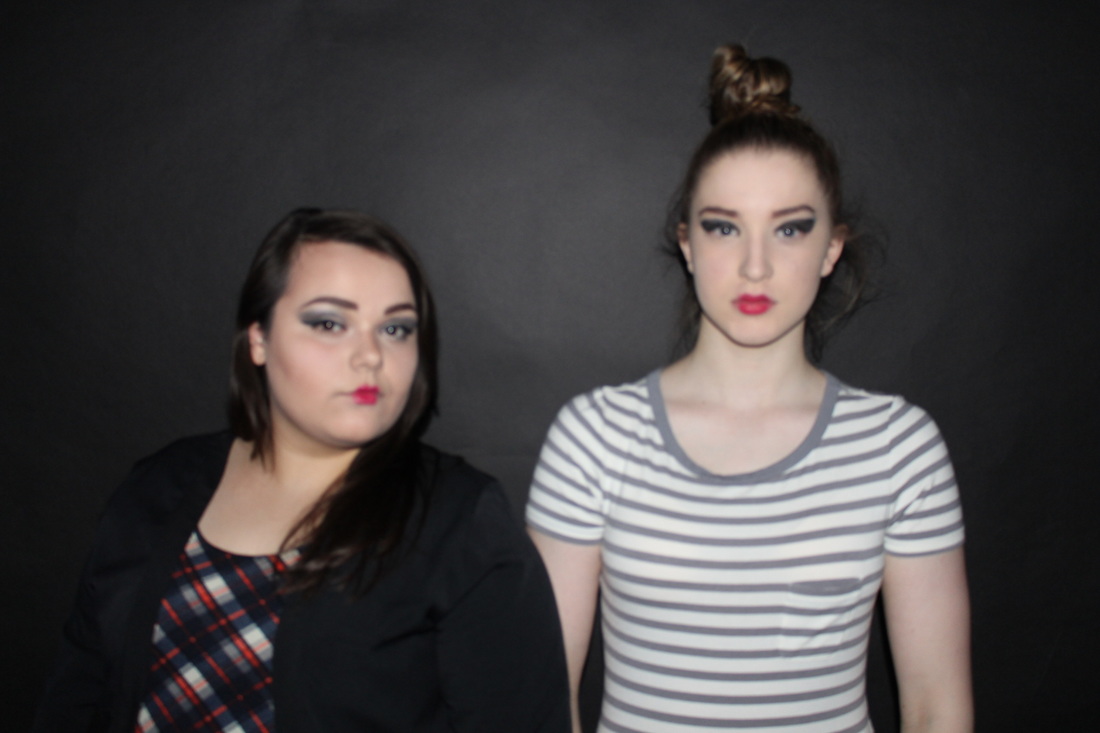
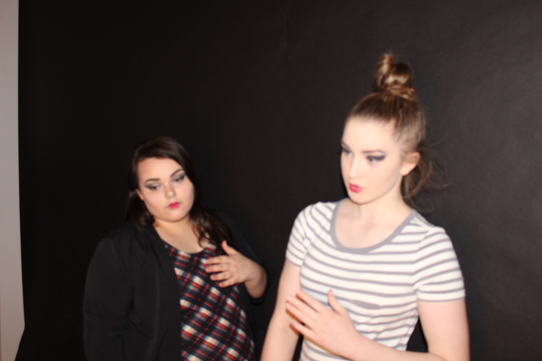
These images have two different themes, one is doll theme and the other theme is casual clothing more like a bit of clothing with sports wear. I decided to do both to show more of a range and show what they look like in casual clothing. The first set of images of the dolls turned out really well. The images are mostly of poses, the images have 2 models in to show it more of an effect of what they look like. In these photos there are two models dressed up in dresses and wearing dramatic makeup to get the look of the doll. What stood out in the image to make it look more like dolls is the lips. We done little heart lips to give it more of an effect. These doll images are really interesting and thought out. They look realistic and there is really good lighting. I would describe these images to someone who could not see them as, two dramatic girls looking still and serious as the pose in all different poses that dolls would pose like. I use a digital camera to take these images, and used lighting to get the lighting effect to make the image seem lighter. By using the lighting it has given it more of an effect and looks more professional. Due to the lighting the background highlights dark black and really light patches of black which reminds me of Irving penns work as her background contrasts with black and white shades. There is a lot of negative space in these images as it should be just focused on the dolls and not having to much of the black bacground in. overall the doll images worked well and turned out really good, i could make them better by not having the lighting on ,and just have the camera flash on this could make the background just black instead of having the different shades.
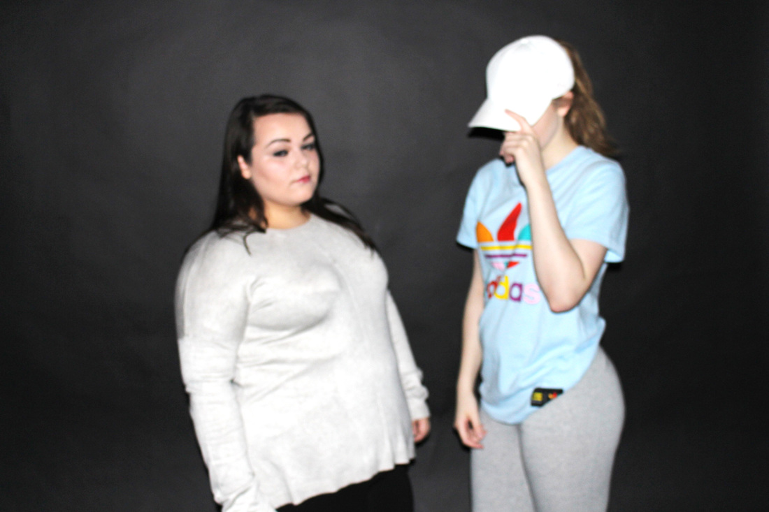
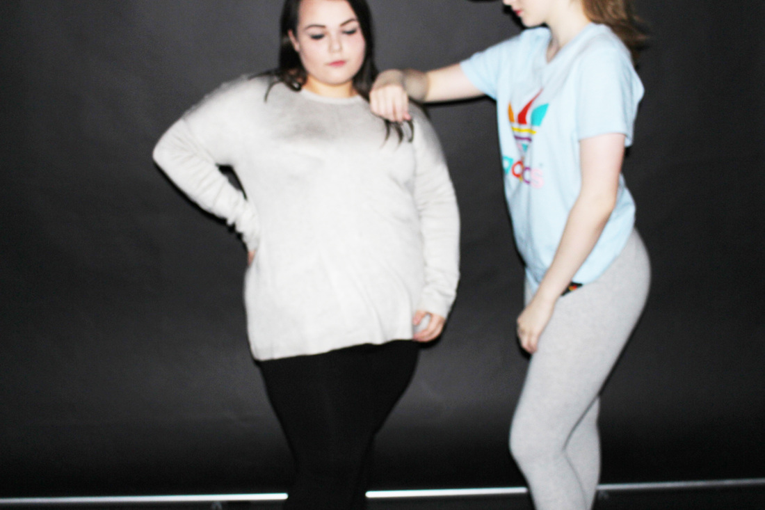
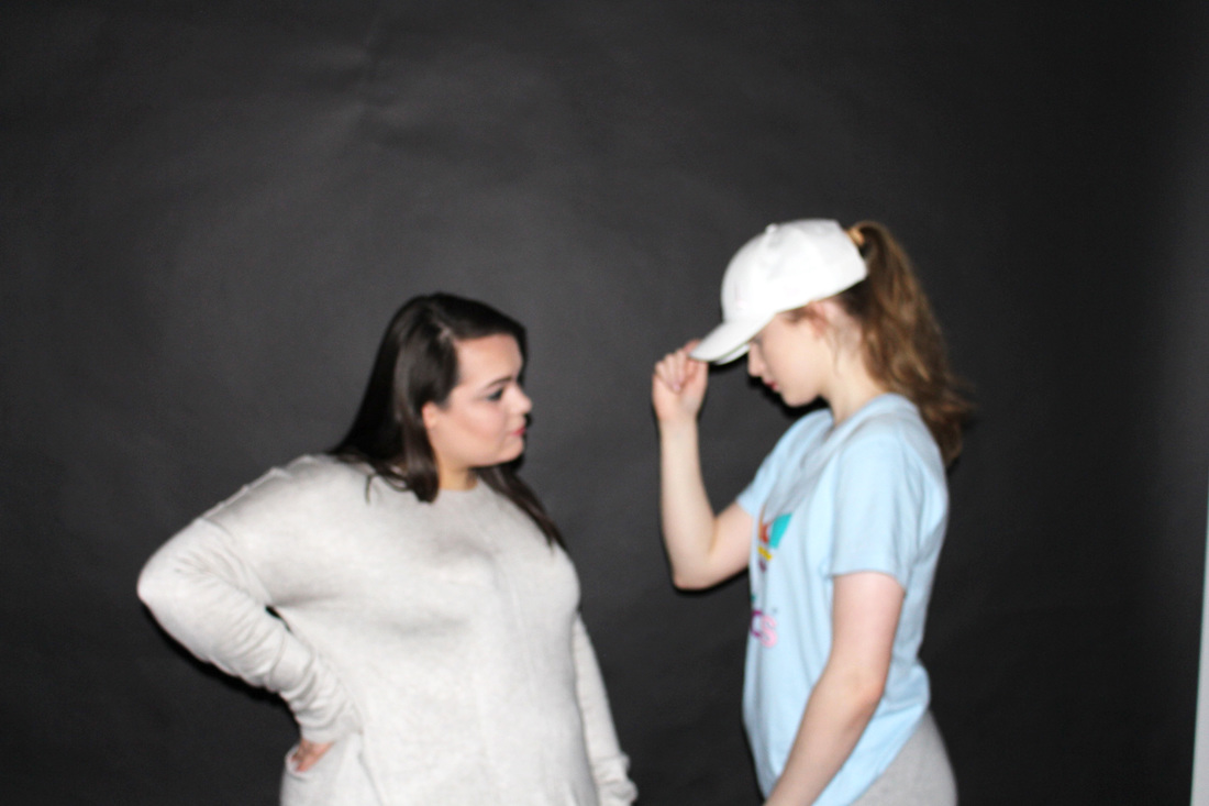
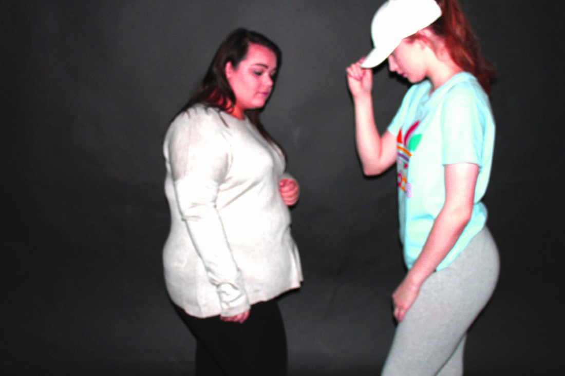
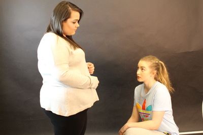
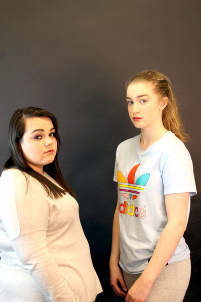
The casual clothing images worked really well, the lighting has made the images look more professional and better. In these images the posing is more natural and the makeup is natural and the clothing. in these images there are two models modelling the same clothes throughout the set of images and posing differently each time. I used a digital camera and and lighting do capture these images. These photos remind me of sports wear clothing brands. In some of the images there is a bit of negative spaced which is not needed as the focus is on the clothing however some of the images the spaced is used well. Something i could change in these images would be that i could change the clothing so there is more of a variety to look at this would make the images look better and look more interesting. Overall i like these images due to the lighting that has been given of and there is not harsh lighting , the lighting has expanded through the images evenly.
The casual clothing images worked really well, the lighting has made the images look more professional and better. In these images the posing is more natural and the makeup is natural and the clothing. in these images there are two models modelling the same clothes throughout the set of images and posing differently each time. I used a digital camera and and lighting do capture these images. These photos remind me of sports wear clothing brands. In some of the images there is a bit of negative spaced which is not needed as the focus is on the clothing however some of the images the spaced is used well. Something i could change in these images would be that i could change the clothing so there is more of a variety to look at this would make the images look better and look more interesting. Overall i like these images due to the lighting that has been given of and there is not harsh lighting , the lighting has expanded through the images evenly.
|
Image that is least successful.
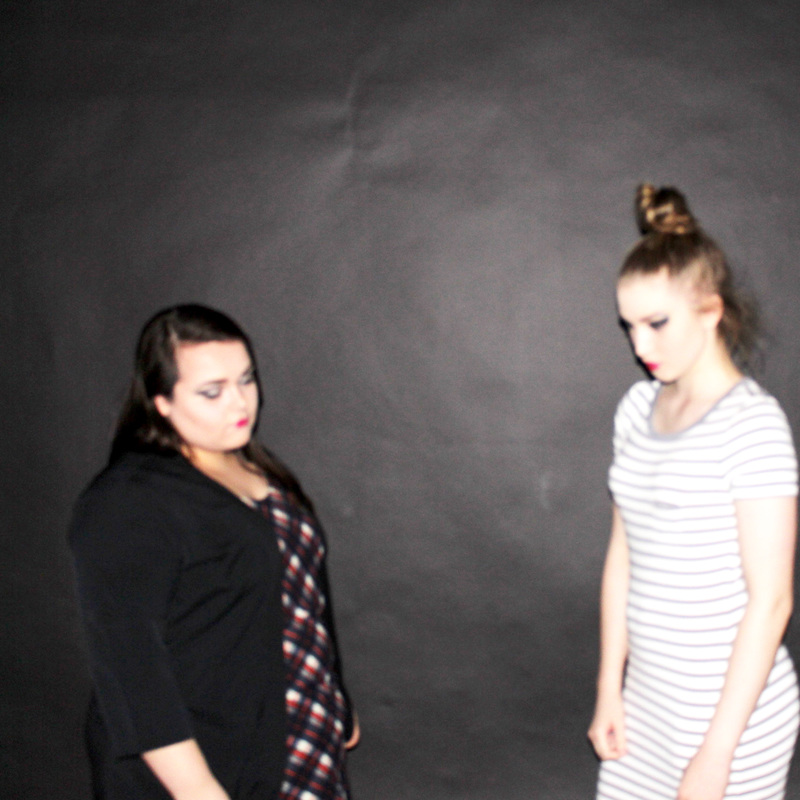
This image is least successful out of the group as the lighting is to much in the image. In this image there is a very harsh lighting that hits her face. By looking at the image it is clear that there is to different shades of lighting being given of by studio lighting . For example one side is orange lighting then on the left side is white lighting. Due to the amount of lighting there is a shadow which is being given off behind her. Other people would say about this work that it is over exposed so it has an impact on the image. There is also a lot of negative space in this image which could be used better for example cropping the image of having some sort of prop in the background or adding another model to the image. |
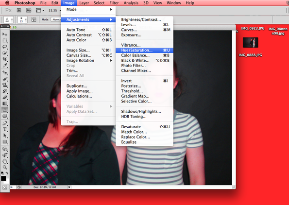
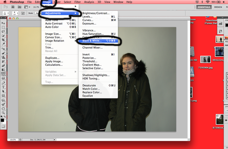
How I Changed My Images To Pink (Photoshop)
Photoshoot (7)

Props Used
- Clothing (coats)
- Equipment
- Digital camera
- Camera Stand
Evaluation
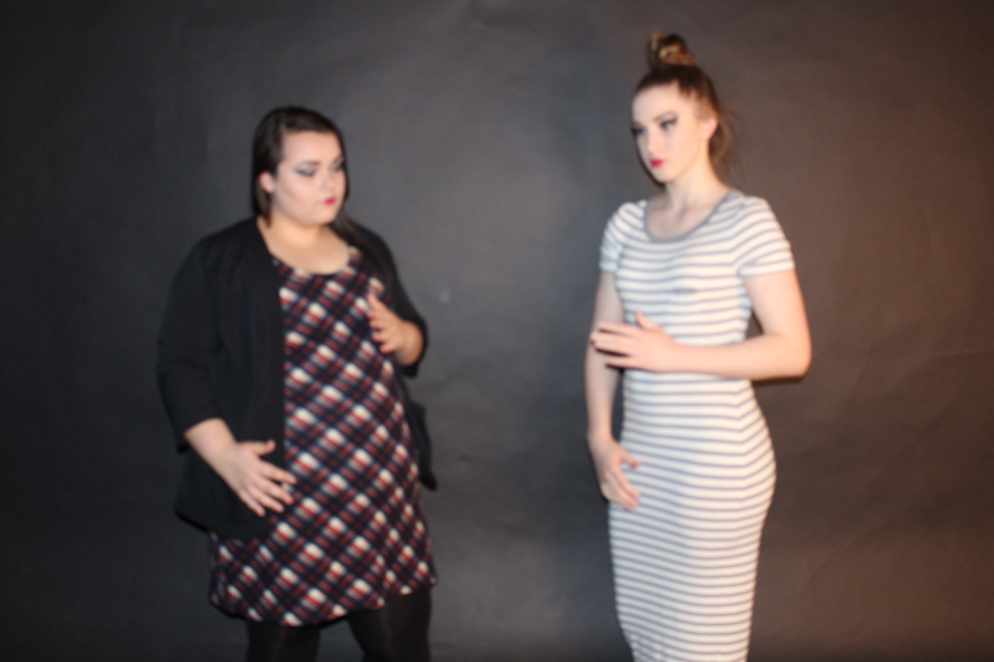
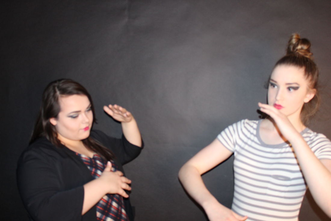
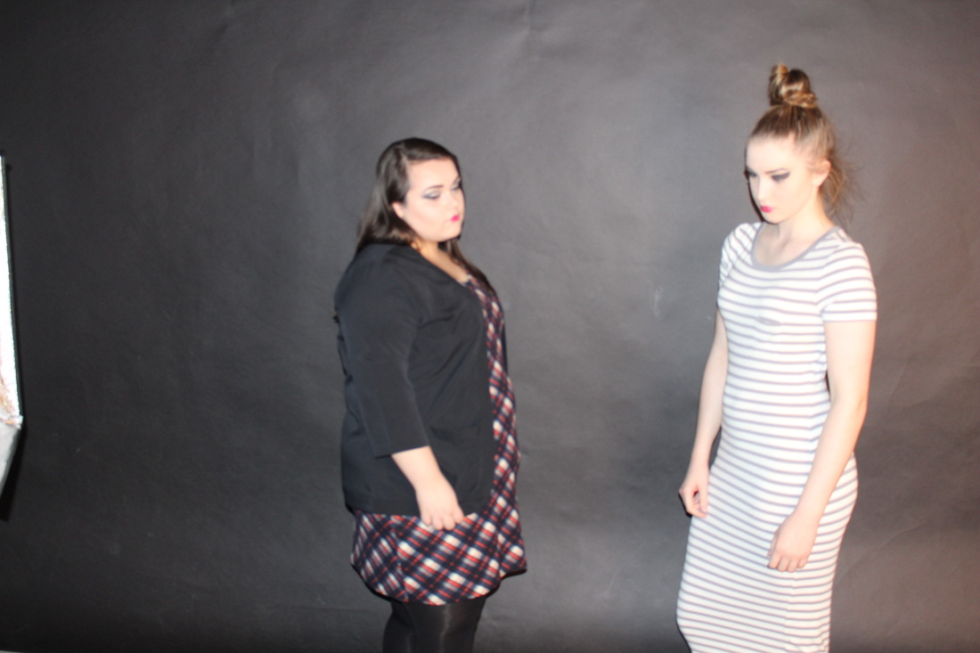
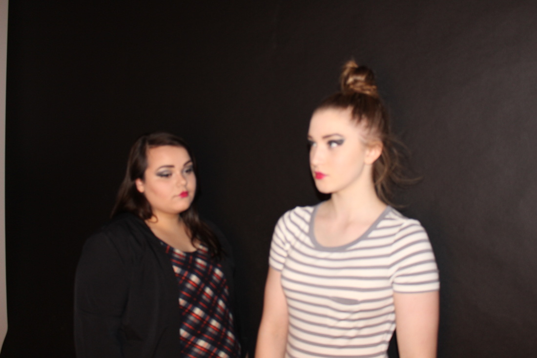
These are a set of images that are focused on coats. This time instead of having one person out side i decided to have two people model the coats, this makes the images more interesting to look at and shows a range of coats from different people. These images are in black and white, i thought that i would change them to black and white as i have only done one photoshoot in black and white. I wanted to to show a range of contrasts in the images. These images look smooth , and soft due to the black and white effect. I would describe these images to someone who cant see them as two girls standing very natural wearing different types of coats. Posing differently. These images are very natural as they don't have any harsh objects in all it has is a plain white background. Once again this makes the models stand out more and also makes the clothing stand out more. I used a digital camera to take these images, this time i didn't use studio lighting as i didn't want any shadow effects being given off, i also wanted it to be more natural and so the background did not have any contrasts or any faded colours. There are only a couple of lines through out these images and the lines are created by the models as the lines are the outlines and the clothing. There is not any harsh lighting in thee images, as the lighting is evenly spread out in these images. I arrived to this idea by looking at fashion magazines. When i was looking through a fashion book as well there was some images that was more natural and did not have much going on. These images worked well overall as the tones and colours within the image work well with each-other and making the images black and white showed more of the tones of the colours. One thing i would change in these images would be the amount of negative space , and the depth of field. For example one image is not central so has no negative space but the person is cut half way of the camera , this makes the image look a bit rushed and therefor it did not work well overall.

|
Image that is least successful
This image is least successful image due to the way the image was taken. The image needs to be more in focus and the people need to be more in the centre as in the image the girl is half way of the camera. This image was not planned and the type of angle the image was taken at was not that good. To improve on this i could of cropped the girl out on the end so it looks as if the picture was just focused on one person and that there was only on e person in the image. |
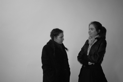
How I Changed My Images To Black&White (Photoshop)
|
|
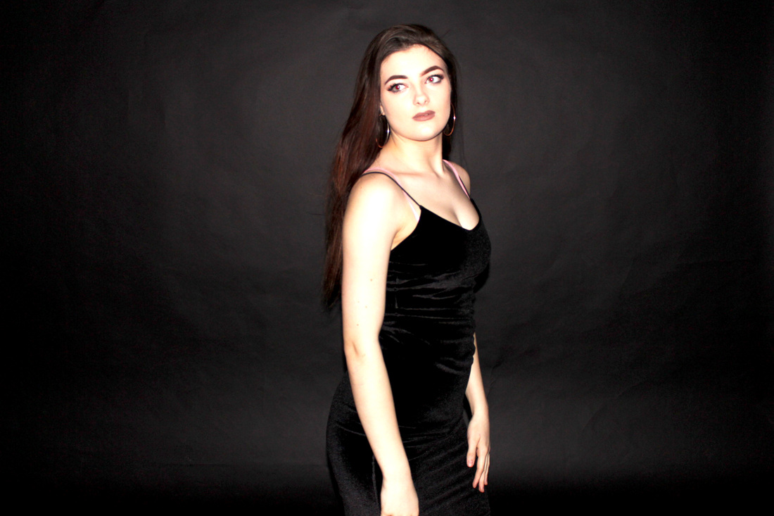
Final Piece 1

Evaluation for final piece
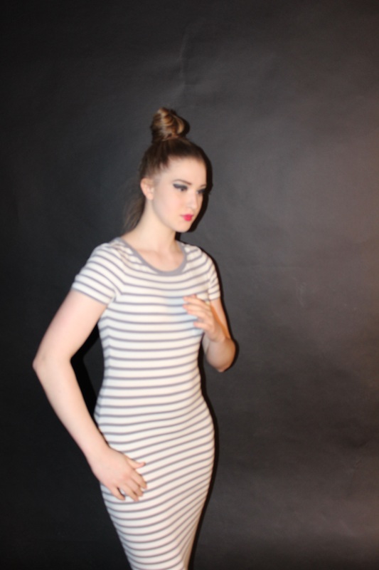
Final Piece 2
Evaluation for final piece
Final Piece 3


Final Evaluation
When starting my project I decided to choose 'clothing'. I chose this as I wanted to challenge my self with my work and try something different something that I have not chose before. I wanted to look into this theme so I decided to get inspiration from pinterest, By doing this it gave me a wider range of artists, posts. This made me see the different types of work and how people create clothing in there eyes. I then gathered together an initial plan of what fashion clothing consisted of and what I was going to do this is a guide to help me through the project. After doing that I created an pinterest board. This would give people and me my self viewing my page an rough idea of what fashion clothing looks like and what pins I liked the best on pinterest. I decided that I was just going to do a first photoshoot with out looking at a particular artist I wanted to see what I was capable of and how I could improve from little knowledge to more knowledge. With my first photoshoot I wanted to start of simple however I wanted it to go with the theme street as I already had locations in mind. With this idea in mind I planned everything out from clothes to location. As this was my first shoot I decided that I was going to start of with basic equipment to see what the result would be and overall turned out good. After doing that I evaluated the whole photoshoot then picked out a picture that I did not like or one that I could of improved on. By doing this it would help me with my next photoshoot on what not todo and what todo this would make my images improve.
I next decided to get inspiration. The first photographer that I liked and whos work was creative was Tim walker. With researching more into tim walker I noticed that his photos were really imaginative something that you would not see on a day to day basis. His photos are things that are not real some things we believe to be toys, fairytales, something that we would see in kid books etc. This was something different to my first photoshoot and something I was not used to seeing. I then evaluated his image to get an idea of how he has taken the photo, what he has done successfully and how I could use the techniques that he has used in my work to make it better and this would help me to improve my work. When looking at his work I noticed that the colours he uses are not really bold and don't really stand out so I then decided to find another photographer to see how they have used colours within there work and to see if it makes a difference. That's when I came across yanzhou bao. This photographer uses bright bold colours in the work that the photographer produces. It looks as if the photographer uses photoshop or some sort of editing app to get the effect on the photographs. With his work its more real life something you would see on a daily basis with normal clothing , normal poses. This makes the images better as it shows how natural it is and how the colour and the different contrast in the images that is produced. I then evaluated his image to show my understanding and how I could show it in my work if ii was to be inspired by this photographer. I then came across another photographer this was something unusual. Something that I found interesting however something that I would find hard to capture. With this artist his work is organised and well thought out. The costumes he uses could show us a story and shows us the creativity that has been used to get good images like this. His images are natural , with the poses , the lighting that is used, that's what makes the image interesting as he has a natural concept but had people dressed up in the same costumes. I then evaluated this work. And wrote an idea of what the photographer was thinking when coming across this idea. Because the artists that I have chosen and researched so far have colour in their images I wanted to be inspired by something different using colour. I started to research artists who use black and white effect in there images when I came across irving penn. Her images looked as if they was inspired by the fashion in the olden days and the effect could also represent the fact that in the olden day they did not have colour. I like the way she uses the black and white as it brings out the different shades and you can see the textures produced in the images. I then evaluated her work, this was something that I was inspired todo. my last artist that I came across was ellon ven . Her work was more of something that is a fashion book something that looked like it was in a book. I researched how her work is produced and I really like her images and how they turn out. The use of space and colour.
I then thought of my next photoshoot. I decided that I wanted todo fairytale theme. So I got inspired by pinterest. I then took a set of images, with a theme of fairy tale. In this images I planned out the setting and whrre the props was going. I then looked at these images as a group and wrote about them to see how they turned out, I then picked an image that I didn't think worked well and wrote about it. This would give me an idea of what the improve on. I then wrote about what props I used so I could show people how I created these images. I then decided to do another photoshoot but to be inspired by one of the artist chosen. I decided I wanted to base my first inspired photoshoot on irviing penn. However I wanted to change the whole point of the image. I wanted the image to look natural and normal clothing as I wanted to choose something that was simple to make the image look natural. So I decided that I wanted the images to be in normal colour. I then evaluated these images and chose one that didn't work well. I then wrote my props that I used to show what helped me to produce these images. I done another photoshoot but wanted to be inspired by pinterest as when I was researching and finding pins I came across fairytale so I wanted to create a group of images to show my understanding and progress that im making. with these images I chose the theme , the props and the outfits , I wanted to make it look as fairytale as possible however my setting changed due to weather conditions so that was something that I could of improved on. I evaluated these images and wrote the props that I used. I then done another photoshoot but based in school, this was inspired on pinterest however the colour black and white was inspired from an artist. I wanted tit to be asetting of a school so I kept the background as part of the image. I evaluated these and chose an image that didn't work well , this would help me to know what to improve. I then decided to do a photoshoot inspired from tim walker , as it was a challenge and something that was interesting to do. I plannedeverything out and the images turned out really well , these were evaluated and I once again picked out an image that I did not like. I then decided to further my skills and use photoshop to change my images to be inspired by yanzhou , this was to try and get my images bright colours. I also showed how I done this on photoshop. I then took one last photoshoot but I decided to change the images to black and white as I wanted to do one more in black and white to see how they would turn out. I evaluated these and chose an image that didn't work well. I then showed how I done this on photoshop.
