|
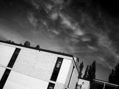
What is Chiaroscuro?
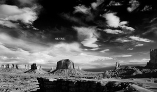
Chiaroscuro is the the contrast between dark and light, the word comes from Italian. Chiaroscuro in photography developed with portraiture. It gives it an more of an dramatic effect to the image. This image is a black and white image it has a wide tonal range. The more pure the image is the whiter it is and builds up to pure black. The contrast in this image is the white clouds and how to spreads out to go to grey and to black. It has given it more of an effect of brightness and darkness and makes you look at the image a lot more. I feel like this picture has been thought out due to the landscape as its not somewhere you would be on a normal day but however i believe it might not of been thought out due to the way the clouds are and if they were looking for something like that or was it just captured at the moment in time and i like the way in the background and the back that the clouds go all the way back and kind of blends out to the end instead of it having gaps. There are a lot of dark spots due to the light not hitting most bits. |
|
|
Edward Weston
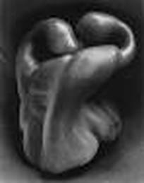
Edward is a photographer who captured organic forms and texture. This image has different shades of types of grey for example there are different tones , from lightest to darkish. The light parts are where the light could of been coming from, and i would say it would of been coming from the side but at angle at the far above. As half of the is dark from where the light is not hitting it. Its not a harsh light as it looks soft and does not cover the full picture. This image does not have any harsh light and does not have any natural day light in. Trent Parke
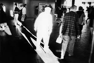
This image has a lot of lighting on the man, so it was coming from a door or a window. The rest of the image is a bit dark so the lighting is focused on the man so you can see a shadow. There is a lot of hard light within his images. Trent Parke has also won an award, W Eugene Smith for humanistic photography in 2003. In Trent Parke photos he tends to have dark and light contrasts within his images. There is natural day light given of from the harsh light shinning on the man as if has come from a window or door, this can be shown as if it was a studio light it would not reach that far and at the end of the light there are more reflections given of. |
|
|
Elliott Erwitt
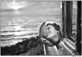
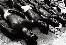
Elliott Erwitt focuses his images on black and white, he also is an advertising and documentary photographer, and is known for what he focuses on , black and white and takes shots of absurd situations. In this image there are no hard lights directly on an object leaving everything a bit dark, the only light bit on this image is from the sun, but it is all evenly spread out with light so there is no harsh sections. In this image by the sun it looks like it has natural daylight as the effect in which the sun is giving on , the reflection on the water. |
|
|
Tom Hunter
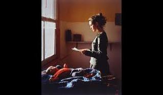
I like this image as it looks like it has a story behind it. There is a soft lighting but is mostly on the baby and the front of the lady but its not a harsh light. It looks like its coming from the window as you can see the window and the light but if the window was not in the image and not able to see it it might of been given of as studio lighting like a spot light on them. |
|
|
Fay Godwin
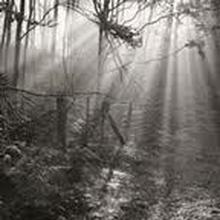
Was a British photographer who is known for her black and white photographs, educated at different types of schools all over the world. This image i like the best as i like the lights within the image, and the way it just shoots through the trees. I believe it is natural day light as if spreads out through the image and shows clearly where it is coming from. There is no harsh lighting within this image as it spreads out evenly not leaving anything in the background dark. Its like light beams coming through which i like. |
|
|
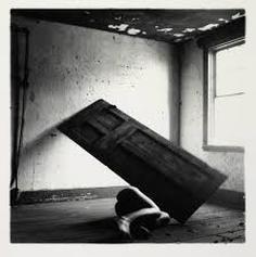
Francesca woodman
Most of Francesca woodman photographs is taken in black and white. The lighting is coming from the window and the door gives it a shadow which looks like its natural lighting as we can see where the light is coming from. However the light is not just focusing on a particular place in the room as the light has been expanded on the wall and a bit of the floor but there is contrast in the image and there are different tones of black and white given off, as there is pure white , greyish tones and black tones given of. |
|
|
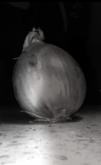
Experiment
This image is what i took at home to show the contrast within the image, and how it goes from black to white. I planned this image as it would of been hard to get the contrast with the natural lighting in my house. So i decided to use a lamp to lean it on its side to have half the image brighter than the other side. I then got a torch to put on the same side as well to make it brighter and by doing that it would make the other side look darker. I used an onion as it had good texture and its not perfect it has lines on which give it an effect so its not plain.However i did have to edit the image after taking it due to it not really going to plan and had to change the effect to black&white to give it more of an effect as its better to see the contrast. What i like about this image would be the shadow that has been given off as its the darkest part and blends in with the background which makes the onion stand out alot more and to make it the main focus. |
|
Experiment
Evaluation
This is an experiment that we done in school, we had to also link it contrast which also is linking it to Chiaroscuro. With this experiment we used a digital camera and lighting using light lamps. The rest of the room had to be dark to give it to extra effect. it was hard at first to show the contrast without showing the shadow and by making the image not to over exposed. So it took a few adjustments. We had to move the lighting, change the exposure on the digital camera. They turned out well for the first try however there are things i would change. I would of liked to plan it out a bit more so it would of made the images better when it comes to the final outcome. All of the images have contrast within the image.
This is an experiment that we done in school, we had to also link it contrast which also is linking it to Chiaroscuro. With this experiment we used a digital camera and lighting using light lamps. The rest of the room had to be dark to give it to extra effect. it was hard at first to show the contrast without showing the shadow and by making the image not to over exposed. So it took a few adjustments. We had to move the lighting, change the exposure on the digital camera. They turned out well for the first try however there are things i would change. I would of liked to plan it out a bit more so it would of made the images better when it comes to the final outcome. All of the images have contrast within the image.
|
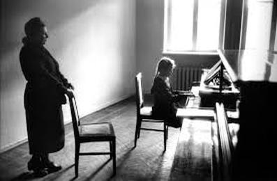
Elliot Erwitt.
In this image the light is very sharp on the Piano and spreads out all around the room but leaving different shades of black in the image due to the light not hitting any other place. the light is coming from the window and this is shown as there is pure white where the window is which shows the amount of light and exposure there is. The lady standing and the girl sitting down are dark but if we was the see the other half of there body it would be light due to where the light is coming from. There are lots of shades been given out of white and black and some parts leads in to grey tones this is the contrast been given out of black and white. I would describe this photograph as very thought out due to the way things have been placed unless it was just taken in the moment due to the amount of light been given off, as if is the lighting form the sun like that every day or was it just that day so they had a chance to get to take the image then. I would describe this if photograph to someone who has not seen it as , There is light coming through the window shinning on a piano which gives it a reflection and there is a lady standing holding a chair which she is dark due to the light not hitting her and the child sitting down playing the piano. There is a lot of light on the floor and on walls but the objects that are facing away have tones of black in them cause the lack of light hitting them. This image is composed as it looks like it has been planned out due to the lady holding the chair. |
|
Homework
These images were taken around my area, these all focus on shadows and how the light makes the image go more darker and makes it look like it has some sort of contrast in them . The images were taken early hours in morning to give it more an effect. These images havent been edited due to wanting them to look natural and to see what i could improve on my next set of images. The image i think has more of a contrast would be the image with the sun shinning in back ground behind the houses. As because of the lighting of the sun it makes the rest of the image darker but also most of the image has some sort of lighting. In that image i can see about 5 different shades of lightness and darkness there maybe more but i can only see them. The other images i decided to capture more of shadows with a beam of light within them to give it that extra effect. The lighting is coming from the background and the darkness is all around the houses due to the light only hitting behind the house.
These images were taken around my area, these all focus on shadows and how the light makes the image go more darker and makes it look like it has some sort of contrast in them . The images were taken early hours in morning to give it more an effect. These images havent been edited due to wanting them to look natural and to see what i could improve on my next set of images. The image i think has more of a contrast would be the image with the sun shinning in back ground behind the houses. As because of the lighting of the sun it makes the rest of the image darker but also most of the image has some sort of lighting. In that image i can see about 5 different shades of lightness and darkness there maybe more but i can only see them. The other images i decided to capture more of shadows with a beam of light within them to give it that extra effect. The lighting is coming from the background and the darkness is all around the houses due to the light only hitting behind the house.
|
Daido Moriyama
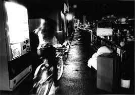
Daido is a japanese photographer who focuses on the scent on the cities and what goes on in the city. This image has a lot of contrast in between the black and the white and also has different shades. There are very light white spots that looks like it is some sort of light that is in the image. My eyes are drawn to the lady on the bike as she is the only one there within the image and shes looking into what looks like a shop window. There are shades of black where the light is not being reflected of and i think it must of been raining due to the light being reflected onto the floor. Most of his images are based at night and took photos of where ever he is and just captures what ever he sees. |
|
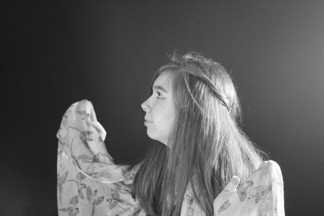
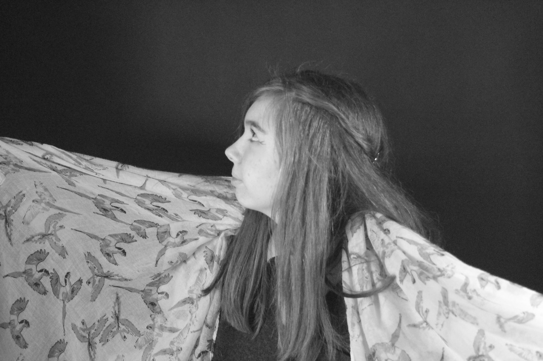
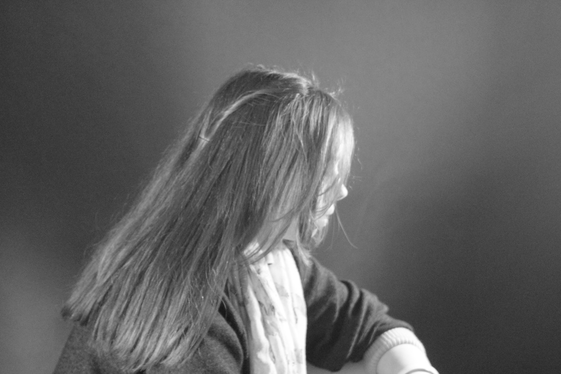
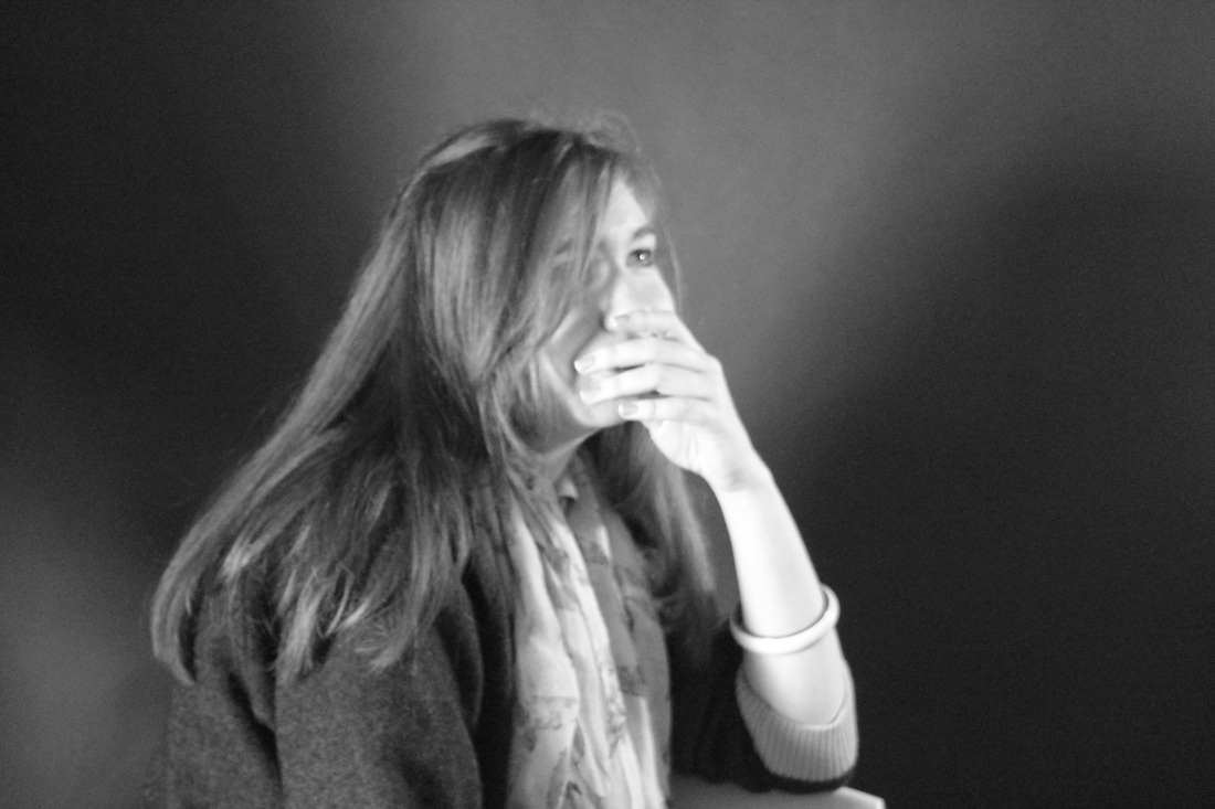
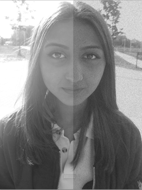
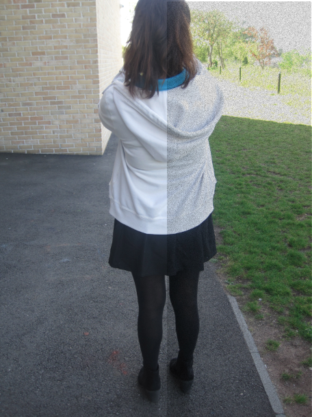
What im going to do
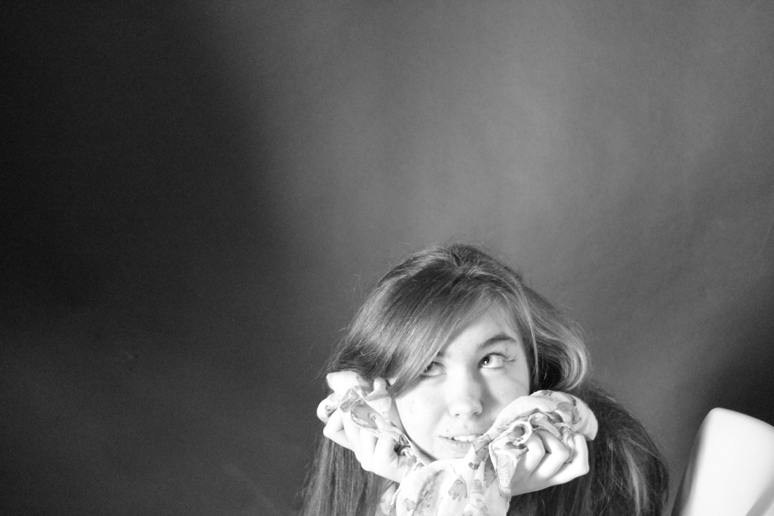
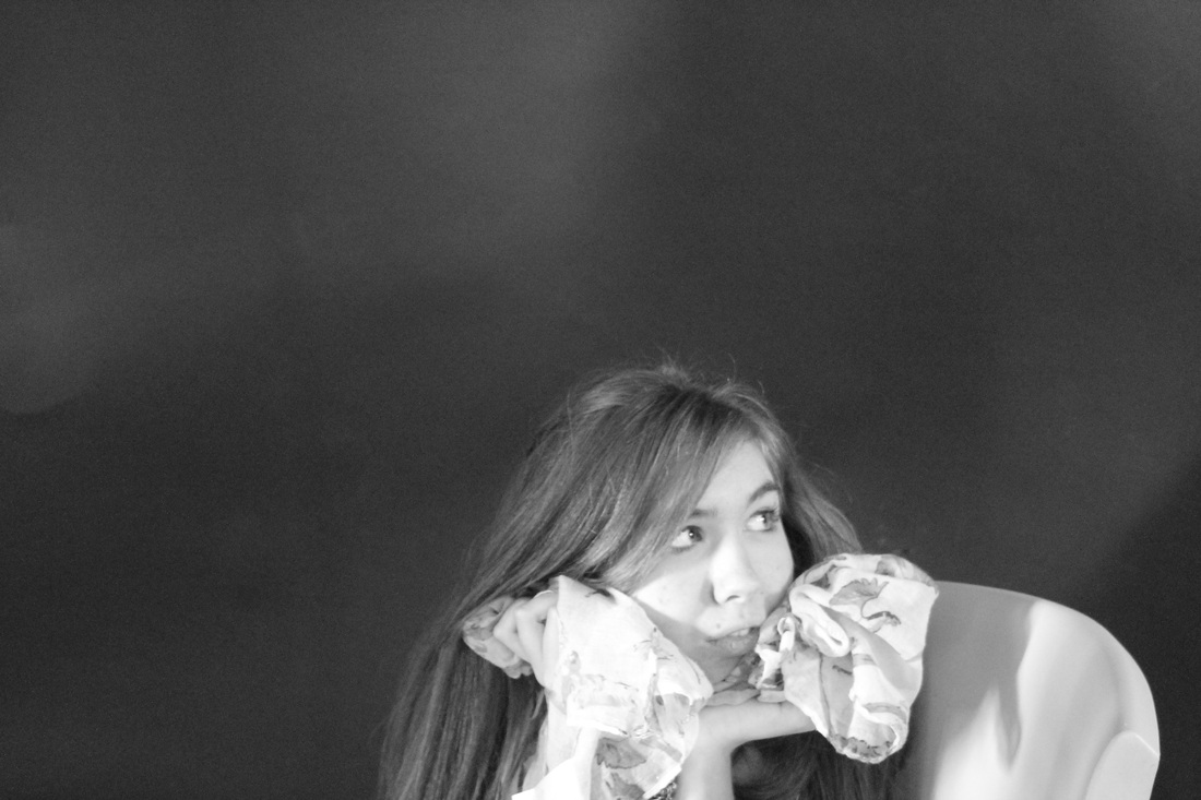
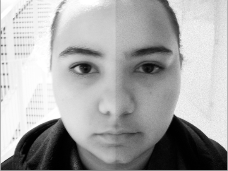
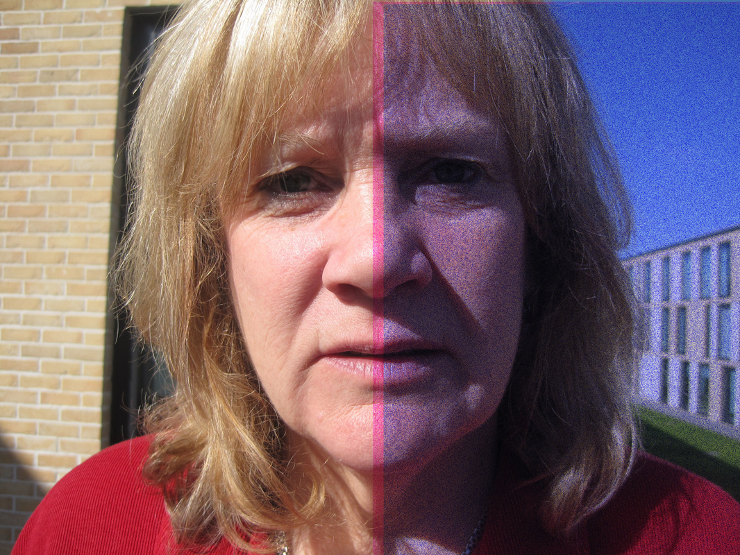
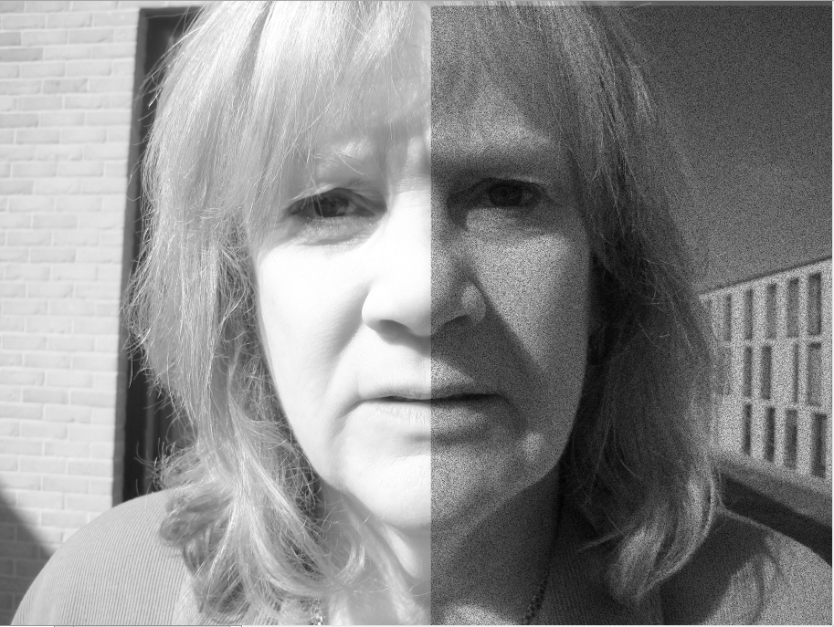
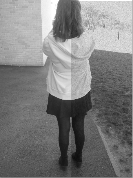
To push my experimenting i have decided to take images of peoples faces , and edit half of the image to a black or white tone to make the image relevant to contrast. I looked on pinterest and saw images that had contrast with in the face , this made me want to do this as i have never done anything like this so it has made me push my experimenting skills further.
To push my experimenting i have decided to take images of peoples faces , and edit half of the image to a black or white tone to make the image relevant to contrast. I looked on pinterest and saw images that had contrast with in the face , this made me want to do this as i have never done anything like this so it has made me push my experimenting skills further.
Experimenting in school
Evaluation
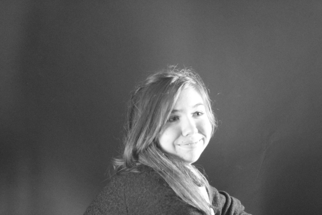
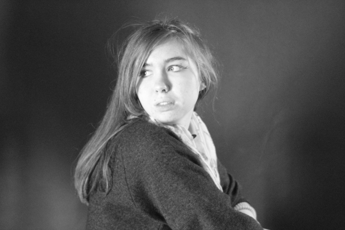
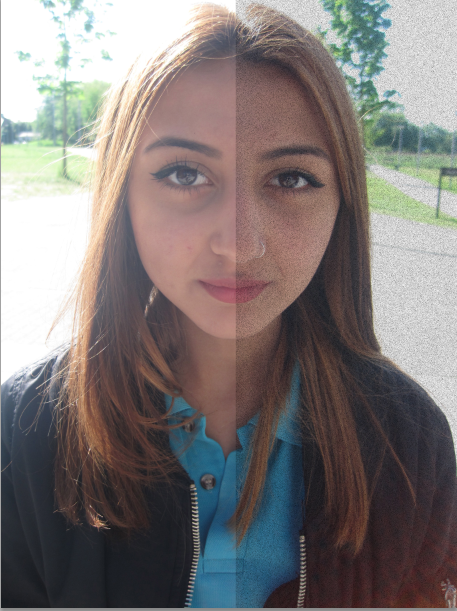
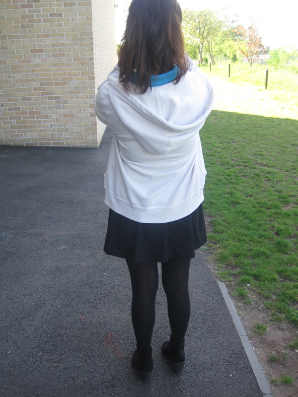
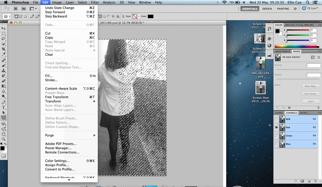
All these images was taken on an ipod. I edited them on photoshop to give it a contrast effect. When taking these images it was kind of hard due to taking pictures of the same thing which felt to me there all going to be the same and boring but however that was my theme to take images of peoples faces to show the contrast. I screen shot at every stage possible to show how i done this and to show what could be improved and what i did not like about it. The first set of image i took was the first row and it was my first time using photoshop it took me a while but i got the hang of it. The set of images did not like was the bottom row as it did not go with my theme and its different to all the other images but i took this to play around with my experimenting skills and decided that to go on further i could next take images of peoples backs or fronts , or maybe take images of buildings between light and dark. In these images i think they all work well as a group as they all are similar and all have at least 1 thing in common, which would be the edits ,and the fact its all faces expect the last row.
What im going to do next
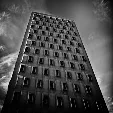
My next experiment i want to have the same theme of editing them of half black and half white but i want to take it further than just taking images of peoples faces. I want to do more of buildings, the types of views of a building the different types of buildings and the way they look. Im going to edit them after taking them to make them better and im always going to have the image on my site before editing it to show the difference.
All these images was taken on an ipod. I edited them on photoshop to give it a contrast effect. When taking these images it was kind of hard due to taking pictures of the same thing which felt to me there all going to be the same and boring but however that was my theme to take images of peoples faces to show the contrast. I screen shot at every stage possible to show how i done this and to show what could be improved and what i did not like about it. The first set of image i took was the first row and it was my first time using photoshop it took me a while but i got the hang of it. The set of images did not like was the bottom row as it did not go with my theme and its different to all the other images but i took this to play around with my experimenting skills and decided that to go on further i could next take images of peoples backs or fronts , or maybe take images of buildings between light and dark. In these images i think they all work well as a group as they all are similar and all have at least 1 thing in common, which would be the edits ,and the fact its all faces expect the last row.
What im going to do next
My next experiment i want to have the same theme of editing them of half black and half white but i want to take it further than just taking images of peoples faces. I want to do more of buildings, the types of views of a building the different types of buildings and the way they look. Im going to edit them after taking them to make them better and im always going to have the image on my site before editing it to show the difference.
|
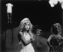
Sally Mann&evaluation
Sally has produced portraiture, architecture , landscape and still life. Sally mann received many awards for her work , NEA and NEH. Sally also has books out for her work that she had produced and also a feature film about her work. This image has contrast within but seems as if it has a story behind it due to the young girl smoking which is highly unlikely. Maybe there was a reason to why the young girl is smoking. The young girl seems to be the brightest figure in the photo and someone in background, but her compared to the girl next to her she is the brightest to show her out and that to show she is the main focus. The rest of the image is blacked out which shows the contrast between black and white. |
|
Experiment
Evaluation
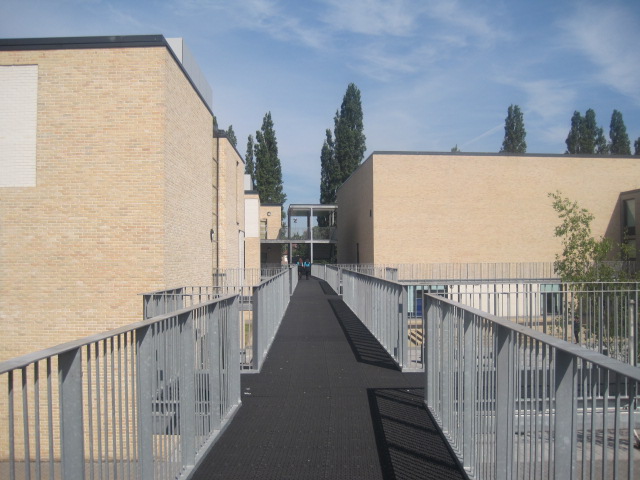
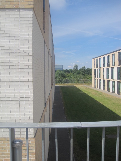
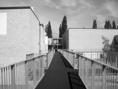
These images were taken in school and i decided to take images of the building and the sky to show how it contrasts with eachother. These images were taken at different types of angles to show the different views. I did plan this out and knew what i was going to take pictures of however i did not get inspired by a photographer i just thought it was something i have not done yet so i thought i would experiment to show my understanding and development of understanding of contrast. These images are not very good quality but if i was to edit them they would look better and could show the contrast a lot more. The sky has different shades of blue , some dark spots , light spots.On the 4th picture the building reflects a shadow to the ground which shows the contrast between the grass and the building. For these images i used an ipod . With these images i did not make it very clear about the subject and what the images were. All the images have lines however two of the images have shadows so there are two different subjects and two different themes. I could develop these images and just focus on one subject as the main one . I could focus on shadows as i have not really looked further into shadows and i have not developed my ideas on shadows. In these images there are no harsh lights there is just a main light from the sky so all the images look the same by the light however if there was sharp lights would make the image look interesting and the contrast within the image would change. These images all work well because they all have lines in common.
These images were taken in school and i decided to take images of the building and the sky to show how it contrasts with eachother. These images were taken at different types of angles to show the different views. I did plan this out and knew what i was going to take pictures of however i did not get inspired by a photographer i just thought it was something i have not done yet so i thought i would experiment to show my understanding and development of understanding of contrast. These images are not very good quality but if i was to edit them they would look better and could show the contrast a lot more. The sky has different shades of blue , some dark spots , light spots.On the 4th picture the building reflects a shadow to the ground which shows the contrast between the grass and the building. For these images i used an ipod . With these images i did not make it very clear about the subject and what the images were. All the images have lines however two of the images have shadows so there are two different subjects and two different themes. I could develop these images and just focus on one subject as the main one . I could focus on shadows as i have not really looked further into shadows and i have not developed my ideas on shadows. In these images there are no harsh lights there is just a main light from the sky so all the images look the same by the light however if there was sharp lights would make the image look interesting and the contrast within the image would change. These images all work well because they all have lines in common.
|
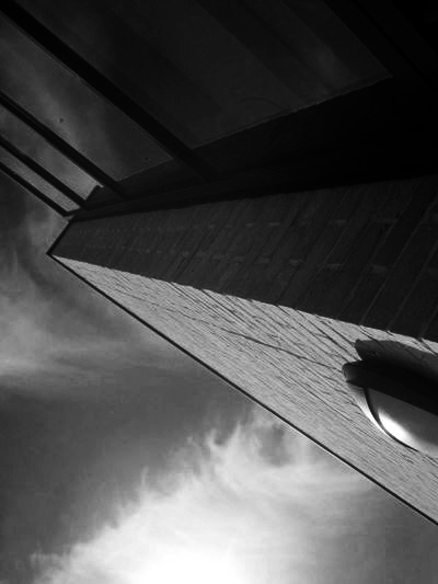
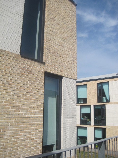
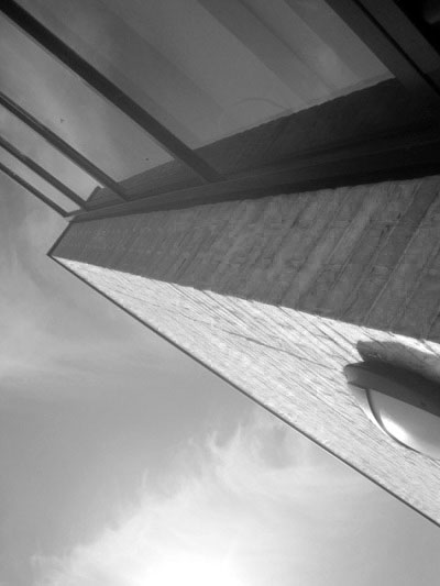
Evaluation
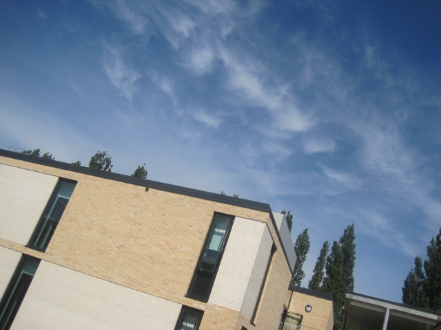
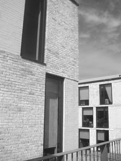
I like this image out of the selection as a group i chose because i like the way i took this image , i took it at a different angle. I like the way the sharp light has been captured at the top of the image near the corner as it makes the image lighter and the contrast within this image is more grey tones and then hits with a harsh white tone. There are many lines within this image from the side of the building and the reflection it has given of in the window, this is due to then sun which gives us the harsh light tone. I things i could improve on in this image would be maybe to capture more light to make the contrast better. |
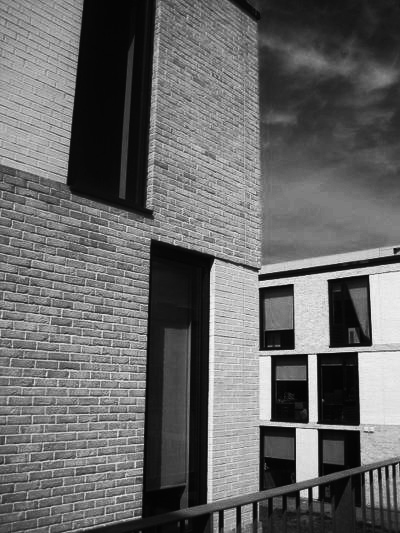
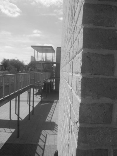
Experiment

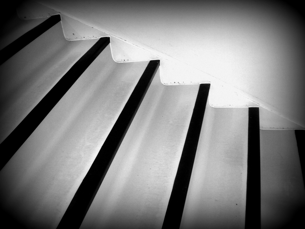
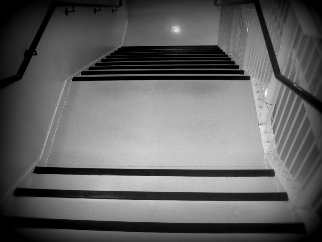

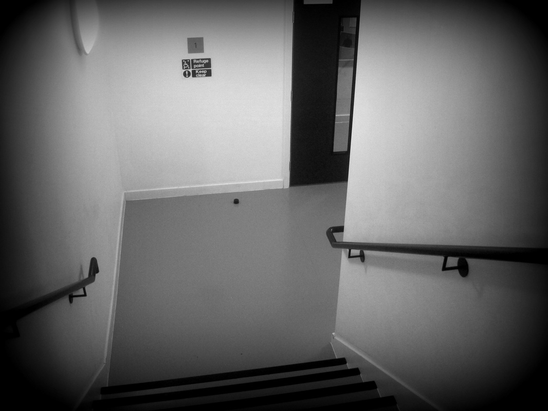
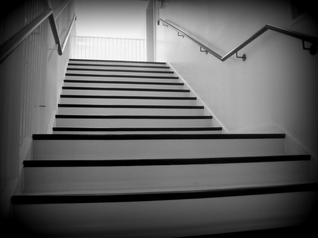
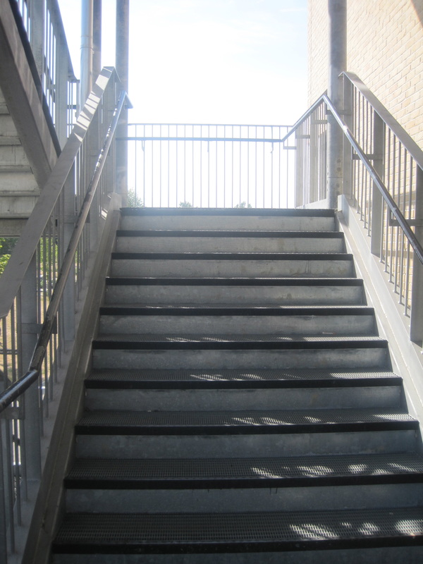
Evaluation
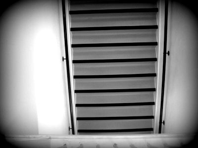
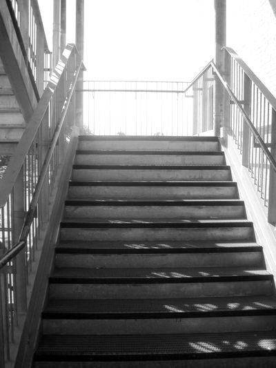
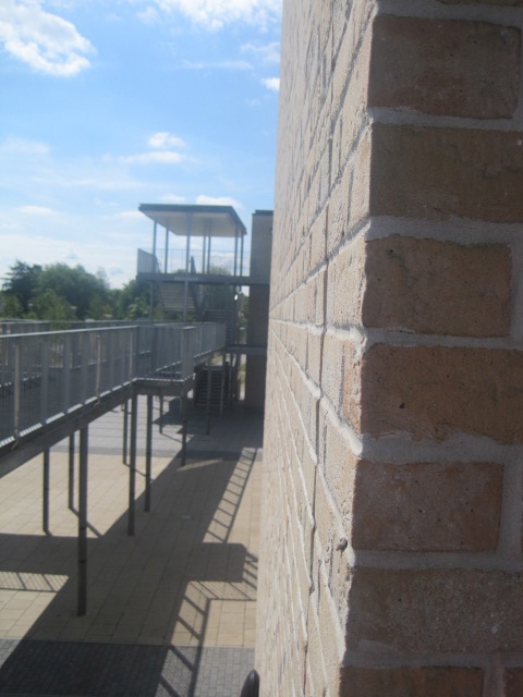
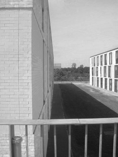
These images are taken from different types of angles and shows the contrast between the stairs and the wall , the stairs and the black stripes. There is a lot of sharp lighting in these images due to the sun and reflection of a light. Most of the lighting is light and the whiteness is more white in some spots and gradually goes to dark grey so it shows the contrast from white to grey and the different shades. These images are a theme of stair and railings. There was thought out however do not really look profesional but they are just the start of the theme and i could gather more knowledge and make it more better and look better. I do like these images however i do not think contrast stands out much in these images but there are signs of contrast. Taking these images at different angles shows the way contrast could be presented , and just showing the different views of stairs.There are many lines in these images and thats the main theme,however there are many ways i could expand this. I could take images of line than just lines of the stairs. They all look the same by the lines but to make it a bit more interesting i decided to take the images at different angles to show the different view points and what the lines look like from different angles, and i could make it all one colour instead of having some normal and some black and white. I took these images with an ipod as i wanted to explore the different apps on the ipod and i didn't want an focus effect so i used an ipod instead of a digital camera. I used an online editing app to make the corners have a black outline. However i didn't intend of getting a black outline but it came with the effect and made the image look better. The last image is not in colour as i wanted to show you what it looks like with out an effect and the difference an effect could have on an image.
These images are taken from different types of angles and shows the contrast between the stairs and the wall , the stairs and the black stripes. There is a lot of sharp lighting in these images due to the sun and reflection of a light. Most of the lighting is light and the whiteness is more white in some spots and gradually goes to dark grey so it shows the contrast from white to grey and the different shades. These images are a theme of stair and railings. There was thought out however do not really look profesional but they are just the start of the theme and i could gather more knowledge and make it more better and look better. I do like these images however i do not think contrast stands out much in these images but there are signs of contrast. Taking these images at different angles shows the way contrast could be presented , and just showing the different views of stairs.There are many lines in these images and thats the main theme,however there are many ways i could expand this. I could take images of line than just lines of the stairs. They all look the same by the lines but to make it a bit more interesting i decided to take the images at different angles to show the different view points and what the lines look like from different angles, and i could make it all one colour instead of having some normal and some black and white. I took these images with an ipod as i wanted to explore the different apps on the ipod and i didn't want an focus effect so i used an ipod instead of a digital camera. I used an online editing app to make the corners have a black outline. However i didn't intend of getting a black outline but it came with the effect and made the image look better. The last image is not in colour as i wanted to show you what it looks like with out an effect and the difference an effect could have on an image.
Experiment
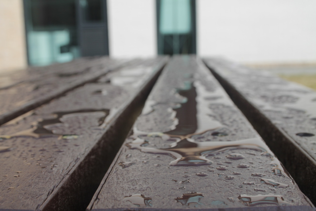
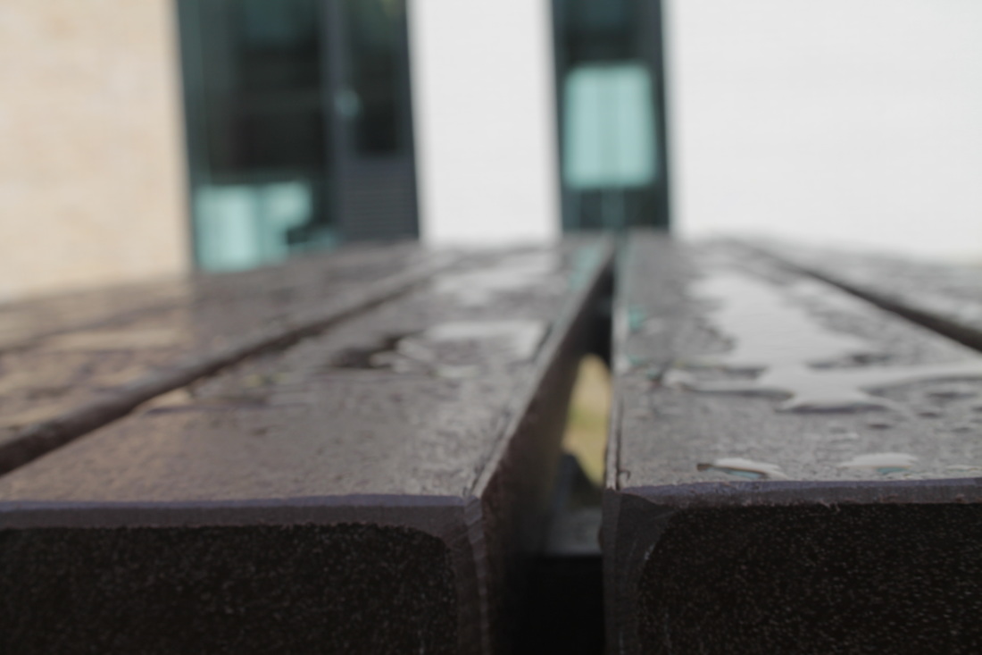
Evaluation
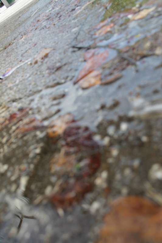
These images where taken outside, i decided todo something different to just show my further knowledge and how i can expand instead of staying on the same road of the project like similar things but now i changed it completely. I have decided to take pictures of water and the reflection that it can give of and some parts give of a 3d effect and looks like it have a lot of detail. I like these images it links to my other project however not much reflection was given of as there was not much light in these images so it was not shown. The contrast in these images is the water compared to the surface it is on. I like these images a lot i thought very well about them and the only thing i did not think about till i got out side was where the water was place. What could be changed maybe just getting the water instead of capturing the background as the background is not really needed for this theme as it all suppose to be focused on the water and the reflection and the contrast it has given of. I like these images but my intention was just to capture reflection and focus on the reflection but instead i captured reflection with more background and i could crop it or i could take the images again and focus on more of the reflection as that was more of the theme. I like the texture that some of the images have but i need to focus more on the reflection, and i could change my reflection type, instead of just taking images of what the water reflects of i should expand on it and take pictures of what mirrors reflect or doors , windows instead of just keeping it to one sort of reflection. I could change the affect to black and white to give it more of just one tone instead of all the different colours. I took these images with a digital camera which gave me a focus effect on some of the pictures which makes the background un focused so it is just focusing on one thing in the image would mostly be the subject.
These images where taken outside, i decided todo something different to just show my further knowledge and how i can expand instead of staying on the same road of the project like similar things but now i changed it completely. I have decided to take pictures of water and the reflection that it can give of and some parts give of a 3d effect and looks like it have a lot of detail. I like these images it links to my other project however not much reflection was given of as there was not much light in these images so it was not shown. The contrast in these images is the water compared to the surface it is on. I like these images a lot i thought very well about them and the only thing i did not think about till i got out side was where the water was place. What could be changed maybe just getting the water instead of capturing the background as the background is not really needed for this theme as it all suppose to be focused on the water and the reflection and the contrast it has given of. I like these images but my intention was just to capture reflection and focus on the reflection but instead i captured reflection with more background and i could crop it or i could take the images again and focus on more of the reflection as that was more of the theme. I like the texture that some of the images have but i need to focus more on the reflection, and i could change my reflection type, instead of just taking images of what the water reflects of i should expand on it and take pictures of what mirrors reflect or doors , windows instead of just keeping it to one sort of reflection. I could change the affect to black and white to give it more of just one tone instead of all the different colours. I took these images with a digital camera which gave me a focus effect on some of the pictures which makes the background un focused so it is just focusing on one thing in the image would mostly be the subject.
|
|
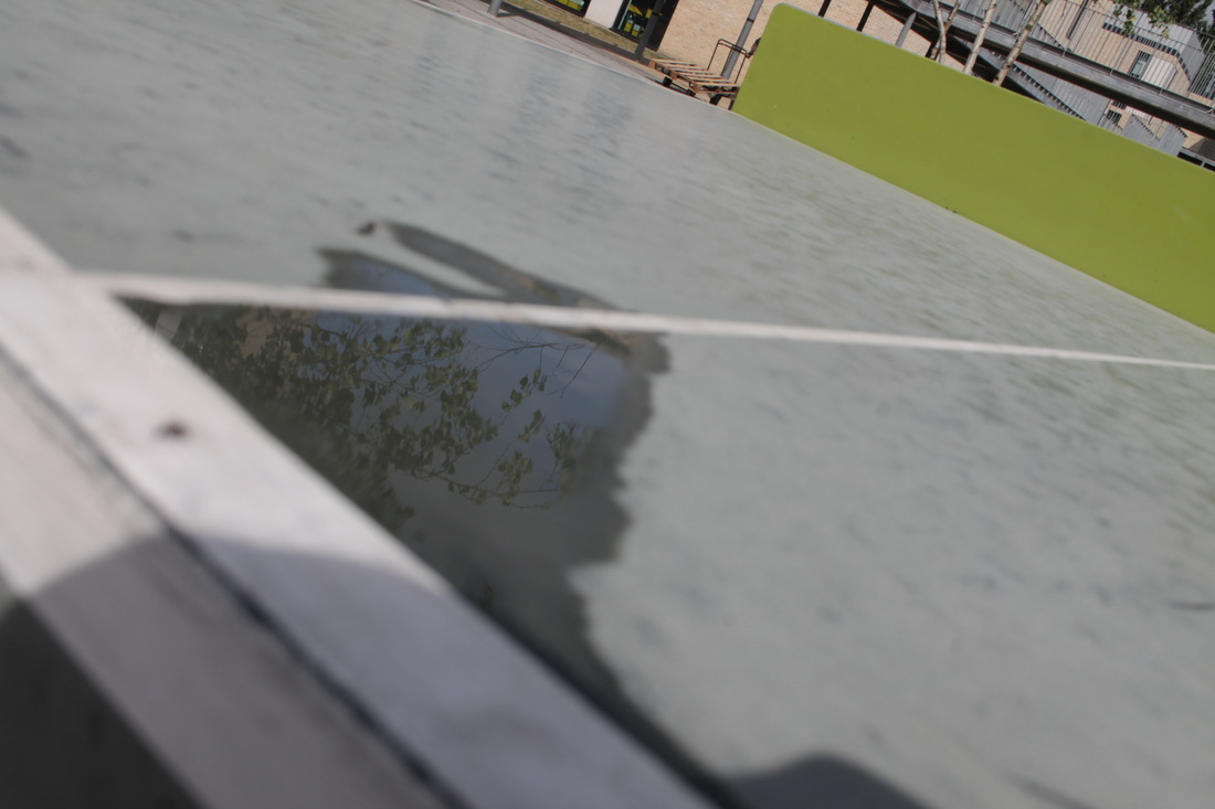
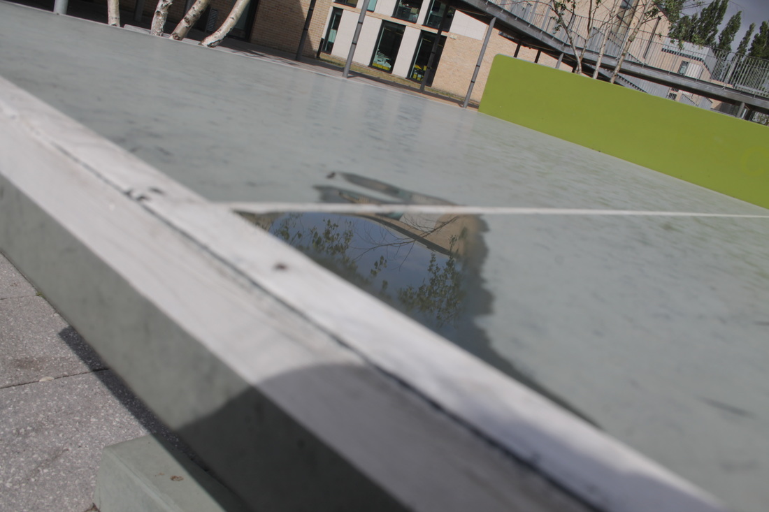
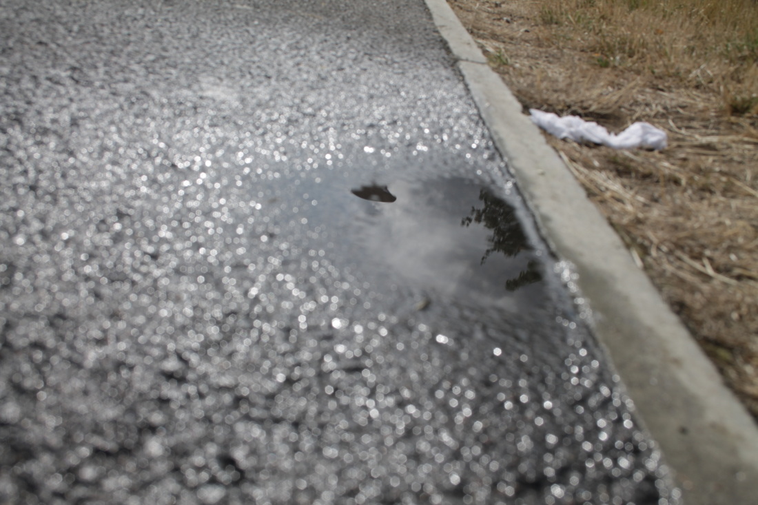
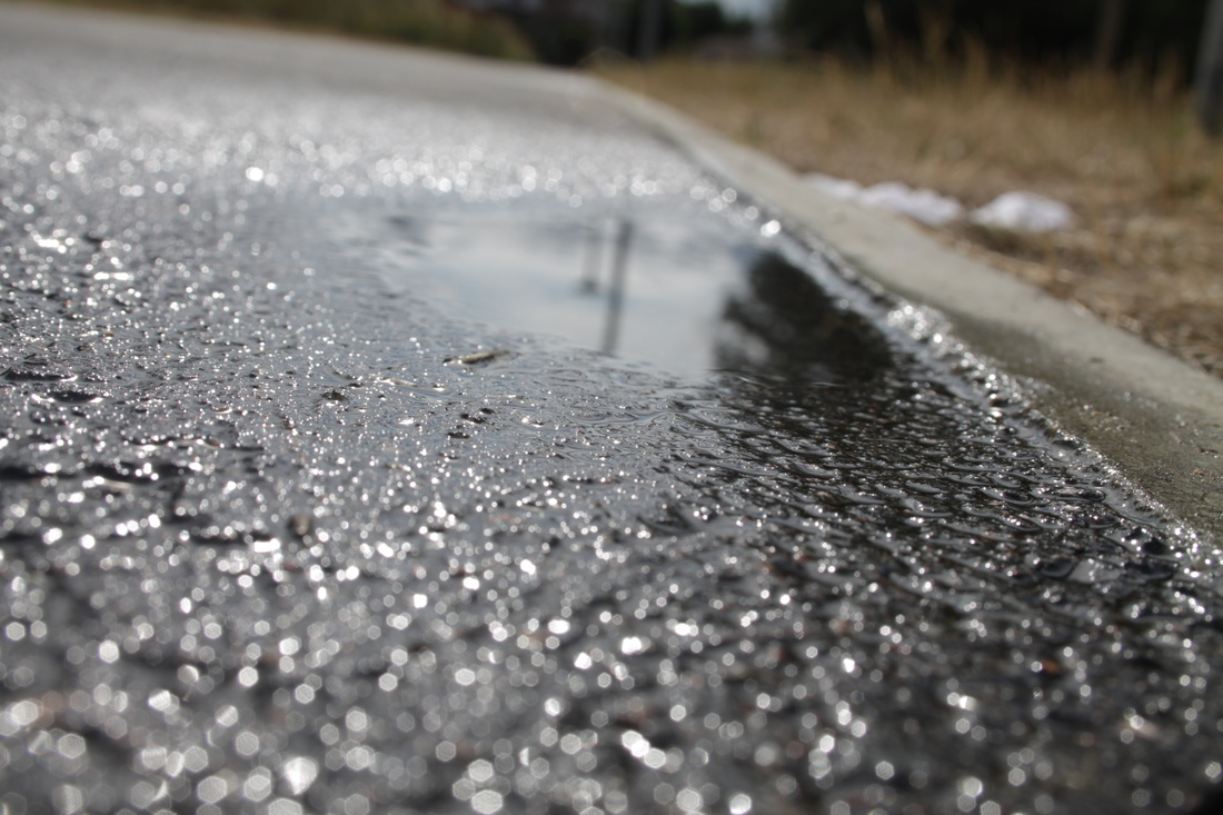
Evaluation
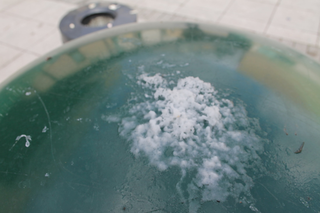
This image is todo with reflection, instead of me capturing more of the background and showing what is making the reflection i just decided to capture what is being reflected of and then makes people think what is being reflected. If i was to add the the window it would be to much and then i wouldn't of expanded my work by just capturing reflection. I took this further, i took picture inside rather than out side. My other reflection images were taken out side and was more of the relocation shown in the water, but this time its mrs of inside and exploring more reflections in a wider range. The lighting is good in this image as its the reflection is very clear in this image and is not really faded. What i could improve on would be expanding these images and maybe add an object in to make it more interesting. I used an iPhone to take this image, if i used an digital camera i could of blurred out the back ground and focused more on the reflection it would make the image better and make the image more clear of what we are actually looking at. The light is coming from the
This image is todo with reflection, instead of me capturing more of the background and showing what is making the reflection i just decided to capture what is being reflected of and then makes people think what is being reflected. If i was to add the the window it would be to much and then i wouldn't of expanded my work by just capturing reflection. I took this further, i took picture inside rather than out side. My other reflection images were taken out side and was more of the relocation shown in the water, but this time its mrs of inside and exploring more reflections in a wider range. The lighting is good in this image as its the reflection is very clear in this image and is not really faded. What i could improve on would be expanding these images and maybe add an object in to make it more interesting. I used an iPhone to take this image, if i used an digital camera i could of blurred out the back ground and focused more on the reflection it would make the image better and make the image more clear of what we are actually looking at. The light is coming from the
Evaluation
This project is about contrast and how contrast relates to photography and how it is used in photography. I first started to find out what Chiaroscuro was as it links to the contrast between light and dark, that was pretty simple to find out. I then started to find out some artist and how they link to contrast and what there images turn out like. Based on my knowledge i started to look further into the artists that i was interested in, this gave me a detailed understanding on contrast. My first artist i researched was Edward western, i decided to research him. I liked the images in which he developed and how i developed which using his way of taking photos was doing my own experiment to show i gather information and showed i understood. Edward Western image that i have evaluated is more todo with the different type of shades and how it makes up the image, i then decided to choose another photographer with a different type of contrast instead of just the shades of one colour, i decided to choose Trent Parke which his images shown a sharp light which is seen to be coming from a window or a door. This is similar however different from Edward Western photo. I then done research , and found another photographer Elliott Erwitt, his image i have chosen is more todo with the shades in the background and how it leads to the people, there are no harsh sections in the image, where as Trent Parke captured a very harsh line of light. I chose next someone different , someone who didn't use black and white , Tom hunter , his image was more like a story.
This project is about contrast and how contrast relates to photography and how it is used in photography. I first started to find out what Chiaroscuro was as it links to the contrast between light and dark, that was pretty simple to find out. I then started to find out some artist and how they link to contrast and what there images turn out like. Based on my knowledge i started to look further into the artists that i was interested in, this gave me a detailed understanding on contrast. My first artist i researched was Edward western, i decided to research him. I liked the images in which he developed and how i developed which using his way of taking photos was doing my own experiment to show i gather information and showed i understood. Edward Western image that i have evaluated is more todo with the different type of shades and how it makes up the image, i then decided to choose another photographer with a different type of contrast instead of just the shades of one colour, i decided to choose Trent Parke which his images shown a sharp light which is seen to be coming from a window or a door. This is similar however different from Edward Western photo. I then done research , and found another photographer Elliott Erwitt, his image i have chosen is more todo with the shades in the background and how it leads to the people, there are no harsh sections in the image, where as Trent Parke captured a very harsh line of light. I chose next someone different , someone who didn't use black and white , Tom hunter , his image was more like a story.
Final Pieces
1)