Abstraction
Abstraction in photography is like abstract but is the freedom to use quality in art . Abstract in photography and art concentrates on the shape,colour,form, pattern and texture.
Abstraction in photography is like abstract but is the freedom to use quality in art . Abstract in photography and art concentrates on the shape,colour,form, pattern and texture.
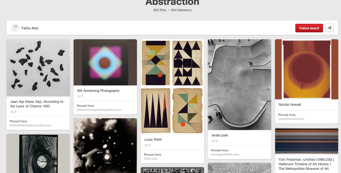
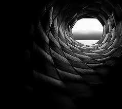
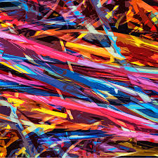
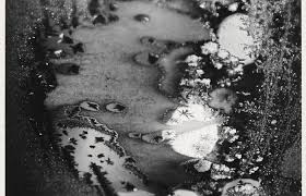
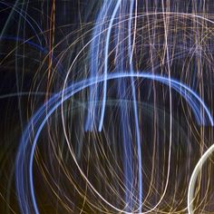
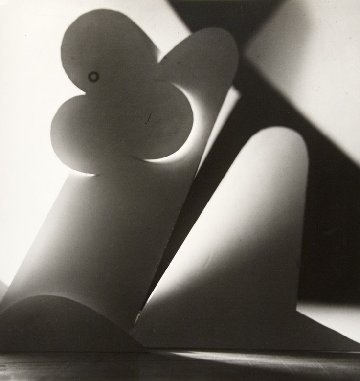
Photos of Abstraction
|
|

|
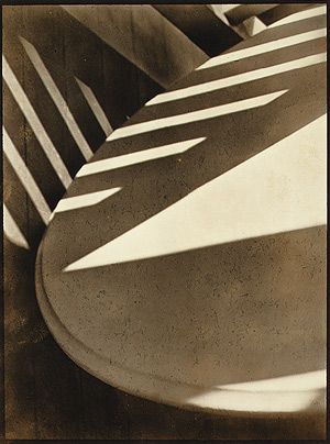
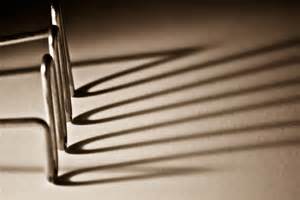
Paul Strand
The american artist Paul Strand had a very long career with the camera. Paul Strand at a time had issues with camera work. Paul Strand was born 1890 and later died 1976. I like this image as the shadow makes it look more interesting and better to look at.The main focus is on the table, there is a triangle where the sun is reflecting, in this image most of it is cropped out so you don't see the full object. In this image the texture looks smooth,its look rough at some parts and only has sharp edges from the reflection given of. the depth of field would be that the table is the nearest, closest object to the camera and the furthest away object would be the background that looks like wood or some sort.With this image you don't focus on the background you focus on where the reflections are coming from and the shapes that are formed e.g, triangle. Normally in an image you would see and check the background to give you a clue on the scene of the image. There is a repetition in the image of the reflection, shadow of another object which fills up the negative space on the table in which if the reflections was not there then there would be a lot of negative space. Overall i like this image as it makes me think about what is going on and what the scene is about. |
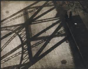
Questions i would ask Paul Strand to help me understand the image better....
1- What inspired you to take the image? 2- Did you take the image knowing what the theme and subject was going to be about? 3- Why did you take it? 4- What was you thinking when you took this image? |
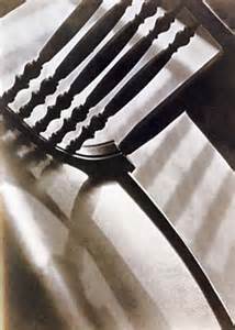
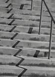
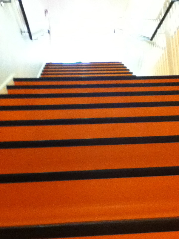
Paul Strand
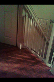
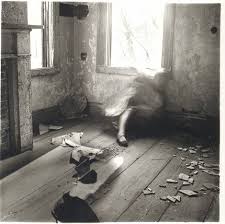
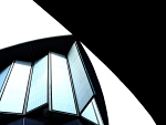
In this image, the subject is lines(zigzag) as you can see the zig zag going up the stairs as because of the reflection that has been given of. This image is focused on the stairs to show so many things in the background cant been seen so it have been cropped, as this is the main focus in the image. This image is in black and white as in my opinion having the image in colour the shadows wouldn't be as dark and you would not be able to see them clear as you do in this image. This image is not to busy its calm as not much is going on. This photographer Paul Strand was at an angle when taking this image as if it was straight the zig zag would be in the image of this image. The photographer was maybe crouching in this image due to the way it looks as it looks as if someone is crouching a bit to look up at the stairs and i believe Paul Strand was standing still when taking this image as there are not parts that are unfocused because of movement all of it looks very still. In this image you can tell straight away what the theme is and the subject and how you can tell, for example there are a lot of shadows within this image and its clear that the photographer has taken the image because of the shadows given off and the shadows are very close to the camera starting from the bottom of the image to the top of the image so it has been captured within the whole frame of the image. This image has not used a wide angle lens due to drawing us closer to the subject and isolating it from the background as if it was a wide angle then a lot more would be captured maybe to not even do with the subject but a lot more would be captured in the image. If i was to give this image a title it would be shadow stairs due to the shadows being involved and a lot of shadows are in the image so if you saw the title you would realise straight away that it is todo with stairs having some sort of shadow given of . |
|
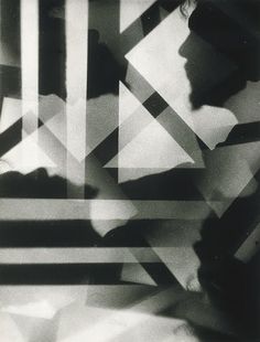
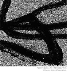
Aaron Siskind
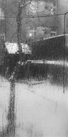
Aaron Siskind was born on the 4th of December 1903 in New York city and later died on the 8th of February 199, Aaron was an american abstract expressionist photographer. He started getting interested in photography in 1930, when he received a camera as a wedding gift,he was also teaching in the public schools. later on his photography career was later presented in the New York photo League in 1932 which they then created a documentary including the harlem document , dead end. He later done a lot of photography with fat surfaces with the detail of nature. In 1950 Aaron Siskind met Harry Callahan when they both was teaching at Black Mountain Collage, which then he persuaded Aaron Siskind to join him in part of a faculty of the IIT Institute of design in Chicago. I like this image as i don't 100% know what it is and it looks interesting and some formal elements are involved as the texture looks rough, and this image looks dull but not in a bad way. |

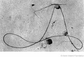
|
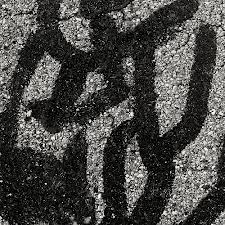
Aaron Siskind
In this image , the subject is lines as of the cracks that have been captured of a wall. This image is in colour, if it was to be in black and white the detail you would not maybe notice and the fact as the image is already dull and there are no bold colours so there would be no need to put the image into black and white. The image to me looks chaotic as there are so many lines within the image and the cracks just take up the whole image so there is hardly any negative space its all been filled up. The photographer Aaron Siskind is very close when taking this image and depending where the cracks where on the wall then he could of been crouching if it was low but if it was directly in front of him then he would of taken it standing directly where he is not crouching . Due to the photographer being close to the cracks is showing the whole point of the image and what the theme and subject is. The angle in which this image was taken was looking straight on as you can see its not titled from being at a different angle. The photographer when taking this image was still as there is no unfocused bits and the image looks still as it would be when looking straight at the cracks. There is a lot captured in this image as there is a wide of cracks and lines if it was just captured and focused on one crack and line then not a lot would of been captured but when looking at the image you can see a wide range and could compare the way they look. Aaron Siskind has used a lens to draw us closer to the subject but also by doing he has captured a lot. Aaron Siskind has cropped out the background so has isolated it from the background. If i was to give this a title it would be cracks on the wall , just simple as just to show what the image is about. |
Formal Elements
Focus- Means out of the whole picture where if the main focus within looking at the photo.
Shape- what shapes are created in the image, (reflections, objects)
Line- Are there any objects that act as lines? are there lines within the image?
Repetition- Is there anything that repeats its self more than once in the image (lines , shapes)
Space- Negative space, positive space,
Texture- How does the image look? how does it feel if you was the touch it? (rough, smooth.....)
|
Focus- The focus in this picture is the object and the look of the object, as it also appears closest to the camera which is the first thing you look at. Shape- The shapes in this image would be the object its self as no shapes are formed. line- There are many lines within this image but curve out so not straight lines. Repetition- There is not any repetition going on. Space- There is a lot of negative space in this image which is not being used only for the background which is shaded in dark which makes the object stand out more. Texture- The image looks smooth , it looks smooth as the way its been drawn and the way it had been shaded in and the light effects on it make it look smooth to touch, like an shiny object., First Experiment at home.
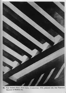
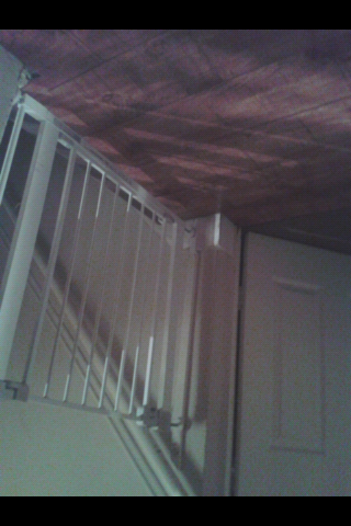
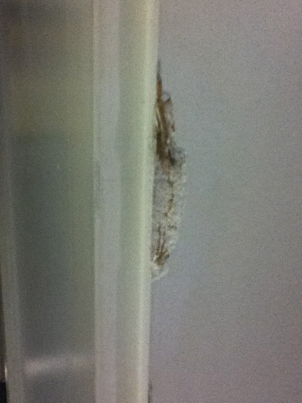
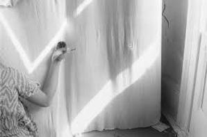
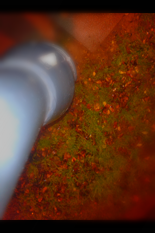
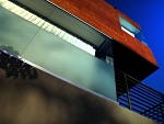
This image has many formal elements involved, it was taken during the day time. The main focus is with the gate and the reflection that is given off. The main shape in which is in the reflection is a triangle, its hard to see but noticeable. There are many lines within this image, the gate in which had lines and the door and the reflection. The reflection plays a big part in an image and most of it is based on the reflection. There is a lot of repetition in this image which again is the shadow of the lines that is given of which is made by the gate. Within this image there is a lot of negative space, this reason is as the main focus is the gate and reflection which goes to show that the background is the background and not really focused on. some parts of the image look smooth but some parts has a hard texture to it. |
|
|
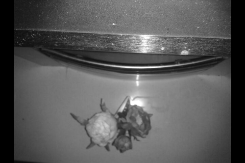
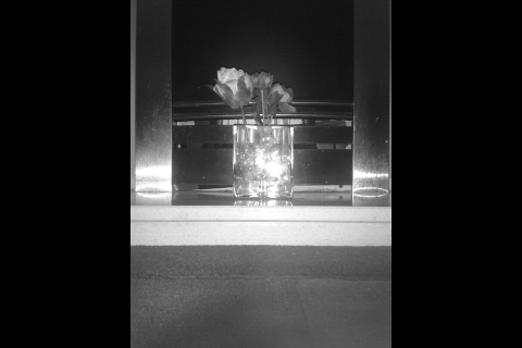
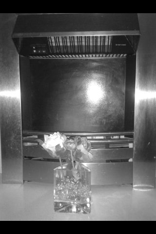
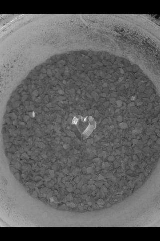
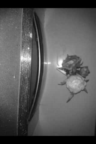
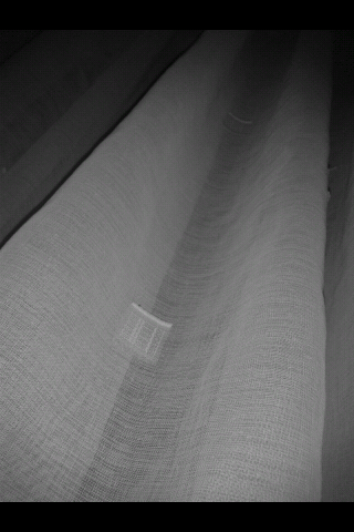
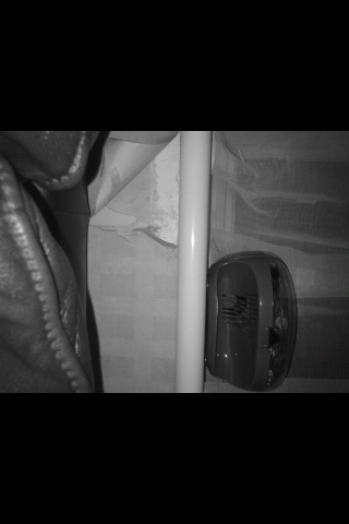
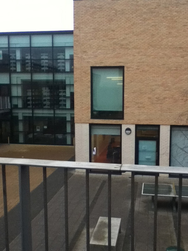
Home Project
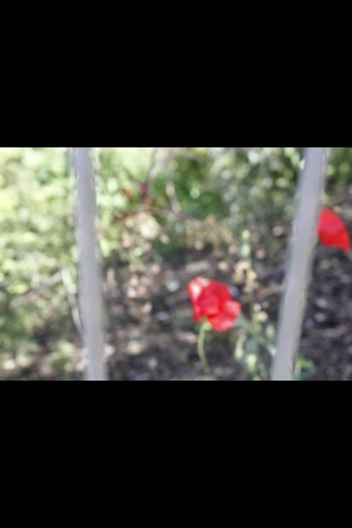
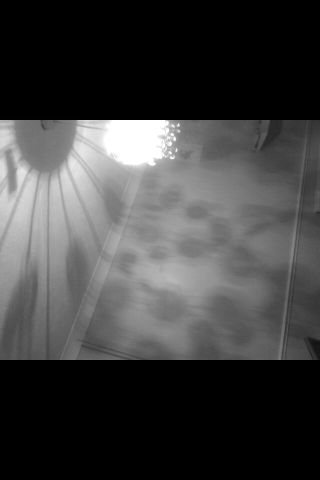
These images are ones i have taken out side of school, i have taken some within my home and i have taken some in london. these are the best ones i have taken at home there for thats why i have used them. These images are similar and different towards each other for example, the first and last image in this group have something inn common, they both have some sort of reflection and shadow but with the 2nd to last one and the flower one they seem to not have anything in common with the rest of the images. I like these images as there are interesting to look at and to see what the image is about and what the subject/theme is behind it. the 2nd image is hard to see and hard to know what is going on and the theme within it. Now with this image i did not take in on purpose it was by accident, until i realised it is a good image to get get the viewer thinking what the image is and about. now i would say the subject behind that image would be blurred/unfocused so would some sort of reflection being given of. Only two of these images are not in focused so some of the image is blurred out which i like as it makes the image for interesting. In all of these images there are shapes in which are formed when taking these images or because of the reflection that is given of. The 1st image has lines in and the 3rd, 4th , 5th and the 6th image so this is something they all have in common. |

|
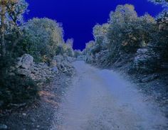
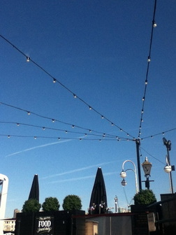
Best image
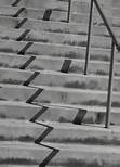
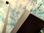
This is one of the best images i took within the images above. I like this image because it has a lot of formal elements in .It has lines and lines in which are created by planes in the background. This image is not chaotic as there is not much going on but in this image there is a lot of negative space which would be the sky and the sky has not filled up with things that would get rid of the negative space as its not being used. But the blue sky does make the image stand out a lot more as it brings a lot of colour to it. So the lines are repeated. There are shapes that are made within this image, as i can see, i can see a triangle that has been made. The objects that are in the background seem to be dark which isolates it from the whole image. |
|
|
First experiment in school 1#
These set of images was taken in school, now in my opinion these are not the best images but that was due to time issues, not having enough time. All these images have something in common, lines . All these images have some sort of line involved , straight to curved. The images would of been better if i planned everything out as then i would get a clear understanding of what i am going to do when going to take images, as with these images i just captured things i saw and didn't actually think about the subject or a theme or anything i just captured what i saw. So making these images better i could of took my time as maybe i could concentrate on what im going to capture to make them look better as a group. I can compare these yet to any other images to see what i done wrong, where i went wrong as i have not taken a 2nd set of images. Overall i like these images i think they are good for a first attempt but i need to make them better and would need to improve on them. |


|
|
Texture
This is my theme, i like the theme texture as you can capture different types of texture but somehow it will all have something in common. The texture in these images would be rough as if you was to feel the wall it would not feel smooth and it looks rough these are all the same texture but just different images. |


What i plan todo when going out to take images.
.Blur the background out
.Take most images outside
.Take images of objects that have a lot of detail
.To make sure all the images overall have something in common.
.Blur the background out
.Take most images outside
.Take images of objects that have a lot of detail
.To make sure all the images overall have something in common.
|
The most successful image
This image is the most successful as texture and focus is within the image. I would say this is the most successful image as i like the way it looks as well out of the set of images above. This image was taken of a bin lid and because of the sun and reflection was given of and the reflection was of the building which made the image even better. In this image i would say the texture is smooth cause of the way the reflection is and smooth things are more likely to catch a reflection and it looks shiny as well which makes the bin look as if it have a smooth surface. This image stood out from the rest and when taking this image i did not realise there was going to be a reflection given of but it happened. The focus i would say in this image would be the bin well thats what i chose to be the focus but another focus in this image would be the reflection as your eyes draw attention to it because it stands out more as it makes you look more into the image. |
Texture and Focus
These images was taken around the school more focused outside. With these images it is very clear that the theme i have chosen is Texture and Focus due to the way the images look. The texture involved within these images would be ; smooth, rough and hard. You can tell what images have them textures due to the amount of detail within the image and the way it looks and if you imagined to touch these objects within the image you would agree with the textures i have picked out. Taking these images was really easy, but by far these are my best images taken as i have taken my time to take the images and thought about the theme. I like these images as a group as it fits in well and they all have the two themes in the images itself, the only one i would say i did not like with these images as a group would be the first images of the mat on the floor, i just think that image least stood out of all of the images as well as it is dull due to the rest of the images. with these set of images things in the background as been blurred out which makes the background and things in the background look smooth all together and thats when focus comes involved as the object i have focused on would be the one nearest to the camera and by knowing that it would be because the rest of the image is blurred out. 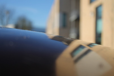
|

|
The Least Successful image
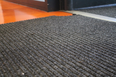
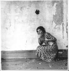
This is the my least successful image i took. i do not really like this image due to the way it looks. There is a lot of negative space in this image. I would say in this image the texture is rough , which is the carpet. That leads on to the main focus which would be the carpet. This image would of been better if you guess straight away what the main focus is and if the texture is linked with the main focus of the image. I would say this image did not stand out from the rest of the images that why i would say that its the least successful image so far , it just looks really dull and my aim was to makes all the images interesting, images that you could think about for ages.Your eyes draw attention to the orange floor as thats what stand out the most in the image as thats the only light colour in this image in general. I did not really think about this image when i took it so that would explain why its not thought out and that it was just quick capture. 
|
|
Black- Negative space
Red- Lines |
Francesca woodman
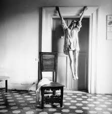
Francesca woodman at the age of thirteen took her first self-portrait and though she was only twenty two when she took her own life, she left behind a substantial body of work. Later on she next received a grant to spend a year in Rome todo her studies. As she was in rome she done her first solo exhibition at a bookshop and gallery. Since 1986 her work has been exhibited and is a subject in the United States and Europe. Francesca was born in 1958 enver, Colorado, Francesca woodman lived and worked in New York and Italy Until her death in 1981. I like these set of images as they all have something in common, they all have a figure in it as i believe is Francesca Woodman. I like these images as it makes me think of is there a story behind it ?they are all interesting. They have the formal elements in such as , Texture. Her photography was first exhibited at Wellesley College in 1986 after it was discovered by Ann Gabhart, the director of the Wellesley Art Museum. Francesca Woodman
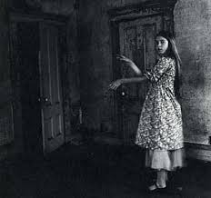
This image is of one of Francesca woodman images she has taken. I like this image as there is not much going on in the image and that i like the reflection that is been given of to make the zigzag effect. There are a lot of zigzag in this image and they are very clear so you would not have to think about the image and look for it. Within looking at the photograph i would say the main focus is her arm as thats more of a real thing in here photo. But inn terms of looking at the photo and which caught my eye first would be the reflection that is been given of, this caught my eye as it mostly covered of the space of the image not leaving any negative space. There are objets that act as lines would be her arm, and its the way she has put her arm to act the same as the reflection on top of her arm. The lines in this image which are the zigzag repeats itself. There is a lot of negative space in this image like the bit with the door and the space around the reflections as its not being used and it would of been better to get rid of the negative space by cropping it out. The texture i would say is in this image is smooth if i was to touch it but the door and corners i would say might be a little rough but overall the texture that is mostly in this image would be smooth. overall i like this image and the way the reflection came out and the way objects were placed. Images Taken At Home
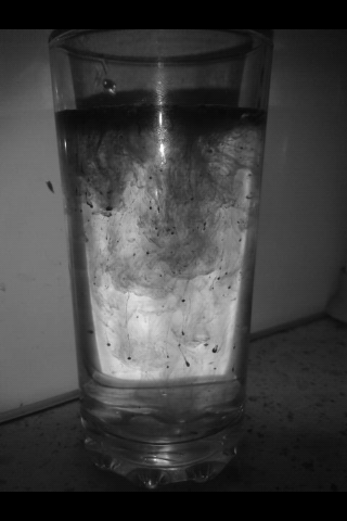
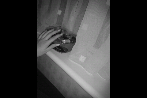
These are images I took at home , these images is to do with my chosen theme for example, focus and texture. These images have a wide rang of textures from smooth to rough from bumpy to hard. I put these set of images in black and white to give it more of an effect but although using this effect its hard to recognise the textures within the image. These some of these images have been cropped as there was a lot of negative space and I did not want certain things in the image as I chose to focus it on the objects within the image. When taking these images I thought well and clear of what I was going to do and I based these all to do with things around my home instead of taking it further to outside. I like the pictures I captured as I didn't think I would be able to take images like that without a good camera . The image I like the most is the cup one I used water and put coffee in the while I took the image I put the flash on my phone and it made the image way better with a good effect to it. The texture I would say in the glass image would be smooth with some rough bits this leads to the focus, the main focus would be what is in the glass. The image I least like would e the last image with my hand in, I didn't really think about this image I just took it, but the main focus would be the nail dryer and the hand. The texture in the image would be smooth but I can not really tell. But if I was to touch the objects in the image then it would be smooth. To improve on the image I should of planned it and thought about it before I captured it and maybe have a better focus and to make it more interesting. Over all www would be the images in general and the effect that I chose to make It better and the way I put objects within the frame of the lens. Ebi if I took more images but took some out side instead of inside as there could of been better and more interesting things to capture out side. |
What im going todo next
. Take images not in home but around the streets.
.Focus on something different E.G nature.
. Leave images in colour
. Take images not in home but around the streets.
.Focus on something different E.G nature.
. Leave images in colour
|
|
Pictures taken at home
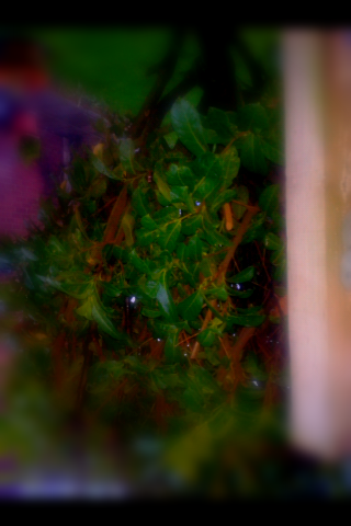
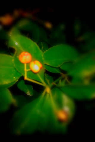
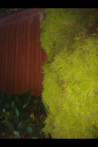
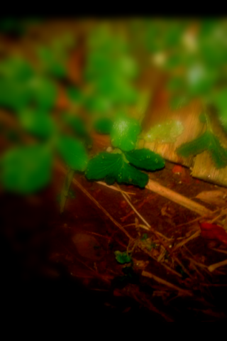
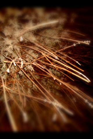
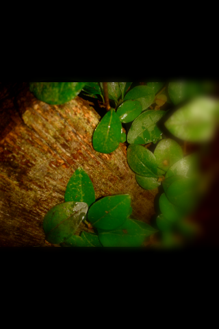
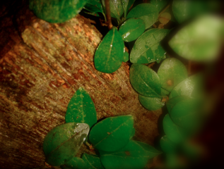
Nature These images were taken outside of school, some was taken in my garden and some were taken on streets. I must say I like these images of nature, I think with nature when you take images there are a lot of the same thing. I struggled taking these 34 images as a lot I came across with the same thing, and the images kind of looked the same. These images are too do with focus and texture, a lot of the texture is same in these images but are different in there own way. As a big group I like these images as there all similar as in mostly focused on the leafs but If they was not to be similar I would say it would of had something in the background not needed e.g a building. I edited these images on an app on Facebook, its an app I have used a lot through out my images on abstraction as I think it makes the image better. The image I like best would be the one with the wooden post with the leaves around it. I focused it on more of the wooden post and a bit of the leaves to give it that effect of capturing the post but not thinking about the leaves. Even though its mostly focused on the post it makes the leaves stand out as your attention is also brought too the unfocused bit to find out what has been unfocused. The texture in this image I would say it mostly smooth but with a rough texture to the post. The one I don't like the most would be the one with a lot of people in as I didn't really see the point in why I captured the people but I did like the flowers within the image, but having the people in the image brings it alive and to show it was taken on an ordinary busy day. When taking these images I thought a lot about them, I didn't just randomly capture nature when I saw it, I thought about what I was going to capture and how I needed it to run in a theme and to look good as a group. I like the fact I left these in colour as because its nature there is a lot of colour and it makes the image interesting to see, putting a black and white effect on an image makes it look dull for nature. www- I would say what went well in this image would be how the images came out as a group, they came out like this because i thought about what i was going to take and that i knew when i went out what i was looking for. EBI- If i expanded where i took the image instead just around on area, as in next time take it further and go to London. |
What i am going to do next
I want to develop my project further and make it more interesting. I am going to look at some artist that are similar to my work but has a different theme behind it so i can gather knowledge to then develop my project and ideas. I am going to look at Ted VanCleave as he takes architectural Photographs of Los Angeles. This is interesting as there is a lot to look at and has a lot of detail. I have not done Architect yet so this is going to be interesting and i am going to learn a lot about it. I will gain further knowledge in the future from Architect so it will help my skills with my images. I would like to also change the way i take my images ,like the angle. When i take my images so far they have been taken at the same angle, it would be interesting the way my images turn out taking it at a different angle and a different view point. But while i am taken the images i am still going to focus them on Focus and Texture and maybe some more formal elements.
I want to develop my project further and make it more interesting. I am going to look at some artist that are similar to my work but has a different theme behind it so i can gather knowledge to then develop my project and ideas. I am going to look at Ted VanCleave as he takes architectural Photographs of Los Angeles. This is interesting as there is a lot to look at and has a lot of detail. I have not done Architect yet so this is going to be interesting and i am going to learn a lot about it. I will gain further knowledge in the future from Architect so it will help my skills with my images. I would like to also change the way i take my images ,like the angle. When i take my images so far they have been taken at the same angle, it would be interesting the way my images turn out taking it at a different angle and a different view point. But while i am taken the images i am still going to focus them on Focus and Texture and maybe some more formal elements.
|
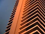
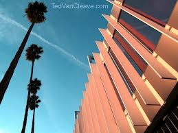
In Ted VenCleave photographs he takes he basis it around lines, curves, sky , angles of building, solid colours.
|
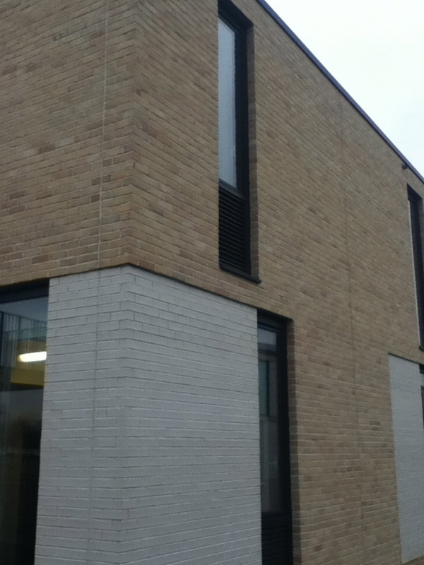
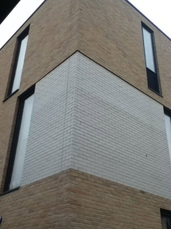
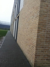
Ted VenCleave
These images are what i would like to take. I like the angle Ted VenCleave has taken them from and i like the colours within these images as a group. The colours are very bright and not dull, if one of the images were dull the background makes it better as the background is interesting and has bright colours in it. All these images are todo with buildings but not just the same building but different. In these images there is not of negative space in as the background makes the images better and is needed and will be captured in the image no matter what unless cropped out. These buildings all have different designs on them, that makes it interesting to look at. These images are going to help me and inspire me to take future images to improve my project and take it further. Getting inspired by this photographer will help me as of the angle its been taken at and i have not really taken a group of images with that angle. The focus would help as the focus is mainly on the buildings. Most of my images i have taken they have tended to be dull and boring so i would gain from this project my use of colours and my project will be bright instead of dull and boring. |

|
|
These images I think work well in a group as they all have something in common , and that would be lines.
I think the colours work well in this image, it makes the image better. These images have a lot of detail to it because of the lines and the shapes that are being formed with in the image, for example, triangles are being produced, rectangles. |
|
|
These images are what I would like to expand on. I would like my images to look better than these and by being inspired my TedVen Cleave I am going to be able to make my images more interesting even the most boring thing I can take I want it to look good.
|

|
|
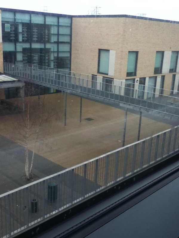
These images are what i took within the school,. my subject behind these images would be texture and focus, These images dont really work well in a group as they dont really look similar. If i was to put these in a group i would but the buildings in a group, the indoor things in a group. These images have not been edited as i wanted to show what my images look when not edited. I thought clearly about these images i wanted a range of different types of images to show how i can develop these to make them better. For the first row of images i think the focus is more of the bird in the first two even though the bird is not in the middle, but if was to be edited i would blur out the background so its focused on the bird itself. The texture in the first row would be rough as if i was to feel the floor on the links and the buildings it would not feel smooth but there are certain things in the picture that looks smooth. The next row of images i would say work well as a group as they have something in common, lines. These set of images have lines in and so the main focus in these images would be lines.
|
|
|

Further experimentation
|
|
|
|
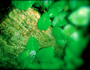
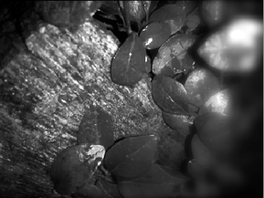
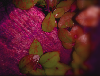
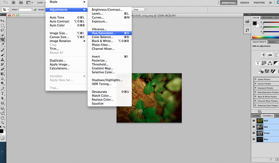
These images are one of my experiments. These are the same images but just with a different effect. These are focusing on texture and focus and with the different effect it shows you the focus and texture in different ways as they look different. I done these in photoshop. The focus is on the wood and some of the leaves and the un focused parts would be on the leaves to give it to effect and to show what is focused and what is the main focused. By putting the different effects on makes it better as your seeing what it looks like in different colours and shows different gradients and shows different details you might not of seen in the non effect one which would be the one at the end.
Selecting images
Final piece
|

|

|

|
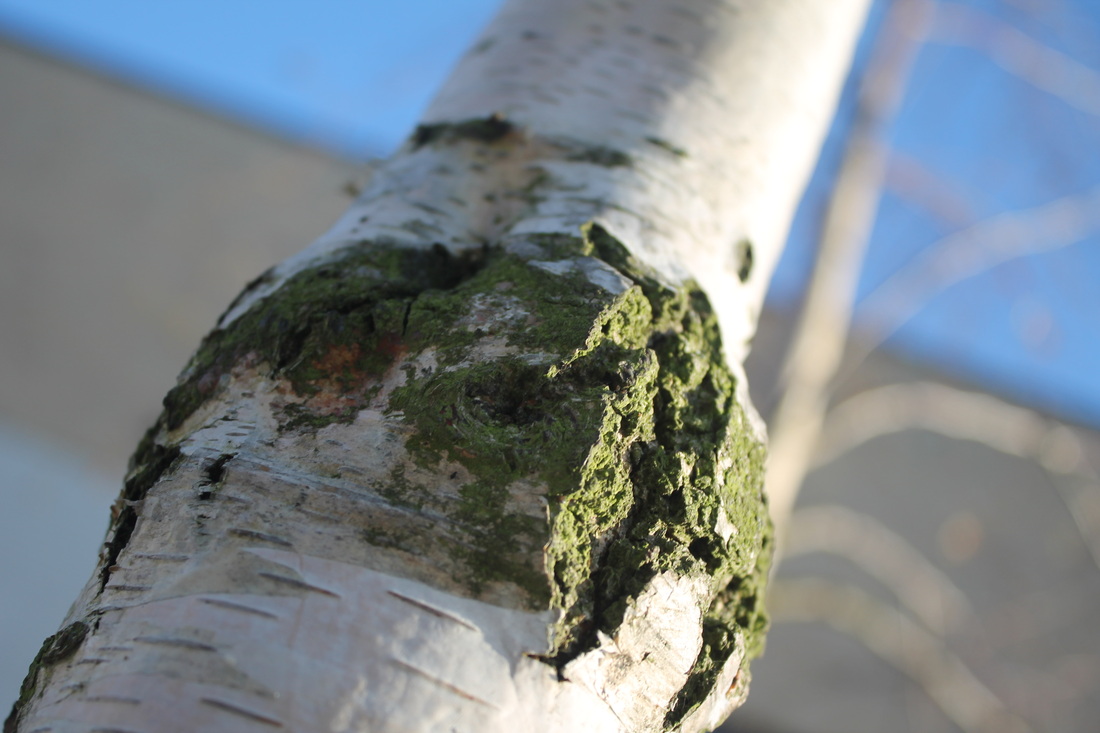
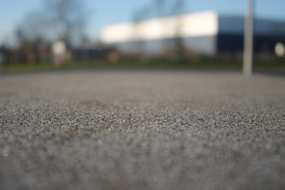
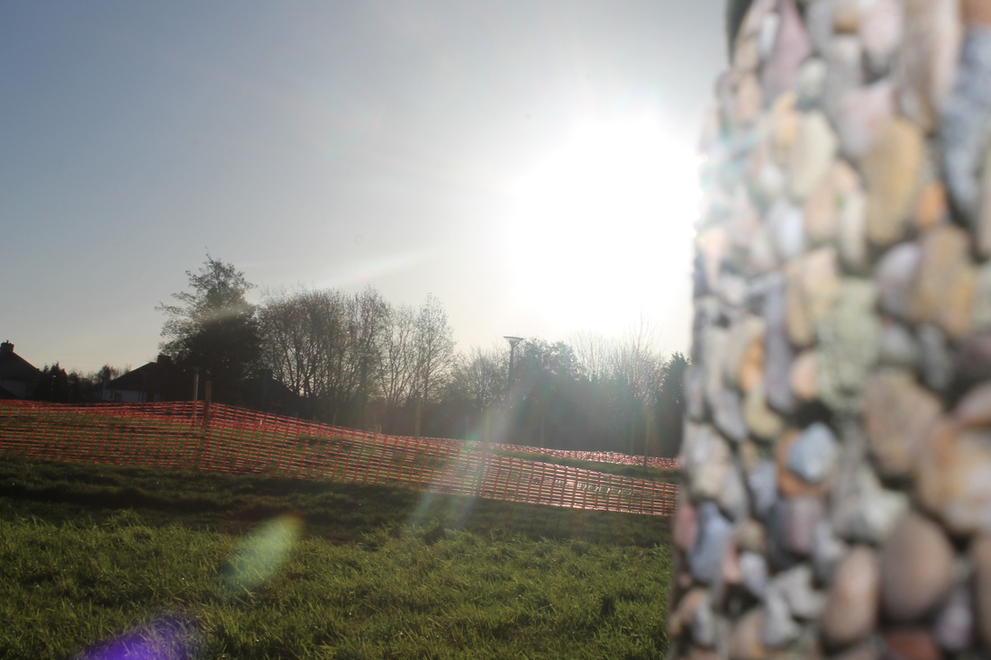
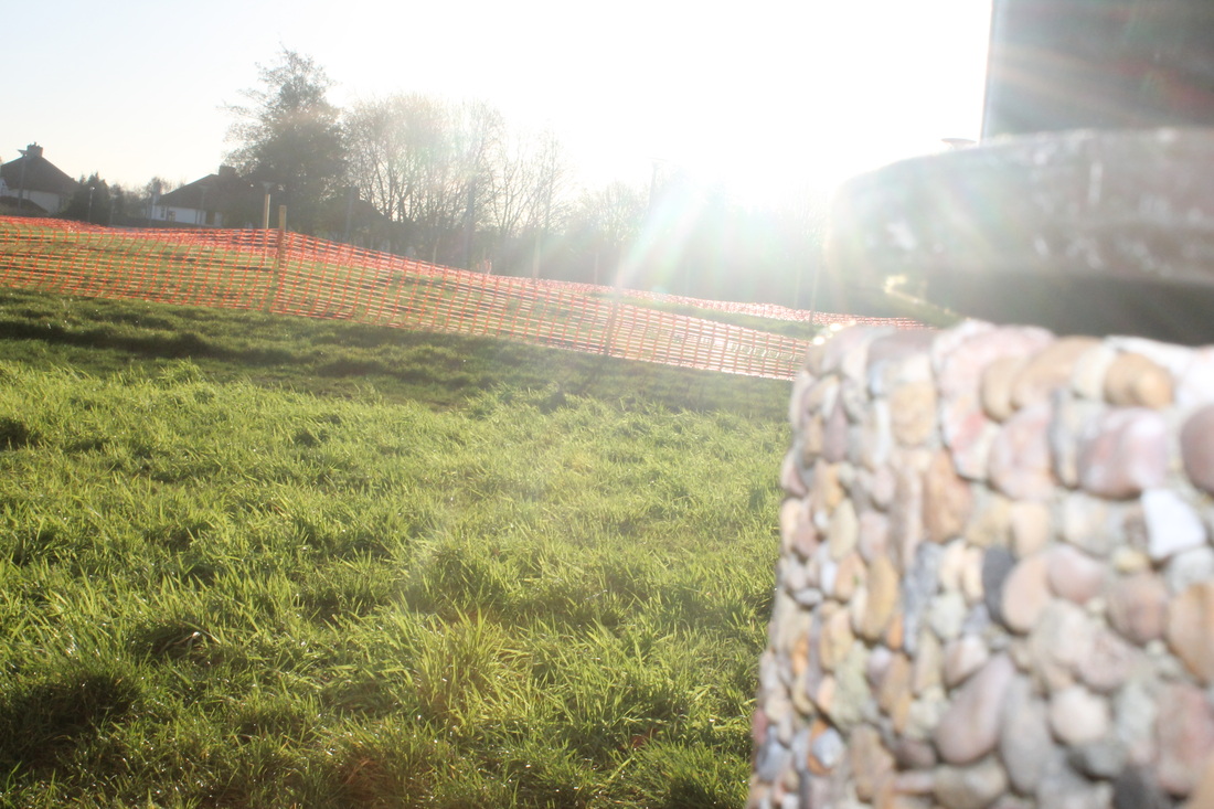
These images are a selection which I was considering for a final piece. These images have no effect towards them and they are all different , but have focus and texture in common.These were taken on digital camera. I like the light in these images as it makes the image look better and lighter , and gives it the effect of the reflection and the blurred out parts. I like the last image as its got the background unfocused and the concrete closer to the camera is in focus that shows the texture of the floor and makes the rest of the image look smooth. I put these into a group as i think it works well as they are all focused out side all have something focused and unfocused.
Final Piece
|
|
|

|
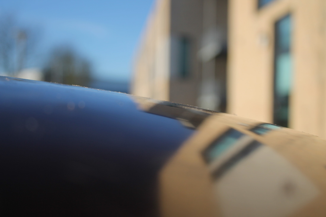
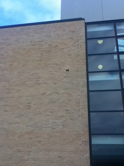
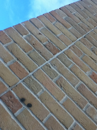
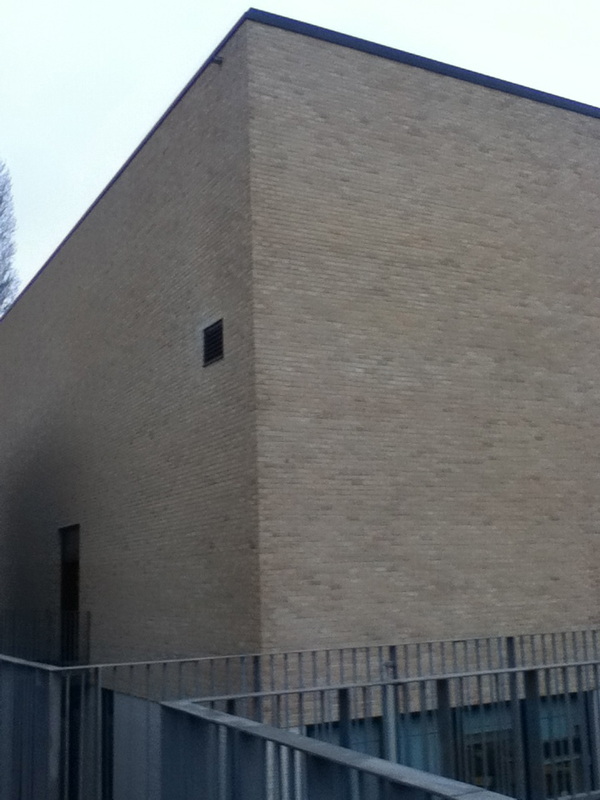
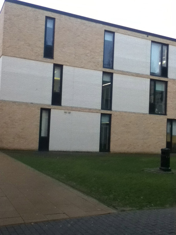
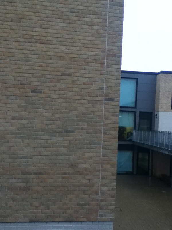
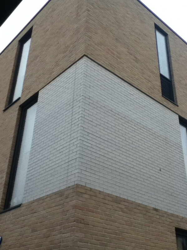
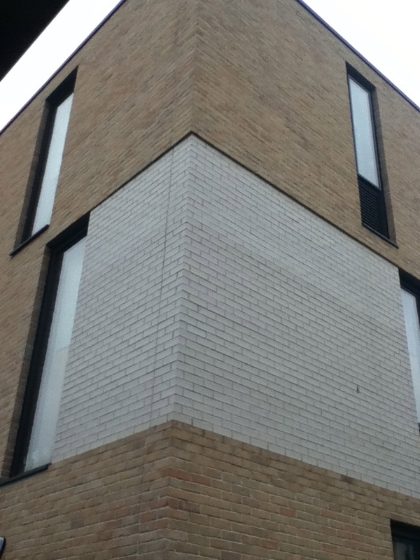
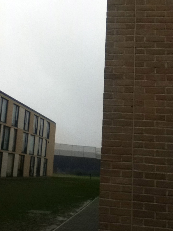
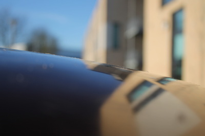
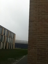
These images are my final pieces. These images have no effect towards them but they are all different and taken at different angles to show how the image looks different when taken at another angle. These were taken on on an iPod. I did not edit these images as i thought it looks better and i think its more natural and shows my aspects of how i took my image.In this images its not really sunny and does not really show the brightness. I put these images into a group as they are alls buildings and all have some part of the sky in the images. So they have something in common so there for works well together as a group
Final Evaluation
For this project we started of by researching what abstraction is to help us to know what we were doing and it would help up create this project. For abstraction I done 3 final pieces as I have lots of time to be able to do more than 2 which helps as its showing the different variety of my inspirations linked to photographers I have researched about. I got inspired by looking at Pinterest so I made my own to show of some examples so that then lead me to some photographers in abstraction, for example , Paul Strand I done some investigation into Paul Strand and looked into his photographers and ones I didn't like and ones I did, this helped me to see the ways he done his abstraction images and to see if this could help me when taking images of my own. I then went onto look in many other artists , Aaron Siskind, Francesca Woodman this helped me gain knowledge of how they take images of different types of abstraction and how they are different in there own way.
I then listed formal elements and for each formal element I wrote a simple definition just so I had a clear understanding of what I was looking for within in an image, I did not really notice that these formal elements was in the pictures taken my the artists chosen but it helped me realise it and helped me more out with the picture. I then done an home experiment just to see what I was capable of at the stage of not knowing much at this stage as there was a lot more to learn as the experiment went on.
I got a youtube video to help understand it a bit more and just to see if it could help me gather more information. I then started to put the formal elements in my images I then took more and more images to try and improve on them overall and to experiment on new ideas. This all lead me to my final pieces , for my first final piece I decided to choose my best images on the theme of light and texture, For my second final piece I kept it simple to show that it didn't need editing as I liked it the way it was as they were abstract.
